Nature Photographers Network
This is the preserved archive of the original Nature Photographers Network. The community continues at naturephotographers.network.
Capitol Ending + REPOST
‹ PreviousLandscape GalleryNext ›

Capitol Ending + REPOST

by Stan Rose

Gallery: LandscapePosted October 16, 2011338 views31 comments
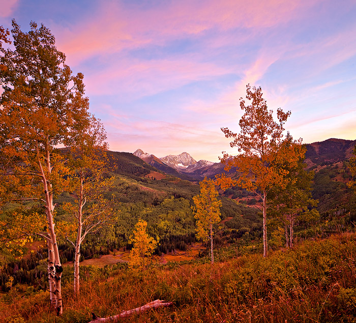
The overlooks from the end of Capitol Creek Rd are a very popular spot for photographers in the fall, because of the terrific views of Capitol Peak (the toughest 14,00o foot peak in CO) beyond an aspen filled valley. Unfortunately, due to the late fall colors this season, it was mostly green when i was there a couple weeks ago, so I had to look for compositions using some of the trees that had changed as fg subjects. This was taken at sunset--i figured the cirrus clouds that were around all afternoon would light up nice and pink and they sure did! Ive already printed this one, and the detail is terrific.
5Dmkii; 24mm TSE--2img shift stitch at f/11
C&C Welcome!
SEE REPOST BELOW!

Comments

31 comments
Comment posted by Wayne Jones on October 16, 2011 at 9:56 PM
WOW! :cool:
Those clouds are not the only think that got lit-up by the sunset! If I had not witnessed the effects of a blazing red sun on fall foliage, I might think that this was "overcooked." (Frankly, I still get that impression looking at the scarlet ground cover down on the floor of the valley, but I was not there -- sadly.) The light on the aspens is neat, too. It seems to be coming from at least two different directions, and I am sure it is, with all those clouds and trees acting as natural reflectors.
At this small size, Capitol Peak seems to be a minor element in the scene, but I bet it's impressive in a big print.
Registered on April 18, 2007, 953 Posts, 6435 Comments
Comment posted by Art Escobado on October 16, 2011 at 10:03 PM
This is very nice - maybe pull back on the highlights around the Capitol Peak area. Great shot!
Registered on January 7, 2007, 0 Posts, 775 Comments
Comment posted by Russell Colletta on October 16, 2011 at 10:11 PM
That is some sweet light on a great subject Stan. Does the shift stich allow better DOF or improve perspective? The end result of this technique is quite impressive. Detail from FG to horizon, and the elements in both areas are boldly presented.
Registered on October 31, 2009, 114 Posts, 1008 Comments
Comment posted by Nancy Lea Sandy on October 16, 2011 at 10:52 PM
Incredible color and fabulous detail. Masterful composition
Registered on January 24, 2011, 576 Posts, 6942 Comments
Comment posted by Stan Rose on October 16, 2011 at 10:54 PM
Russell--shift does improve perspective (eliminates a lot of distortion) and i also used tilt here, which gives better DOF.
Registered on September 15, 2005, 836 Posts, 17099 Comments
Comment posted by Joseph Campisi on October 17, 2011 at 12:16 AM
Love the color and detail Stan, those aspens really pop!

Overall, I really like the comp. My only nit is that aspen on the left hand side, it seems "cut off". I'd have liked it a little better if there was more room on that side, but that's pretty minor.
Registered on November 24, 2008, 304 Posts, 3211 Comments
Comment posted by Floris van Breugel on October 17, 2011 at 1:33 AM
Sweet view, Stan. I get the same impression as Wayne, however, and find the overwhelming red/magenta color a little too much. I'm not saying that it didn't look like this, it very well could have, but I just don't really like it :wink: Part of that may be my utter boredom with pink sunsets and sunrises; for landscapes like this I prefer the life that a little sunshine gives the scene.
Registered on December 19, 2008, 306 Posts, 4840 Comments
Comment posted by Nicolaus Wegner on October 17, 2011 at 2:40 AM
The ground and trees are a bit too pinkish/magenta to my eye Stan. Usually the only times I have seen color casts like this are with super low clouds and/or rain/mist that is being directly reflected by sunshine. Looks like the sun was very much gone, so I don't see how the cast could be possible. I'm assuming this was shot in AWB?

A beautiful scene though...brings a sense of peace, which is a good thing in my book.

Have to agree about the aspen...a 'shift' to the left would have been more to my tastes. But then, we all have different tastes. ;]

Nice work overall.

Registered on February 21, 2010, 133 Posts, 1509 Comments
Comment posted by R.Bill Moser on October 17, 2011 at 6:13 AM
Stan, I love the view here. Maybe a little bit too much magenta and red! But I really like the light here.
Registered on January 29, 2010, 285 Posts, 4281 Comments
Comment posted by Stan Rose on October 17, 2011 at 9:09 AM
Interesting comments--there is definitely no magenta cast here, but there is quite a bit of pink--cause the sky was pink; i even struggled to find a comp with just aspen trees cause they turned quite pink, but the light only lasted 30 seconds or so (which is why i probably didtn inclued the lhs too--no time!) and it was gone before i could find any more decent comps. Ill take another look at the WB issue, maybe repost later today if i can work anything up that looks reasonable.
Registered on September 15, 2005, 836 Posts, 17099 Comments
Comment posted by Marc Adamus on October 17, 2011 at 11:05 AM
Slight halo around the tree at right is the only thing I can think of critique-wise. That tiny peak sure adds a lot for a focal point.
Registered on September 17, 2005, 780 Posts, 8091 Comments
Comment posted by Soubhik Patranabis on October 17, 2011 at 11:21 AM
Nice ..
Registered on January 25, 2010, 54 Posts, 610 Comments
Comment posted by Hamed Musharbak on October 17, 2011 at 11:54 AM
colorful :toast:
Registered on June 1, 2009, 372 Posts, 2282 Comments
Comment posted by Daniel Rappaport on October 17, 2011 at 11:56 AM
Simple balanced composition with interest and detail through the frame but always leading back to the peaks. Feels just right.
Registered on September 9, 2009, 294 Posts, 2006 Comments
Comment posted by Gino Cortez on October 17, 2011 at 1:09 PM
Gorgeous color, lighting, and comp. here, Stan! I love the pink sky and complimentary subtle color palette.
Registered on November 23, 2010, 57 Posts, 396 Comments
Comment posted by Jason Kim on October 17, 2011 at 3:13 PM
Nice image, but I would agree with the others regarding the color issues. To my eye, this looks over saturated and the pink/magenta is overwhelming. I think some more careful blend/process work around the right tree/sky area would also help.
Registered on July 1, 2006, 60 Posts, 1233 Comments
Comment posted by Bill Chambers on October 17, 2011 at 3:37 PM
Lovely capture and composition. Sky colors are great, but terrain colors appear a bit exagerated on this crappy work monitor.
Registered on April 10, 2005, 753 Posts, 21216 Comments
Comment posted by Dietrich Gloger on October 17, 2011 at 3:41 PM
Love the comp. Stan! And that light! Such glow from the sun (or from the sun that has already set) can render the landscape in some appealing ways and you captured it. I think it is believable, but a tad on the heavy side - I admit.
Registered on January 26, 2007, 360 Posts, 9876 Comments
Comment posted by Nick Bristol on October 17, 2011 at 5:23 PM
It's a fantastic place and a beautiful Image. Really enjoy looking at this Stan. On my monitor it does look a bit pink but it is a beautiful image regardless. I think your comp works really well too. The more I look the more I enjoy it, and I always think that is a good thing! :toast:

Nick Bristol
Lone Rock, WI
Registered on February 1, 2004, 752 Posts, 14140 Comments
Comment posted by Kah Kit Yoong on October 17, 2011 at 6:53 PM
Processed in a very natural manner IMO. The slightly unconventional composition works a treat.
Registered on September 27, 2006, 636 Posts, 10682 Comments
Comment posted by Stan Rose on October 17, 2011 at 7:58 PM
I'm really quite surprised by the comments that it is 'over-saturated'--i barely touched the saturation and on several different monitors it looks pretty much on target to me. Anyhow, i completely reprocessed from scratch without even looking at the old version, with the critiques in mind, and this is what i came up with. I dont know if its more accurate, but its definitely more neutral. I shot this with AWB (5500 K) and that looked right to me on site, so i stuck with it. Additional thoughts welcome! :smile:
Registered on September 15, 2005, 836 Posts, 17099 Comments
Comment posted by Nick Bristol on October 17, 2011 at 8:59 PM
Perfect!, and I love it. I think this would make one awesome print that people would not tire of. :toast:

Nick Bristol
Lone Rock, WI
Registered on February 1, 2004, 752 Posts, 14140 Comments
Comment posted by Robert Dayton on October 17, 2011 at 10:27 PM
Another outstanding fall scenic, Stan! The colors and tones here are superb.
Great detail and sharpness. Keep the autumn scenics coming.
Registered on November 11, 2008, 281 Posts, 3958 Comments
Comment posted by Jimmy Gekas on October 17, 2011 at 11:21 PM
I really like the repost, Stan. Great scene indeed. :toast:
Registered on July 26, 2007, 244 Posts, 2807 Comments
Comment posted by Richard Hartmann on October 18, 2011 at 1:45 AM
I like the repost better.
Registered on January 15, 2009, 13 Posts, 772 Comments
Comment posted by Jason Kim on October 18, 2011 at 11:08 AM
Hey there Stan,

The repost looks better to my eye. It still looks very rich to me, as if you might have used an s-curve a bit aggressively. In the first post, that fallen log in the FG appears to be glowing pink as if it was dipped in melted cotton candy. Less so in the repost. I'm guessing that those high clouds were just saturating the landscape with pinkish light, and combined with the rich colors of the forest, this is the result. It must be a struggle to capture such wonderful light and then find ways to dial it back in PS!! :biggrin:
Registered on July 1, 2006, 60 Posts, 1233 Comments
Comment posted by Michael J Greene, on October 18, 2011 at 2:05 PM
I like the re-post better too Stan. I have no problems whatsoever with the saturation, I think the image has a strong color cast that people are mistaking for saturation. I could see trying to neutralize the picture a lit bit more and fading out the effect with a grad reducing the overall warmth and orange tones of the foreground and leaving the background as is.

Michael :wavey:
Registered on June 18, 2009, 86 Posts, 2317 Comments
Comment posted by Morris McClung on October 18, 2011 at 4:49 PM
I'm only sorry you didn't make it for the full on show, but this'll do. I really like the repost for more natural color. Superb work, Stan.
Registered on May 7, 2007, 670 Posts, 19650 Comments
Comment posted by Zack Clothier on October 19, 2011 at 2:39 AM
Repost looks very natural Stan, nice shot. Love that distant peak!
Registered on January 28, 2010, 343 Posts, 2257 Comments
Comment posted by Paul Marcellini on October 19, 2011 at 9:52 AM
I haven't read the comments but this is sweet! I like the color cast..only nit is the darkness in the left aspen up top. Even if natural, it draws my eye.
Registered on November 27, 2007, 250 Posts, 2468 Comments
Comment posted by Stan Rose on October 20, 2011 at 8:03 PM
Thanks for all the feedback, folks--much appreciated! :toast:
Registered on September 15, 2005, 836 Posts, 17099 Comments