Nature Photographers Network
This is the preserved archive of the original Nature Photographers Network. The community continues at naturephotographers.network.
Surf Lines
‹ PreviousLandscape GalleryNext ›

Surf Lines

by Phil Pogledich

Gallery: LandscapePosted October 21, 20111,441 views13 comments
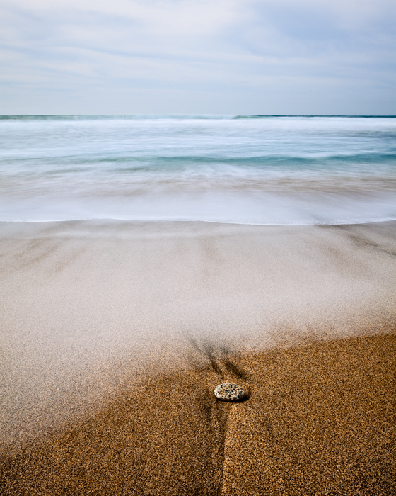
An older shot that I finally took the time to process. Not entirely sure if this will work for folks, but I'm curious to find out. All comments and critiques are greatly appreciated.

Canon 5DII, 17-40L at 27mm at f/22 for 10 seconds (ISO 50). Polarizer and 6-stop ND filters.

Comments

13 comments
Comment posted by Anil Rao on October 21, 2011 at 8:39 PM
This is really beautiful and inviting. I am really enjoying the soft colors and light.
Registered on November 15, 2003, 234 Posts, 4923 Comments
Comment posted by Yiming Hu on October 21, 2011 at 8:40 PM
It works for me! I like the minimalistic comp and the muted colors. Should work even better in the square format.
Registered on April 28, 2011, 38 Posts, 733 Comments
Comment posted by Nick Bristol on October 21, 2011 at 8:44 PM
I love the soft color and wonderful feel you captured here, Phil. This is very calming to look at. I think my dentist needs this hanging in the waiting room! :biggrin:

Nick Bristol
Lone Rock, WI
Registered on February 1, 2004, 752 Posts, 14140 Comments
Comment posted by Vance Gese on October 21, 2011 at 8:59 PM
Very much enjoy the soft light and pastel colors that make for a very quiet image. The water motion is nicely done, especially that nearest the viewer. Really nice work.
Registered on November 13, 2008, 298 Posts, 6629 Comments
Comment posted by Eva McDermott on October 21, 2011 at 10:39 PM
Simple and beautiful Phil. I a especially enjoying the pastels in the upper 3/4. Beautiful work!
Registered on January 4, 2009, 1015 Posts, 13229 Comments
Comment posted by John Williams on October 21, 2011 at 11:07 PM
I like what Eva said, simple and beautiful. It works well for me Phil, pastels with the minimal comp and smoothed water all come together nicely.
Registered on September 6, 2007, 221 Posts, 5985 Comments
Comment posted by Mark Metternich on October 22, 2011 at 12:06 AM
Excellent clean simple and impressionistic. Just the way I like 'em! :toast:
Registered on June 19, 2009, 276 Posts, 6240 Comments
Comment posted by Todd Bielby on October 22, 2011 at 7:47 AM
Wow I really like this it almost seems unreal. The textures in the sand really pop.
Registered on March 10, 2011, 169 Posts, 392 Comments
Comment posted by Dietrich Gloger on October 22, 2011 at 10:16 AM
Sure works for me Phil. Very well crafted in my opinion. A calm and relaxing image. Very good work!
Registered on January 26, 2007, 360 Posts, 9876 Comments
Comment posted by Guy Manning on October 22, 2011 at 11:03 AM
I love the color palette in this image and its simplicity in composition. Even without the rock and mark in the sand this would stand up well because of the frame divisions, perspective and color. Good work. .
Registered on October 17, 2011, 13 Posts, 44 Comments
Comment posted by Michael J Greene, on October 22, 2011 at 1:23 PM
Hi Phil,

I like the softness of the tones and overall color palette. It is peaceful and inviting. I was little on the fence about the rock, but the more I look at it the more I like it.

Michael
Registered on June 18, 2009, 86 Posts, 2317 Comments
Comment posted by Morris McClung on October 22, 2011 at 2:56 PM
I like the overall feel and I'm sure a print will bring out the detail that compression is robbing here. Simple, effective, and engaging.
Registered on May 7, 2007, 670 Posts, 19650 Comments
Comment posted by Bruce King on October 23, 2011 at 1:33 AM
Really nice. I like the soft waves and the earthy tones in the fg. Excellent. :toast:
Registered on January 14, 2010, 276 Posts, 2212 Comments