Nature Photographers Network
This is the preserved archive of the original Nature Photographers Network. The community continues at naturephotographers.network.
Dramatic Rapids + Repost
‹ PreviousLandscape GalleryNext ›

Dramatic Rapids + Repost

by Navin Sarma

Gallery: LandscapePosted October 26, 2011303 views10 comments
If at first you don't succeed...

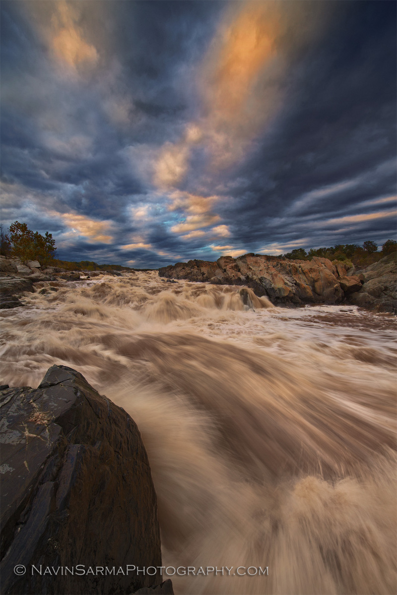
Thanks for all the comments on the last version of this image. Appreciate the comments regarding the 50/50 split. I personally think that the character provided by the highest cloud and the lowest rapid is more important for the story of the image than the split. I played with a few crops, regardless, but nothing really stuck for me. Again, thanks for that!

There was one comment about the darkness of the rocks. I took a look at the image, and some of my first draft of other recent images, and thought I really was not cranking the contrast enough. I have been concerned about showing individual spritzes of water that get drowned out by the contrast. Straying far from that in this version -- I want the darkness of the image govern its mood.

Another comment about the blues. I did an overall color balance shift a little coldish pink, but I didn't like it. I removed that shift and desaturated the blues a bit. Thanks for that.

Thanks lastly for the comment on CA. When I processed the RAW file, I didn't see any CA, but it reared its neck when I started some curves transitions. I used a desaturated layer to cover the CA since the Photoshop filter on the main layer did very little. Please let me know if you find the halos disconcerting.

Please view LARGE and provide any comments on the details.

Canon 5dm2, Nikkor 14-24/2.8G

f/18, ISO 50, 3 image blend: 2 for motion, and one for dynamic range in the sky

C&C requested!

Comments

10 comments
Comment posted by Giovanni Russello on October 26, 2011 at 3:41 AM
Hi,
I find the sky full of drama and very appealing. On the other hand, the water is not that appealing to me. Maybe it's the muddy colours (brown-ish) that really do not cut it for me. Also the dark rock on the left-bottom corner does not add to the flow in the composition.

gio
Registered on January 21, 2007, 95 Posts, 1617 Comments
Comment posted by Tom Hilton on October 26, 2011 at 7:34 AM
Nevin,
I really like both versions,
maybe take a look at desaturating the water on the right, just under the rocks, to remove some of the brown.
The rest of the color balance looks fine to me.
this is a great shot...
Registered on September 19, 2011, 68 Posts, 668 Comments
Comment posted by Neale Dyster on October 26, 2011 at 8:56 AM
I love the drama in this one Navin. The clouds and the water are amazing. Well captured.
Registered on February 19, 2008, 94 Posts, 738 Comments
Comment posted by Navin Sarma on October 26, 2011 at 9:18 AM
gio - thanks for your comments. it's a struggle trying to deal with the colors of the potomac. in some cases, i've completely desaturated the water. but, i like to stay relatively true to the scene. this is a common comment i get here and otherwise, so i'll have to think of a better way to deal with this.

tom - thanks for your input. i'll take a look to see the saturation in that corner of the rocks.

thanks again for everyone's thoughts
Registered on July 17, 2011, 233 Posts, 1373 Comments
Comment posted by Harry Lichtman on October 26, 2011 at 9:37 AM
Navin - Nice job on the repost. I think it is an improvement. I struggle with some of the waterfalls and rivers in NH - lots of tannins disolved in the water that give it a yellow/brown look. Not the most photogenic! :toast:
Registered on September 17, 2010, 304 Posts, 3507 Comments
Comment posted by Paul Marcellini on October 26, 2011 at 10:22 AM
Love the echoing lines but the water color really doesn't add much for me. I think the comp is strong enough for a good black and white.
Registered on November 27, 2007, 250 Posts, 2468 Comments
Comment posted by R.Bill Moser on October 26, 2011 at 1:29 PM
There's a lot of actions here. I love that dramatic sky. Well composed but I don't like that muddy looking water.
Registered on January 29, 2010, 285 Posts, 4281 Comments
Comment posted by John Williams on October 27, 2011 at 12:03 AM
I think Paul is on to something there Navin. That BW idea may just be the winner.
Registered on September 6, 2007, 221 Posts, 5985 Comments
Comment posted by Hillary Younger on October 27, 2011 at 3:36 AM
I love the drama of both water and sky, and think Paul's idea of a B&W conversion would be great to see...
Registered on October 2, 2011, 17 Posts, 167 Comments
Comment posted by Navin Sarma on October 28, 2011 at 1:30 AM
ahhh the brown water. a welcome challenge. i figured the brown might not work for most. i tried a few conversions in raw to awaken the water, but no go to this point. i think this is why folks might try super long exposures in these parts.

i dont do too many b&w's, and i tried one before the second version of this image, but it never stuck for me. i gave it another go and it may be growing on me!

curious for additional thoughts, might repost so you can get a larger view.

Registered on July 17, 2011, 233 Posts, 1373 Comments