Nature Photographers Network
This is the preserved archive of the original Nature Photographers Network. The community continues at naturephotographers.network.
A mountain castle
‹ PreviousLandscape GalleryNext ›

A mountain castle

by Peter Coskun

Gallery: LandscapePosted November 10, 20111,329 views47 comments
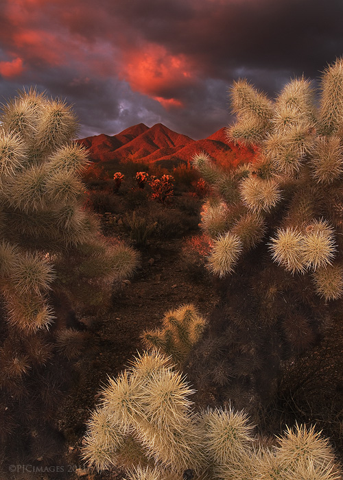
This is another image from the same evening as my last post. I wanted to frame the red mountain peaks between the cacti and have the cholla act almost as a border for the landscape itself. I'm wondering if that empty space in the middle is distracting and if I should have shot this from a lower angle. to have the peaks only between the cactus? I did a layer mask to brighten up some of the cactus and bring out the textures as well. Anyways, as always comments and critiques are welcome.

Canon 7d
Canon 17-40mmL @17mm
f/16
ISO 100
2 sec
tripod mounted
3 stop grad ND filter.

Comments

47 comments
Comment posted by Justin Reznick on November 10, 2011 at 1:42 PM
This is beautiful Peter and very unique. I think a lower angle would have been problematic in that the cacti on the borders of the image would have protruded into the sky too much. As is, you have a little path leading to the mountains. I think it works great.
Registered on November 24, 2009, 79 Posts, 515 Comments
Comment posted by Peter Coskun on November 10, 2011 at 1:44 PM
Thanks Justin, that was my main concern with going lower. I knew the upper cacti would reach too high or out of the frame.
Registered on October 31, 2011, 170 Posts, 1240 Comments
Comment posted by Daniel Mosquin on November 10, 2011 at 1:47 PM
I think your suggestion of a lower angle would have improved the composition, yes -- that empty space doesn't do much for the photo.

Great work with using the cholla for framing, though -- I'd love to see additional photographs along those lines.

Another critique, and I suppose this is a processing one. Orange light in clouds, orange light on mountains, orange light on distant cholla...I expect as a viewer to see the same in the near chollas.
Registered on November 20, 2003, 24 Posts, 122 Comments
Comment posted by Charlie Baugh on November 10, 2011 at 1:54 PM
Wow for two reason here. The shot was imo splendidly composed and that does indeed prove a pleasant trail leading to the peaks. And Wow for the critiques as well. The comment about the near cholla's is a good one.

Registered on April 18, 2011, 329 Posts, 1985 Comments
Comment posted by Daniel Rappaport on November 10, 2011 at 1:55 PM
The framing works wonderfully. I agree that the difference in color between the foreground and mid and background is pretty stark, but however you did it, it's in large measure why this works so well.
Registered on September 9, 2009, 294 Posts, 2006 Comments
Comment posted by Joseph Campisi on November 10, 2011 at 2:31 PM
This has a very fantasy-like quality Peter. I would reduce the saturation just a tad though. Must have been a wonderful experience to witness this light in person!
Registered on November 24, 2008, 304 Posts, 3211 Comments
Comment posted by Aaron Feinberg on November 10, 2011 at 2:32 PM
Holy crap that's cool. Looks like you might have needed to blend for dof but guess you got away with 1 shot. Looks like, on my monitor, that your red channel is going crazy. Might take the luminance down just a tad (in the raw). Killer work and cant wait to shoot these guys!

aF
Registered on October 26, 2009, 399 Posts, 2789 Comments
Comment posted by Peter Coskun on November 10, 2011 at 2:45 PM
Thanks guys. I'll have to look into getting some of the color in the foreground cholla. The original didn't have as much color as the rest of the image however. Also the red's were pretty vibrant, I thought I had them fixed but again I'll go back and work on it. Aaron I was thinking of doing a blend for DOF but I keep having trouble keeping all parts in sharp detail. Any tutorials that can aid in doing blends for DOF would be greatly appreciated.
Registered on October 31, 2011, 170 Posts, 1240 Comments
Comment posted by Jake Case on November 10, 2011 at 2:50 PM
Hey Peter, first of all, thanks for the comment on my photo :smile: . For this photo, I think you've done the best you could with this particular composition. I've tried to do similar things with the cholla to get some new unique stuff, and its hard to do, but this turned out pretty good. The empty space in the middle is fine I think. My nit is the red saturation...for the mountains it looks fine, but looks like the reds in the sky and middle ground chollas are pushed to the point of detail loss. All the other processing looks spot on. Great job! I've been wanting to shoot the McDowells myself for a while now....we should meet up sometime!
Registered on December 13, 2010, 38 Posts, 167 Comments
Comment posted by Fabio Giarrizzo on November 10, 2011 at 2:53 PM
Fantastic treatment of light and beautiful warm colors on this one- My congrats, Fabio
Registered on December 3, 2010, 90 Posts, 1614 Comments
Comment posted by Peter Coskun on November 10, 2011 at 3:20 PM
No problem Jake. Thanks for you input on this. I agree with the light on the cholla's in the middleground. That's something I'm working on and will hopefully have a repost up soon. The Mcdowell's are a real treat to shoot and unpredictable. I've taken some of my best photos here. If you ever wanna meetup and shoot just send me an email.
Registered on October 31, 2011, 170 Posts, 1240 Comments
Comment posted by Tim Donnelly on November 10, 2011 at 3:46 PM
It really is a unique way of framing the mountain. Personally, I really like the result. The eye goes straight through to the mountain but then it can come back and appreciate the frame. Very nicely done indeed
Registered on March 2, 2011, 13 Posts, 54 Comments
Comment posted by Kory Lidstrom on November 10, 2011 at 4:04 PM
Very creative image with stunning light. I think a lower angle might've improved the comp, but it's pretty darn good as is. The only thing that seems a bit off is the cacti in the foreground seem a tad lighter than they should be.

Also, I have to ask: how many times did you get stuck by an Evil Teddy Bear while making this image? :jump:
Registered on November 19, 2008, 49 Posts, 1035 Comments
Comment posted by Peter Coskun on November 10, 2011 at 4:21 PM
Heres a repost that hopefully fixed most of the issues. I opted to work softer colors into it so let me know what you think. @Kory- Surprisingly not at all (at least on the skin). I've been around these guys so many times I know how to work with them. My boots on the other hand looked like cacti though, glad they have thick padding :smile:
Registered on October 31, 2011, 170 Posts, 1240 Comments
Comment posted by Barry Ashenhurst on November 10, 2011 at 4:45 PM
Terrific photograph Peter. And very original.
Registered on August 4, 2009, 253 Posts, 455 Comments
Comment posted by Chikku Baiju on November 10, 2011 at 5:09 PM
Terrific shot Peter! The repost looks a lot better. I have always wanted a shot like this with the chollas as a frame, but never got any awesome light like this. Guess I will have to try shooting in the McDowell's now.

As for blending for DOF the auto-blend layers function is photoshop is pretty effective. Here is a tutorial on that; http://layersmagazine.com/extended-depth-of-field-with-auto-blend-layers-in-photoshop-cs4.html
Registered on January 9, 2010, 31 Posts, 246 Comments
Comment posted by Tonia Graves on November 10, 2011 at 5:54 PM
Peter, I really like how you lead the viewer into the frame through this network of chollas. Very interesting comp, & I like it! You also captured some great, dramatic lighting in this. Good job!
Registered on October 29, 2011, 92 Posts, 1035 Comments
Comment posted by Brian Schrayer on November 10, 2011 at 7:14 PM
Ouch, you were right about those mixed feelings - I think I got pricked in the nose with those cactus spines when I opened this up. :wink:

Seriously though, I like your composition. The "empty" space in the middle doesn't bother me. With that fantastic color on the middle ground cholla they add interest to the middle of the frame and help lead my eye throughout the frame. That light and color is amazing.
Registered on May 28, 2004, 114 Posts, 2890 Comments
Comment posted by Nancy Lea Sandy on November 10, 2011 at 7:33 PM
Repost is about as good as it gets. fantastic work.
Registered on January 24, 2011, 576 Posts, 6942 Comments
Comment posted by Peter Coskun on November 10, 2011 at 7:35 PM
Thanks Chikku. If you ever do shoot the Mcdowells opt for the lost dog wash trailhead. It's far less crowded and much more photogenic. If you decide to head out there let me know, maybe we could meet up or something. Also thanks for the link I'll have to take a look. I actually have a few areas that I want to try this with the cholla's framing a mountain. Supes are priority #1 hah.

Tonia and Brian thank you for your comments as well. Brian these things are soft, I promise :cool:
Registered on October 31, 2011, 170 Posts, 1240 Comments
Comment posted by Richard Teller on November 10, 2011 at 8:31 PM
I think the image is outstanding. The light is really sweet and the frame of the cacti works very well. It is an unusual shot and very compelling. the center doesn't bother me at all.
Registered on August 23, 2010, 1162 Posts, 6692 Comments
Comment posted by Joseph Campisi on November 10, 2011 at 9:24 PM
The repost is excellent. I think you can even add back just a teensy bit of saturation. I really love the comp Peter!
Registered on November 24, 2008, 304 Posts, 3211 Comments
Comment posted by Chip Phillips on November 10, 2011 at 9:43 PM
This is awesome. Makes me feel all prickly just looking at it. Love the way the cactus close you into the comp. If you are concerned about that left corner, you could always play around with "warp" and try and pull the lower cactus over a touch.
Registered on November 26, 2007, 128 Posts, 1436 Comments
Comment posted by Art Escobado on November 10, 2011 at 10:36 PM
very dynamic and bold shots!! i like what you've shown here recently. keep'em coming!
Registered on January 7, 2007, 0 Posts, 775 Comments
Comment posted by Tony Kuyper on November 10, 2011 at 11:35 PM
The light you bring to this is incredible, Peter. This has a very Adamus-esque look to it, and I mean that in the best possible way. The elements and light work together to create a very dramatic scene. It's really well done.
Registered on November 1, 2003, 364 Posts, 22328 Comments
Comment posted by Peter Coskun on November 11, 2011 at 12:00 AM
Thank you Tony, that is a huge compliment. I have followed Marc's work for quite some time so the comment is greatly appreciated. I had other results in mind when I shot this but didn't have the right tools to do so. Still very pleased with this.
Registered on October 31, 2011, 170 Posts, 1240 Comments
Comment posted by Michael J Greene, on November 11, 2011 at 12:10 AM
Congrats Peter. This is fantastic too. Your composition is very original and I like the colors better in the original. Just my two cents...

Michael
Registered on June 18, 2009, 86 Posts, 2317 Comments
Comment posted by Zack Clothier on November 11, 2011 at 12:17 AM
First of all I really appreciate the nice, creative comp and wonderful light you've captured here. The only thing that irks me about this is the artificial looking light on the chollas in the FG, an issue that was partially addressed in the repost (although the bottom one still seems to bright compared to the rest of the scene and tends to pull my eye downward). I also think the repost could use a bit more punch in the sky and distant cholla, not quite as much as the original but somewhere in between the two versions. Just my 2 cents, take it for what it's worth. :wavey:
Registered on January 28, 2010, 343 Posts, 2257 Comments
Comment posted by David Chauvin on November 11, 2011 at 1:55 AM
The view from behind the cactus into a stormy sky makes this very dramatic. I can't imagine the pain of falling into one of those guys. Beautiful work. :toast:
Registered on August 5, 2004, 1007 Posts, 5595 Comments
Comment posted by John Fan on November 11, 2011 at 9:56 AM
Fantastic image!! Yes I also think a slight lower position might help to reduce the empty space somewhat. I almost feel that the cactus at front is too much "on your face", distracting the viewer's attention from the main subject.
Registered on August 24, 2010, 135 Posts, 489 Comments
Comment posted by Jimmy Gekas on November 11, 2011 at 10:44 AM
Really, really nice. The comp and creative process here are unique. Love the light on the mountains and above! :toast:
Registered on July 26, 2007, 244 Posts, 2807 Comments
Comment posted by R.Bill Moser on November 11, 2011 at 10:49 AM
Awseome. Beautiful work :toast:
Registered on January 29, 2010, 285 Posts, 4281 Comments
Comment posted by Mark Metternich on November 11, 2011 at 11:42 AM
One of the most unusual and coolest desert scenes I have seen in a long while!!!!! Worth many replies! :toast:
Registered on June 19, 2009, 276 Posts, 6240 Comments
Comment posted by Peter Coskun on November 11, 2011 at 3:48 PM
Thank you all.

@Zack- When I shot this that foreground cholla was extremely close to the lens (kinda hard to tell from the web view) and actually caught more light than the rest of the cacti. This is as natural as it looked regarding that area.

@David...It feels as bad as it looks. When I first moved out here I fell into one, took a half a day pulling out cactus needles. I've since then learned to work with them.
Registered on October 31, 2011, 170 Posts, 1240 Comments
Comment posted by Adrian Klein on November 11, 2011 at 3:58 PM
The first one is the one I would pick between them, personally. It is a fine image for sure. I see what some say about the "artificial" feel to the light on the FG but it does not personally bother me. And I would keep the more intense mountain colors on the first one and not lighten as much as you did the repost. Again it's all personal choice. In the end you can't go wrong either way with this beauty for sure!
Registered on June 10, 2007, 112 Posts, 1506 Comments
Comment posted by Peter Coskun on November 11, 2011 at 5:06 PM
Thanks Adrian. I too prefer the drama in the original post but did want to fix a few things others have suggested. I'm working on a print of this shot that is going to be a medium between this and the repost. I'm hoping it looks much better.
Registered on October 31, 2011, 170 Posts, 1240 Comments
Comment posted by Jim Greenwood on November 11, 2011 at 10:13 PM
Wow!!!!! Your last post was outstanding. But this one is in a different league altogether. How you could resist posting this one first ... I'll never understand. :wink:

Incredible! Stunningly beautiful!
:toast:
Registered on November 9, 2003, 229 Posts, 1523 Comments
Comment posted by Peter Coskun on November 11, 2011 at 11:31 PM
Thanks Jim. It was just the order in which I processed them. The previous image had some real special light though. If I had the light from the first one (the glow on the cacti) this would be the clear winner of being posted first hah. I have a few more from this evening I plan on sharing in the future. Started with the bangs first though (IMO).
Registered on October 31, 2011, 170 Posts, 1240 Comments
Comment posted by Doug Koepsel on November 12, 2011 at 9:12 AM
Peter, I prefer the sky and mountain of the repost (maybe add a slight bump in saturation), but like the brighter cholla of the first. One possibility would be a square crop with the top to rid the area between the lower and upper chollas. I like your framing of the mountain with the up-close cholla.
Registered on April 1, 2010, 196 Posts, 1592 Comments
Comment posted by Peter Coskun on November 12, 2011 at 9:14 PM
Thanks Doug. I got it to a point that I find visually pleasing for a print and "hopefully" a magazine publication in the near future. Personally though I don't like square crops so it's very unlikely to see anything on this site from me that is square unless it works perfectly :smile:
Registered on October 31, 2011, 170 Posts, 1240 Comments
Comment posted by Nick Bristol on November 13, 2011 at 2:59 PM
This is outstanding! Beautiful work Peter. I prefer your repost but both are wonderful. Maybe something right in-between for the background color saturation? Nice work!! :toast:

Nick Bristol
Lone Rock, WI
Registered on February 1, 2004, 752 Posts, 14140 Comments
Comment posted by SandyRichardsBrown on November 16, 2011 at 11:30 PM
Amazing light - congrats on the WP!
Sandy
Registered on November 24, 2003, 3937 Posts, 12909 Comments
Comment posted by Peter Coskun on November 16, 2011 at 11:42 PM
Thank you Sandy! I didn't even notice until you mentioned it. I feel honored. Thank you everyone for your positive feedback on this piece!
Registered on October 31, 2011, 170 Posts, 1240 Comments
Comment posted by Doug Koepsel on November 17, 2011 at 1:39 PM
Peter, congratulations on the WP!
Registered on April 1, 2010, 196 Posts, 1592 Comments
Comment posted by Peter Coskun on November 17, 2011 at 7:22 PM
Thank you Doug!
Registered on October 31, 2011, 170 Posts, 1240 Comments
Comment posted by Rodrigo Sandoval on November 22, 2011 at 4:05 PM
Peter,
Beautiful! Almost surreal. Loved it. The tones, colors, composition are just great!
Registered on April 4, 2009, 13 Posts, 254 Comments
Comment posted by Peter Coskun on November 22, 2011 at 6:13 PM
Thank you Rodrigo, I appreciate it!
Registered on October 31, 2011, 170 Posts, 1240 Comments