Nature Photographers Network
This is the preserved archive of the original Nature Photographers Network. The community continues at naturephotographers.network.
Vibrant Colors
‹ PreviousLandscape GalleryNext ›

Vibrant Colors

by R.Bill Moser

Gallery: LandscapePosted November 23, 2011206 views11 comments
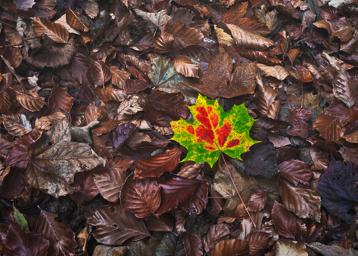
Another one from the “Twannbachschlucht”. This is taken early November. I came back to take some fall shots since the last time I had visited this gorge the fall colors hadn’t been at its peak but unfortunately I was too late……the trees were already bare…all leaves were laying on the ground. While hiking back I saw this leaves laying on the ground. Thought this would be a great contrast to all those “faded” leaves laying around. Hope this one works.
Techs: Nikon D700, 16-35 lens (@35mm), ISO 200, 8sec, f11, polarizer

Comments

11 comments
Comment posted by Nick Bristol on November 23, 2011 at 3:44 PM
Hi Bill, I think this works really well. It makes a nice image showing the end of the fall season and makes you think of what is ahead. The large version especially shows amazing detail and clarity. I like this alot...really well done! I have been out cutting some wood today for the long, cold winter nights ahead. Cheers.

Nick Bristol
Lone Rock, WI.
Registered on February 1, 2004, 752 Posts, 14140 Comments
Comment posted by Joel Hazelton on November 23, 2011 at 4:36 PM
I love this, great contrast. I especially enjoy all the different shades of brown.
Registered on August 6, 2008, 194 Posts, 1315 Comments
Comment posted by Carolyn Derstine on November 23, 2011 at 6:00 PM
Wonderful details in this image, Bill. I really like the colors of the one leaf and the brown background works so well so show off this leaf. The brown leaves are also quite interesting with their various textures and shades of brown.
Registered on February 16, 2011, 610 Posts, 3684 Comments
Comment posted by Richard Teller on November 23, 2011 at 6:38 PM
I like the way the bright leaf really adds a point of interest to the image, it really draws the eye. Fine image.
Registered on August 23, 2010, 1162 Posts, 6692 Comments
Comment posted by Todd Bielby on November 23, 2011 at 8:06 PM
I like this a lot but I think a slight smaller crop would benefit this shot a great deal.
Registered on March 10, 2011, 169 Posts, 392 Comments
Comment posted by Nancy Lea Sandy on November 23, 2011 at 8:18 PM
I really like the details in all the fallen leaves. The colored one stands out very well against this bg, but I'm thinking it might have been interesting to make a compostion of the mat of dead leaves that didn't include it. This is very nice, it engages my imagination. I like it
Registered on January 24, 2011, 576 Posts, 6942 Comments
Comment posted by Joseph Campisi on November 23, 2011 at 8:42 PM
The color contrast of that lone leaf against the background of bronze, almost metallic looking leaves is quite striking Bill! I agree with Todd about a smaller crop. I like it as is, but a crop would make this an even stronger image IMO. Maybe a vertical or almost square crop would work well here.
Registered on November 24, 2008, 304 Posts, 3211 Comments
Comment posted by Stan Rose on November 23, 2011 at 9:55 PM
Neat! I like the coppery look to the dead leaves, and the 'standout' is nice too. I wouldn't crop it--the surrounding leaves add to the isolation here--the more of the surroundings the better. :wavey:
Registered on September 15, 2005, 836 Posts, 17099 Comments
Comment posted by David Chauvin on November 24, 2011 at 5:37 AM
The the rich color and detail in the brown leaves elevate this image from the typical image of this type. :cool:
Registered on August 5, 2004, 1007 Posts, 5595 Comments
Comment posted by Gary McGhee on November 24, 2011 at 2:28 PM
Certainly works for me Bill, the contrast in colour is excellent. I also think a slightly tighter crop may enhance this a bit more.

Gary.
Registered on April 15, 2010, 142 Posts, 2416 Comments
Comment posted by Lon Overacker on November 25, 2011 at 3:16 PM
Bill,

This works beautifully! Of course in my jaded mind I can't help think the leaf is placed - but quite honestly, who cares? And from your description, it's not, so what's my point? Heck if I know. I think this is wonderful. I love the contrast between the almost metalic bronze, copper and golden tones surrounding the vibrant colors of the maple leaf. I like this very much.

Lon
Registered on November 24, 2006, 521 Posts, 19147 Comments