Nature Photographers Network
This is the preserved archive of the original Nature Photographers Network. The community continues at naturephotographers.network.
High & Dry
‹ PreviousLandscape GalleryNext ›

High & Dry

by Harry Lichtman

Gallery: LandscapePosted November 29, 2011257 views10 comments
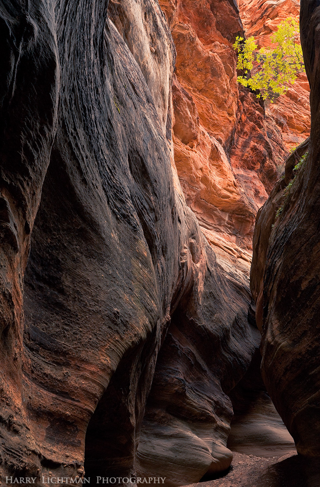
A little slot arond Zion this fall- the lighting appeared near perfect too me, but I am concerned that the tiny tree high on the right of the canyon wall might be lost a bit with the brightness of that back wall. I have considered cropping it off, as the rock below might have enough interest in itself. Your thoughts on this any anything else welcome.

Ideally the tree might be a little lower in the image, but the rock above was a little to hot, and I needed to zoom to eliminate that area.

Focal blend of 3 images @ f16, though 2 may have worked out just as well. Was hard to tell when compared.

17-40L, polarizer, ISO 400

Comments

10 comments
Comment posted by Bill Dark on November 29, 2011 at 11:33 PM
I think it looks fine, Harry. My only nit might be the black BG here. I like the gray border much better in the larger version. Nice work.
Registered on May 27, 2005, 148 Posts, 1121 Comments
Comment posted by Harry Lichtman on November 29, 2011 at 11:39 PM
Thanks Bill - Good idea. I haven't gotten fancy enough to do my own boarders prior to upload!
Registered on September 17, 2010, 304 Posts, 3507 Comments
Comment posted by Neale Dyster on November 30, 2011 at 2:14 AM
It works for me Harry, I'd leave the tree in. Nice work.
Registered on February 19, 2008, 94 Posts, 738 Comments
Comment posted by Lon Overacker on November 30, 2011 at 2:24 AM
Harry,

I can hopefully rest your concerns about the tree and the back wall. There's no problem at all! I think the tree stands out beautifully - so much so that I consider it the anchor to the entire scene. The back wall is understandably brighter given the layout of the walls and such, but it's not too bright and certainly not over exposed or anything like that. I think you've done a great job with the processing in that regard. In fact I would say this is excellent all the way around. Nice work.

Lon
Registered on November 24, 2006, 521 Posts, 19147 Comments
Comment posted by Peter Richter on November 30, 2011 at 6:04 AM
Great dynamics for me in your composition, Harry. The delicate tree counteracts the mighty walls aptly in my opinion, and makes for a beautiful focal point.

Peter
Registered on November 10, 2010, 218 Posts, 2723 Comments
Comment posted by Nick Bristol on November 30, 2011 at 9:19 AM
This looks great to me Harry. I like the light and the small tree! This looks quite natural to me and I enjoy the view. Wonderful detail here too!

Nick Bristol
Lone Rock, WI
Registered on February 1, 2004, 752 Posts, 14140 Comments
Comment posted by Phil Pogledich on November 30, 2011 at 12:00 PM
I'll join the chorus and agree that the small tree definitely adds to the image and stands out effectively against the brighter wall. I agree with you that, ideally, it would have been slightly lower in the frame, but that's how it goes. It's a very fine shot overall and I like the juxtaposition of the light and dark walls, together with the delicacy of the tree in a landscape of stone.
Registered on August 24, 2009, 123 Posts, 3099 Comments
Comment posted by scott lanz on November 30, 2011 at 12:38 PM
I think the tree is a nice element, and I like the comp and light. It may be better if the tree were a little more prominent, but I like it as is and it stands out good enough to work. Still, if you go back in 20 years, and bring a ladder, you may get something even better. :wink:
Registered on November 14, 2003, 840 Posts, 12902 Comments
Comment posted by Daniel Rappaport on November 30, 2011 at 4:45 PM
The complementary color of the tree makes it stand out just fine. The flow of the image from dark to light puts me right there feeling like my neck is craning to look up.
Registered on September 9, 2009, 294 Posts, 2006 Comments
Comment posted by Tony Kuyper on December 1, 2011 at 9:01 AM
I like this just fine, Harry. The textures and colors here are very pleasing.
Registered on November 1, 2003, 364 Posts, 22328 Comments