Gallery: LandscapePosted December 2, 2011287 views12 comments
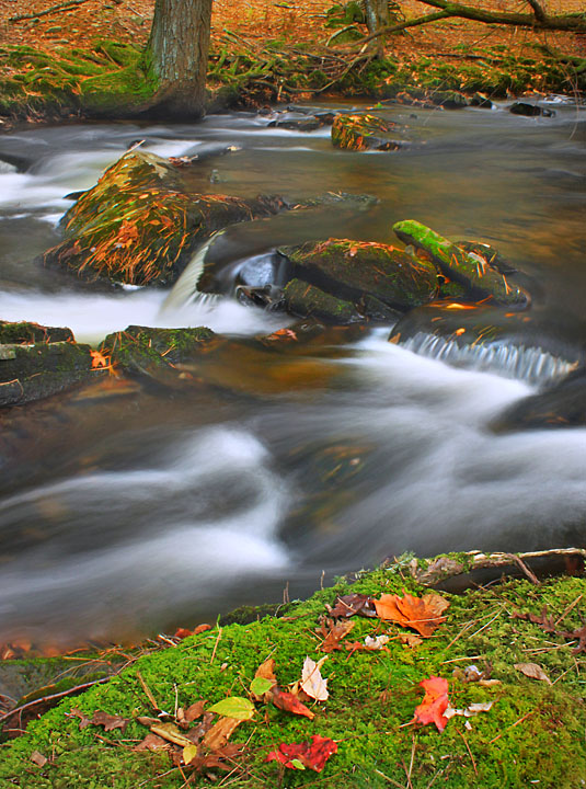
Another photo of a fall stream shot from the Pocono Mountains in October. Does this view work? C&C welcomed; they help me learn.
Canon Rebel T1i. 21mm at F/22 for 3.2 sec. ISO 100.
Comments
12 comments
Comment posted by Philip Hodgkins on December 2, 2011 at 12:16 PM
A well taken shot, Carolyn, but I have to say it doesn't work for me.
Why vertical rather than horizontal?
Registered on July 24, 2006, 2741 Posts, 12349 Comments
Comment posted by Carolyn Derstine on December 2, 2011 at 12:52 PM
Why vertical? Wanted a bank-to-bank shot and to have more of a close-up view of the stream, there was "junk" beyond these boundaries, and last but not least--something different! But hey, if it doesn't work, it doesn't work. Thanks for your honesty, Phil.
Registered on February 16, 2011, 610 Posts, 3684 Comments
Comment posted by John Kerr on December 2, 2011 at 2:21 PM
I think this is a nice shot Carolyn. Great color, sharpness and texture. I would be tempted to crop down from the top so the top of the picture is at the base of the far riverbank. There is nice color on the other side of the river but cropping it out make for a more stunning photo in my opinion.
Registered on October 28, 2009, 111 Posts, 1070 Comments
Comment posted by Daniel & Loana on December 2, 2011 at 5:08 PM
I like this one, Carolyn. Colours and flowing water are great!
Congrats
D&L
Registered on October 7, 2008, 166 Posts, 3044 Comments
Comment posted by Nancy Lea Sandy on December 2, 2011 at 7:53 PM
I'm going to go the opposite direction of John's suggested crop and say remove the fg bank. the stream is extremely nice but the near bank feels incomplete to me. The flow of the river is beautiful. You certainly have a way with water
Registered on January 24, 2011, 576 Posts, 6942 Comments
Comment posted by Stan Rose on December 2, 2011 at 8:46 PM
Nice Autumn scene! Id crop half the top to eliminate the urhc horizontal log. Otherwise its a good comp. The top half looks a tiny bit 'hazy' or soft to me, probably not a focus issue but hard to say at this size--the bottom leaves look sharp so not sure what's causing that.
Registered on September 15, 2005, 836 Posts, 17099 Comments
Comment posted by Tony Kuyper on December 2, 2011 at 10:02 PM
The depth and textures here are nice. I sort of with the far side had a bit more detail.
Registered on November 1, 2003, 364 Posts, 22328 Comments
Comment posted by Robert Dayton on December 2, 2011 at 10:41 PM
I like this as presented. Instead of going vertical, I'm wondering if it would be
possible to clone out the fallen tree branch in the upper right in the background.
That's my only concern. Well done, Carolyn.
Registered on November 11, 2008, 281 Posts, 3958 Comments
Comment posted by Lon Overacker on December 3, 2011 at 1:35 PM
Carolyn,
I think you did well with the composition and accomplished what you wanted with the inclusion of both banks and including the details in the stream. It's hard to suggest alternatives without having been there, but you did describe some garbage areas that you wanted to exclude, and there are always those composition constraints, so I think you did well with what you had in front of you.
In general, I try and make use of the elements and if I'm going to include something, make it on purpose, as you've done with the near and far banks. In this case though, especially with the far bank, I'm wishing for a little more. It feels a little like you had to compromise both the foreground and bg just to include them both. I try when I can to make one of the elements a little more prominent so there's either 1. a place for the eye to rest, 2. a main subject or focal point and 3. balance. So all in all, I think you did well in all these. It's about choices and compromises. Good job.
Lon
Registered on November 24, 2006, 521 Posts, 19147 Comments
Comment posted by Carolyn Derstine on December 3, 2011 at 2:19 PM
Thanks everyone for your helpful comments! There are many varying opinions of how to improve it but that is helpful because it gives me "food for thought" next time I am out preparing to shoot a picture. I guess close-up/macro photography is more my thing but there are times when larger scenes present themselves that I wish to photograph so I need to work on this aspect of my photography too.
Registered on February 16, 2011, 610 Posts, 3684 Comments
Comment posted by Richard Siggins on December 3, 2011 at 5:19 PM
I like the colors, light and the flowing water. I agree with several others - crop the far bank off the top and you will have a stronger composition. I see you shot f/22 21mm so DOF should not have been a problem but the top half of the photo seems a bit soft. The foreground looks good so I suspect you focused at the closest point (red leaf at the bottom?) Next time you might try focusing 1/3 into the scene. That way the foreground and background will be sharp.
Registered on October 11, 2007, 115 Posts, 223 Comments
Comment posted by Carolyn Derstine on December 3, 2011 at 9:45 PM
I don't want to drag this "conversation" on forever but I did decide to do a re-edit of this picture which I have reposted. I cropped down from the top and sharpened the middle and top of the picture. Is this a better image?
Registered on February 16, 2011, 610 Posts, 3684 Comments


Comments
12 commentsWhy vertical rather than horizontal?
Congrats
D&L
possible to clone out the fallen tree branch in the upper right in the background.
That's my only concern. Well done, Carolyn.
I think you did well with the composition and accomplished what you wanted with the inclusion of both banks and including the details in the stream. It's hard to suggest alternatives without having been there, but you did describe some garbage areas that you wanted to exclude, and there are always those composition constraints, so I think you did well with what you had in front of you.
In general, I try and make use of the elements and if I'm going to include something, make it on purpose, as you've done with the near and far banks. In this case though, especially with the far bank, I'm wishing for a little more. It feels a little like you had to compromise both the foreground and bg just to include them both. I try when I can to make one of the elements a little more prominent so there's either 1. a place for the eye to rest, 2. a main subject or focal point and 3. balance. So all in all, I think you did well in all these. It's about choices and compromises. Good job.
Lon