Nature Photographers Network
This is the preserved archive of the original Nature Photographers Network. The community continues at naturephotographers.network.
Stac Pollaidh +2  Reposts
‹ PreviousLandscape GalleryNext ›

Stac Pollaidh +2 Reposts

by Eva McDermott

Gallery: LandscapePosted December 13, 2011576 views13 comments
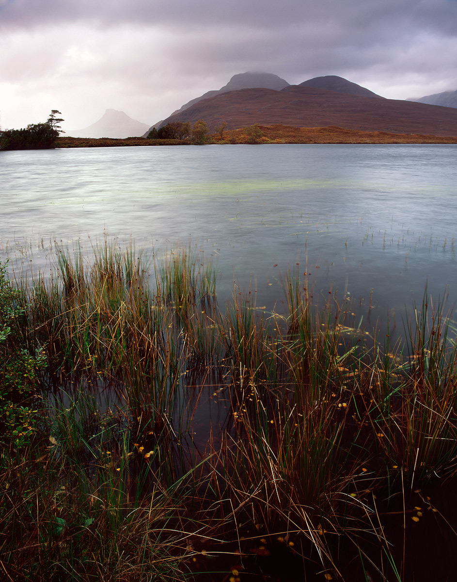
Stac Pollaidh is the ghost in the distance. Invepolly, Scotland.

Another film image from my Scotland trip. This one is not as sharp as I would like especially in the foreground since the wind was blowing (good excuse, not). Never-the-less I still like the scene.

Also, does this look dark on your monitor? It looks quite vibrant on my Lenovo workstation with Firefox but dark on my iPhone (Safari) and Dell (MS IE8).

Thanks for having a look.

Pentax 67II (courtesy of Ian Cameron)
Velvia 50
Pentax 55-100mm
Graduated ND
Minor adjustments in CS5

Epson V750 scan using Lasersoft Ai Studio 8 with betterscanning.com adjustable film holder with ANR glass.

Comments

13 comments
Comment posted by Ian Cameron on December 13, 2011 at 8:23 PM
It looks really fine on my monitor Eva, The greens of the grasses are a wee bit fluorescent but the rest is great. I might actually crop this to a square format from the bottom as where the grass becomes reeds in the water the whole image becomes more attractive.
Registered on August 6, 2004, 1125 Posts, 3318 Comments
Comment posted by Eva McDermott on December 13, 2011 at 8:43 PM
Thanks Ian. Here is your crop suggestion with green and yellow taken down a bit. The bottom right did appear quite dark. I hesitate to crop, but sometimes I should.
Registered on January 4, 2009, 1015 Posts, 13229 Comments
Comment posted by Navin Sarma on December 13, 2011 at 8:49 PM
i think i like the first crop better. the square crop brings my eyes dead center to the water, which is relatively bare. i wonder how it would look to open up the shadows in the foreground just a bit?

in any case, the background is awesome. i love the mood that the mist provides.
Registered on July 17, 2011, 233 Posts, 1373 Comments
Comment posted by Ian Cameron on December 13, 2011 at 8:59 PM
Ah well everyone has their own preference. I reckon it works well as a square and I would agree with the middle appearing quite empty if it weren't for that sweet green smear of weed in the middle. Love the soft misty rendition of Stac Pollaidh.
Registered on August 6, 2004, 1125 Posts, 3318 Comments
Comment posted by Navin Sarma on December 13, 2011 at 9:07 PM
very true -- the green section is quite cool and unique!
Registered on July 17, 2011, 233 Posts, 1373 Comments
Comment posted by Eva McDermott on December 13, 2011 at 9:09 PM
Well the ghostly Stac Pollaidh and green in the middle drew me in too Ian and made me want to post this. Navin, I think I still like my 1st repost best (square crop) since there seems to be more of a balance there. A bit more of a crop off the bottom here but regardless, I really like this scene in general since I can still feel and hear the wind. The light show was amazing too after I switched back to digital. An amazing and beautiful place your Scotland is Ian! Thank you both for your input Navin and Ian.
Registered on January 4, 2009, 1015 Posts, 13229 Comments
Comment posted by John Williams on December 14, 2011 at 1:15 AM
I think I like the original crop. Very nice, but I agree the greens are just a tad too strong.
Registered on September 6, 2007, 221 Posts, 5985 Comments
Comment posted by Lon Overacker on December 14, 2011 at 1:37 AM
Eva,

I think you've captured the environment and mood beautifully from this place. I think I prefer either of the cropped square versions over the original. I think mostly because of balance and a more pleasing composition. The original I found myself fighting between the foreground grasses and the rest of the landscape. Also, the cropped versions showcase the unique color in the water that I think you were attracted to. I think I would go for the first cropped version.

Lon
Registered on November 24, 2006, 521 Posts, 19147 Comments
Comment posted by Dan Baumbach on December 14, 2011 at 7:50 AM
I love seeing this different subject matter from you, Eva. I like all three, but I think the first repost is probably my favorite. Wonderful combination of elements.

- Dan.
Registered on November 1, 2003, 473 Posts, 7980 Comments
Comment posted by Nick Bristol on December 14, 2011 at 8:58 AM
I like this very much, Eva. I think you captured a wonderful feeling and mood here. This looks like a beautiful place, one I hope I can visit one day. I really enjoy the colors here too. It does not look dark on my monitor, just a nice natural look! The first cropped repost is the one I like best. Really nice image!

Nick Bristol
Lone Rock, WI
Registered on February 1, 2004, 752 Posts, 14140 Comments
Comment posted by Hamed Musharbak on December 14, 2011 at 11:45 AM
so nice Eva, i like the simplicity of this scene

Hamed
Registered on June 1, 2009, 372 Posts, 2282 Comments
Comment posted by R.Bill Moser on December 14, 2011 at 1:27 PM
I think you captured this scene very well.I'd prefer the reposts because the comps are more balanced. Great colors. love this a lot
Registered on January 29, 2010, 285 Posts, 4281 Comments
Comment posted by Peter Richter on December 14, 2011 at 2:15 PM
Eva, I prefer the original uncropped version, as the foreground anchores the image well in my opinion and adds a wonderful sence of depth to my eye. A plain and effective composition for me.

Peter
Registered on November 10, 2010, 218 Posts, 2723 Comments