Nature Photographers Network
This is the preserved archive of the original Nature Photographers Network. The community continues at naturephotographers.network.
Winter's Dream
‹ PreviousLandscape GalleryNext ›

Winter's Dream

by Bruce King

Gallery: LandscapePosted December 14, 2011163 views13 comments
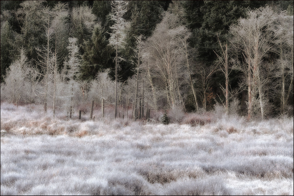
This is another version of the pano I posted a couple weeks ago. Phil Pogledich had commented on that one that a B&W version was mandatory. I tried that and it just looked too graphic for my tastes but it was probably my lack of experience with B&W more than anything. So rather than delete the file I cropped it to 8x12, applied a soft focus filter then brought a touch of the color back. It prints very well....I hope it works in the small web version. Check out the larger version and thanks for looking.

Comments

13 comments
Comment posted by Phil Pogledich on December 14, 2011 at 10:23 PM
I hear that guy is often wrong. Anyway, whatever the process you used to produce this, I really like the end result. The textures look wonderful and the composition has a nice layered effect.
Registered on August 24, 2009, 123 Posts, 3099 Comments
Comment posted by Harley Goldman on December 14, 2011 at 10:25 PM
Very surreal and cool looking!!! Love the trippy white grass look. Very IR looking. Real creative processing!!!
Registered on November 19, 2003, 586 Posts, 11271 Comments
Comment posted by Ken Smith on December 14, 2011 at 10:53 PM
Bruce, nice effects...the softening has the frost expanding and flowing large like a fuzzy bed of downy feathers. I might try to tap down brightness in f/g and the softener..just to see if the tree trunks become more dominant. They are attractive against the green/black b/g.
Registered on September 5, 2008, 449 Posts, 2444 Comments
Comment posted by Joseph Campisi on December 14, 2011 at 11:21 PM
Glad you posted this Bruce! As I said, I would have mistaken this for an infrared shot had I not known better.

Looks nice here, but as I also said, it looks fantastic in print! The print really brought out all that fine detail even better than the web version!
Registered on November 24, 2008, 304 Posts, 3211 Comments
Comment posted by Vance Gese on December 14, 2011 at 11:32 PM
Love the results of your work on this image, Bruce. Really emphasizes the frost and the wonderful graphical appeal of the grasses and trees. The hint of color is just right. Nicely done.
Registered on November 13, 2008, 298 Posts, 6629 Comments
Comment posted by David Edwards on December 15, 2011 at 3:58 AM
Wonderful light and frosted textures. Love the subtle colours and fragility.
Registered on December 6, 2008, 142 Posts, 2623 Comments
Comment posted by Dan Baumbach on December 15, 2011 at 8:43 AM
This looks teriffic and doesn't look photoshopped. You did a great processing job. It has a wonderful feel to it. I'd love it if you would post a link to the original version so I can see the difference.

- Dan.
Registered on November 1, 2003, 473 Posts, 7980 Comments
Comment posted by Rodrigo Sandoval on December 15, 2011 at 4:08 PM
I think the real strength of this are the textures, which are not visibile in the thumbnail version. The larger version is just wonderful. About the color, maybe turning it to B&W altogether would turno into a great result. Anyway, wonderful picture.
Registered on April 4, 2009, 13 Posts, 254 Comments
Comment posted by Nick Bristol on December 15, 2011 at 6:06 PM
Bruce, This is so cool looking! I can really get into the large version. Would love seeing a print of this!! Excellent work.

Nick Bristol
Lone Rock, WI
Registered on February 1, 2004, 752 Posts, 14140 Comments
Comment posted by Zack Clothier on December 15, 2011 at 8:10 PM
Wonderfully processed Bruce, almost looks like an infrared image..might burn down the grasses in the lower right to match the rest but that's about it.. :toast:
Registered on January 28, 2010, 343 Posts, 2257 Comments
Comment posted by R.Bill Moser on December 16, 2011 at 12:20 PM
Indeed a winter's dream. I like it a lot. Great stuff
Registered on January 29, 2010, 285 Posts, 4281 Comments
Comment posted by John Williams on December 17, 2011 at 11:13 AM
Looks good here too Bruce, with the larger version better. The print was even better though, especially because of the detail in the grass.
Registered on September 6, 2007, 221 Posts, 5985 Comments
Comment posted by Peter Richter on December 18, 2011 at 5:34 AM
Bruce, I enjoy your composition based on the diverse layers with their filigree character. Your image reflects this specific atmosphere very well to me. The subtle colors add a lot in my opinion.

Peter
Registered on November 10, 2010, 218 Posts, 2723 Comments