Nature Photographers Network
This is the preserved archive of the original Nature Photographers Network. The community continues at naturephotographers.network.
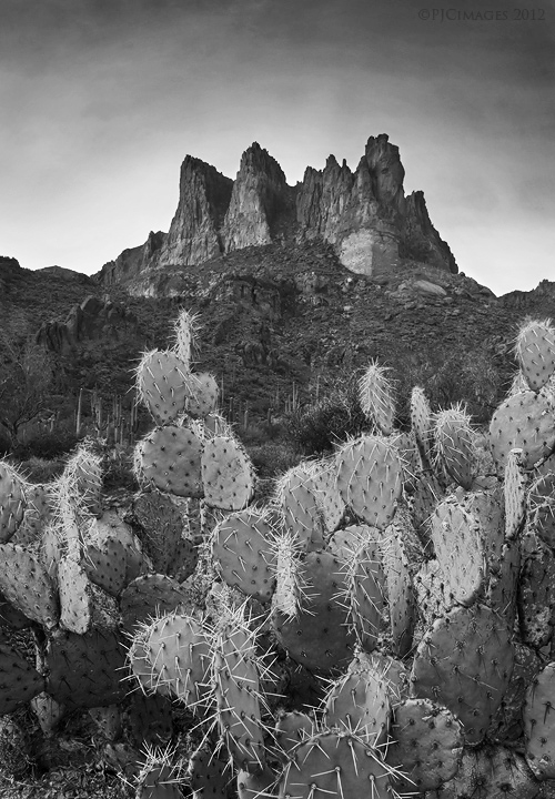
Crown of thorns
‹ PreviousLandscape GalleryNext ›

Crown of thorns

by Peter Coskun

Gallery: LandscapePosted January 17, 2012196 views16 comments
Same location as my last post. This one I decided to convert to black and white. There was a little bit of nice color, but comparing the two, this had more drama. I would have preferred a different composition, but just scouting around and playing with some blending techniques. Of course, I get so antsy to take a shot at new locations I don't pay too much attention to camera settings at first. This is a seven image blend for DOF. Did some burning and dodging in the sky and lower part of the cactus. Comments and critiques appreciated.

Canon 7d
Canon 17-40mm @17mm
f/18 ( I know it shouldn't have been that small)
1/25 sec
ISO 100
Tripod
3 stop grad ND
7 image blend for DOF

Comments

16 comments
Comment posted by Jim Sabiston on January 17, 2012 at 10:35 PM
The B&W conversion works well here. Nice job on the DoF blending.
Registered on April 7, 2007, 134 Posts, 443 Comments
Comment posted by R.Bill Moser on January 18, 2012 at 11:52 AM
The blending looks good. Also the black and white converion works fine here....though i'm missing the colors a bit here.
Registered on January 29, 2010, 285 Posts, 4281 Comments
Comment posted by Peter Coskun on January 18, 2012 at 12:03 PM
Thank you, Bill, here is a color version for comparison. http://500px.com/photo/4419359
Registered on October 31, 2011, 170 Posts, 1240 Comments
Comment posted by Andreas Resch on January 18, 2012 at 12:33 PM
I like the B&W more as it accentuates the tones a bit better and makes that halo around the ridge less visible.
Registered on November 14, 2007, 322 Posts, 6101 Comments
Comment posted by Michael J Greene, on January 18, 2012 at 6:33 PM
Hi Peter,

I really like the black and white far better than the color. Excellent comp and processing.

Michael
Registered on June 18, 2009, 86 Posts, 2317 Comments
Comment posted by Peter Coskun on January 18, 2012 at 7:14 PM
Thanks Andreas and Michael. I agree the black and white is definitely better.
Registered on October 31, 2011, 170 Posts, 1240 Comments
Comment posted by Nancy Lea Sandy on January 18, 2012 at 7:37 PM
Interesting comp with the bg rocks echoing the fg cactus. color might have been nice here but the b&w works pretty well
Registered on January 24, 2011, 576 Posts, 6942 Comments
Comment posted by Peter Coskun on January 18, 2012 at 7:50 PM
Thanks Nancy!
Registered on October 31, 2011, 170 Posts, 1240 Comments
Comment posted by Lon Overacker on January 19, 2012 at 1:17 AM
Peter,

Excellent near/far composition. No nits from me, and the b&w works quite well here.

Lon
Registered on November 24, 2006, 521 Posts, 19147 Comments
Comment posted by dean hebert on January 19, 2012 at 3:12 AM
I like the comp, the jumble of cacti leading to a "jumble" of peaks works for me, as well as your processing. :toast:
Registered on August 4, 2010, 70 Posts, 1132 Comments
Comment posted by Peter Coskun on January 19, 2012 at 6:21 AM
Thanks Lon. I'm still trying to get that whole blending for DOF perfected. So far most of the images have worked well. Cacti are a little difficult though with the outer most spines.

Thanks Dean.
Registered on October 31, 2011, 170 Posts, 1240 Comments
Comment posted by Doug Koepsel on January 19, 2012 at 10:29 AM
Peter,
I do like this B&W over the color version. The blending looks good from what I can tell on this image size. Your recent images have the Superstitions calling me to the warmer desert.
Registered on April 1, 2010, 196 Posts, 1592 Comments
Comment posted by Peter Coskun on January 19, 2012 at 2:05 PM
Thanks Doug! I figured you would be down here by now with the lack of winter I'm sure your having up north. I really hope the canyon gets a good dusting of snow soon. If your ever down here, let me know and we can meet up. By the way, congrats on making the finalists in the AZHW contest!
Registered on October 31, 2011, 170 Posts, 1240 Comments
Comment posted by Tony Kuyper on January 19, 2012 at 10:36 PM
I think this is better. The elements separate very nicely here. I also like the sort of halo the sky/clouds make around the peak.
Registered on November 1, 2003, 364 Posts, 22328 Comments
Comment posted by Peter Coskun on January 19, 2012 at 11:40 PM
Thanks Tony. As much as I love color, this one was screaming black and white when I began processing them. I too like the halo around the mountain peaks, I think it emphasizes them nicely.
Registered on October 31, 2011, 170 Posts, 1240 Comments
Comment posted by Jim Bullard on January 20, 2012 at 11:52 AM
A very good job overall Peter but it feels just a tiny bit flat to me. I'd suggest a curves layer (like the one attached) to brighten the highlights and darken the shadows just a touch. It would also add a bit more separation of the midtones.
Registered on February 4, 2009, 30 Posts, 128 Comments