Nature Photographers Network
This is the preserved archive of the original Nature Photographers Network. The community continues at naturephotographers.network.
Ocean Waterfall+alt comp
‹ PreviousLandscape GalleryNext ›

Ocean Waterfall+alt comp

by Chip Phillips

Gallery: LandscapePosted January 18, 20121,427 views39 comments
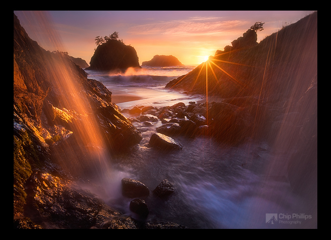
I was hoping to get some feedback on processing, etc. and preference for this or the other comp down in the comments. This was a pretty difficult one for me, with all the dynamic range and spray going everywhere. It's a hand blend and was shot with my Canon 5D mark II, Canon 16-35mm f2.8L II lens with polarizer. Thanks for any feedback.
Chip

Comments

39 comments
Comment posted by Harry Lichtman on January 18, 2012 at 2:13 PM
Not on a calibrated monitor, but the processing looks fine. Maybe a touch of fringing on the left of the main stack, possibly on the web version only? I'm wondering if a little added contrast especially on the right side water falls might help it stound out better. Very cool shot. :toast:
Registered on September 17, 2010, 304 Posts, 3507 Comments
Comment posted by Yiming Hu on January 18, 2012 at 2:22 PM
The process looks spot-on on my monitor (a calibrated NEC 2960). If I have to be nit-picking, I will say it seems to me that there are some halo around/above the trees on the top of haystack on the left.
Registered on April 28, 2011, 38 Posts, 733 Comments
Comment posted by Stan Rose on January 18, 2012 at 2:52 PM
Crazy shot, Chip! Neat mix of elements. I like the falls on the left, the stuff on the right gets in the way a bit (where it crosses the sunstar) but overall pretty cool. Processing looks good to me--hard to see the edges at this size so i cant comment on that. I might bring out the shadows just a tiny bit, especially the one prominent stack which is nearly black, in comparison with the other rocks that are a bit brighter;some of that is just the lighting, but probably not all of it. :wavey:
Registered on September 15, 2005, 836 Posts, 17099 Comments
Comment posted by Mark Metternich on January 18, 2012 at 3:25 PM
Chip, looks like you did a great job on the blending. An extremely busy image! It does take putting a ton of cool elements in one image to another level! This has it all and great light! Works very well. That has sort of been a thing on this forum for some years. Having said that, as a seller of photography, I know simplifying sells better but gets less accolades on forums. So it depends on which way you want to go... I like both. :smile:
Registered on June 19, 2009, 276 Posts, 6240 Comments
Comment posted by Chip Phillips on January 18, 2012 at 3:29 PM
Here's a slightly different comp for comparison: Simpler perhaps...
Registered on November 26, 2007, 128 Posts, 1436 Comments
Comment posted by Harry Lichtman on January 18, 2012 at 3:40 PM
I actually like the 2nd better - the sun is off center a little more and the stack poking throught the water is more unique from the usual. Nicely done. You must have had to react quickly to get both of these comps. I do like the wave action catching the sun better in the 1st.
Registered on September 17, 2010, 304 Posts, 3507 Comments
Comment posted by Dorin Bofan on January 18, 2012 at 4:22 PM
Stunning shot, Chip. There is indeed a lot for the eye to explore, but it's balanced very well. The second version is indeed simpler and it works a bit better, although it seems you lost some of the glow on the rocks and in the spray.
Registered on April 30, 2007, 122 Posts, 3086 Comments
Comment posted by Phil Pogledich on January 18, 2012 at 5:31 PM
For me the first post is the clear winner compositionally. I like every bit of it and the processing appears flawless to me.
Registered on August 24, 2009, 123 Posts, 3099 Comments
Comment posted by Nicolaus Wegner on January 18, 2012 at 5:36 PM
First post is awesome. Symmetry is great!

Beautiful shot.
Registered on February 21, 2010, 133 Posts, 1509 Comments
Comment posted by Navin Sarma on January 18, 2012 at 5:43 PM
i would have to go with comp 1. i personally like hitting a comp with some obvious and simple subjects, and scattering interesting detail around it. almost like the saying "hurry up and wait" (if that makes any sense). i think in the case of comp 1, your most obvious subjects are the stack, sun, and backlit falls. everything else folds into place and balances out (e.g., sheen on rocks, white rush of water, URC stack). if i were to nit just a little, i might take this same comp without a crashing wave, and it seems to be the only "chaotic" element to this photograph. also, i would also make one last small comment that the sunstar looks a bit more clean in comp 2; i'd pull that one fwd if possible.

just my humble thoughts.
Registered on July 17, 2011, 233 Posts, 1373 Comments
Comment posted by Anthony Vincent on January 18, 2012 at 5:50 PM
A+ for creative aspect Chip. Good to see some work from you here.
There are a lot of great elements at play and I think the first version is more impressionable.
Great job on the blend.
Registered on February 5, 2009, 199 Posts, 2775 Comments
Comment posted by Harley Goldman on January 18, 2012 at 6:25 PM
Wild group of elements that all come together well. I am preferring the first comp. The tunnel-like perspective works for me.
Registered on November 19, 2003, 586 Posts, 11271 Comments
Comment posted by Michael J Greene, on January 18, 2012 at 6:26 PM
Processing looks excellent Chip. I like the second version better. The first one I find has a little too much going on.
Registered on June 18, 2009, 86 Posts, 2317 Comments
Comment posted by Kah Kit Yoong on January 18, 2012 at 6:32 PM
I much prefer the composition in the first with the scene framed by the sprays of water. Fabulous work.
Registered on September 27, 2006, 636 Posts, 10682 Comments
Comment posted by Ned Fenimore on January 18, 2012 at 6:33 PM
Quite an array of elements.. well done..
Registered on November 1, 2003, 467 Posts, 2803 Comments
Comment posted by Mark Pelton on January 18, 2012 at 7:09 PM
Incredible array of visual elements that are arrranged beautifully, Chip. Both are fine, but I would have to pick the first as my favorite, becouse of the tunnel view and the wave breaking out in ocean. :toast:
Registered on November 25, 2003, 380 Posts, 4647 Comments
Comment posted by Kory Lidstrom on January 18, 2012 at 7:17 PM
Wow, this is a sweet comp, Chip! Very original, creative and cohesive. Love the sunstar, too. The ULC does seem a bit darker than it should be, though.

EDIT: Now that I see there are two versions, just wanted to say that I prefer the first one.
Registered on November 19, 2008, 49 Posts, 1035 Comments
Comment posted by Tom Hilton on January 18, 2012 at 7:33 PM
Chip,
Outstanding image.
I would be proud to have either in my home,
but - since I saw #1 first... that is my preference.
Comp and subject are outstanding, processing seems first rate.
Either is excellent, I love #1.
Registered on September 19, 2011, 68 Posts, 668 Comments
Comment posted by Nick Bristol on January 18, 2012 at 7:42 PM
Chip, A very beautiful shot. I like the first post better myself. Love that highlighted wave splash in the bg in that version. Awesome light on a fantastic scene. Really enjoy the feel of this too. I think you did an excellent job capturing this, which I'm sure wasn't easy! :toast: :toast:

Nick Bristol
Lone Rock, WI
Registered on February 1, 2004, 752 Posts, 14140 Comments
Comment posted by Vance Gese on January 18, 2012 at 7:43 PM
Amazing image, simply an amazing image. Enveloped in light. Incredible.
Registered on November 13, 2008, 298 Posts, 6629 Comments
Comment posted by Peter Coskun on January 18, 2012 at 7:53 PM
This is great. I love how the water seems like it's rushing over you. In the second version, it's just not there. The light is great in both, but like some of the others, the first image is the one I'd keep.
Registered on October 31, 2011, 170 Posts, 1240 Comments
Comment posted by Robert Dayton on January 18, 2012 at 8:40 PM
Because of the care in composing and the wonderful light, this is beautiful, Chip.
You've spaced the rock formations from front to back in a way that really gives
this a 3D effect. I like the spray falls to the left and the sunburst effect to the right.
There's also a wave splash in the back that you caught at an opportune time.
That along with the FG water and spray falls to the left really gives a feeling
of movement. I can almost hear the sound of the ocean in this image.
Registered on November 11, 2008, 281 Posts, 3958 Comments
Comment posted by Chris Chamberlain on January 18, 2012 at 11:12 PM
This is awesome! # 1 for me, no question.

Chris
Registered on March 13, 2007, 500 Posts, 8365 Comments
Comment posted by James Fougère on January 18, 2012 at 11:45 PM
Man, what an amazing scene, with so much to look at from front to back :eek:

The warmth and colour are so inviting. as for processing it looks natural to me. Tough stuff to achieve, well done!
Registered on October 25, 2010, 41 Posts, 831 Comments
Comment posted by David Edwards on January 19, 2012 at 3:36 AM
You've captured some beautiful light here Chip. The comp seems rather busy with the water coming in over the top. I can see it must have been a challenge to stay dry and get this one in the bag considering the dynamic range, but the blend looks very nice and the sunstar is fabulous. I prefer the original to the alt.
Registered on December 6, 2008, 142 Posts, 2623 Comments
Comment posted by Cliff Dodge on January 19, 2012 at 6:23 AM
Its the first for me. I like the separation of the f/g land and the first island, and all the nice water. The upper left water fall seems a little dark compared to the rest. Beautiful. :)
Registered on March 25, 2006, 125 Posts, 507 Comments
Comment posted by Shawn Thompson on January 19, 2012 at 10:48 AM
Epic
Registered on July 20, 2011, 22 Posts, 102 Comments
Comment posted by Todd Liotine on January 19, 2012 at 4:29 PM
Well done, #1 for me.
Registered on July 1, 2008, 131 Posts, 671 Comments
Comment posted by Tony Kuyper on January 19, 2012 at 11:20 PM
Good light for sure. You're blending is at the expert level. Both scenes seem busy to me, and it's the sun the gives it the "too much" feel. Cropping it makes a more "implicit" image where the light is implied by the glow on the water. The "explicitness" of the sun takes away some of the mystery.
Registered on November 1, 2003, 364 Posts, 22328 Comments
Comment posted by Dennis Harding on January 19, 2012 at 11:51 PM
A very busy but also fabulous capture Chip. The first one is a clear winner for me. The blue in the water and the wave puts it in front and also the processing looks great on my monitor.
Registered on January 19, 2011, 33 Posts, 408 Comments
Comment posted by Chip Phillips on January 20, 2012 at 1:39 AM
Thanks guys. I appreciate the feedback on this. I know what you mean Tony. Problem was, without the sun in the comp, there was really no glow on the water and I thought that part of the image was pretty cool (the glow on the water). The images I shot after this when the sun had gone down more just don't do it because there is little or no light on the falls, and the whole bottom portion and rhs of the image is in shadow.
Registered on November 26, 2007, 128 Posts, 1436 Comments
Comment posted by Greg Lessard on January 20, 2012 at 8:25 PM
Hi Chip,
I like both versions. If I were to pick, I would go with the first, because shows the falls on both sides of the composition. The second one has a cleaner look to it, but the first one seems to be a little more exotic and strikes my imagination more. I like the processing better in the first image, but you might try a touch more contrast in the first image. The starburst in the second image seems much more saturated. In my opinion, I would back off the color in that area of the image. Despite those minor nitpicks, I am truly impressed with these images. They are outstanding!
Registered on January 14, 2009, 38 Posts, 219 Comments
Comment posted by Anil Rao on January 20, 2012 at 11:00 PM
What an amazing sight this must have been. You have truly captured it in great style. Stunning!

I prefer the original post over the cropped version.
Registered on November 15, 2003, 234 Posts, 4923 Comments
Comment posted by Phillip Noll on January 21, 2012 at 12:12 PM
Damn!!! So much going on, so much to look at. And so masterfully done! Just incredible, Chip!
Registered on November 17, 2003, 207 Posts, 1083 Comments
Comment posted by Zack Clothier on January 24, 2012 at 12:01 AM
Stunning, Chip! Personally I prefer the first version, mainly for the light and the wave action in the mid-ground. Blend also looks very good. :toast: :toast:
Registered on January 28, 2010, 343 Posts, 2257 Comments
Comment posted by Chip Phillips on January 24, 2012 at 12:49 PM
Thanks guys. Comments very much appreciated. Chip
Registered on November 26, 2007, 128 Posts, 1436 Comments
Comment posted by SandyRichardsBrown on January 26, 2012 at 1:36 PM
Exceptional light and mix of interesting elements - congrats on the WP!
Sandy
Registered on November 24, 2003, 3937 Posts, 12909 Comments
Comment posted by Chip Phillips on January 26, 2012 at 7:21 PM
Cool, thanks everyone. I'm happy to have a WP!
Registered on November 26, 2007, 128 Posts, 1436 Comments
Comment posted by Catherine Reilly on February 1, 2012 at 6:50 PM
Wow, Chip. Tough to choose between the two comps...
I think overall I like the 1st one because of the way all the elements of the comp lure the viewer through the scene. Waterfall on the left and a hint of same in the fg shadows to the lower right; the sea spray catching the sunlight; and on out to the sea stacks and the sun with the dazzle of the starburst/rays. And blue and gold just can't be beat.
Congrats on the Pick for this! Well deserved.
Registered on August 16, 2006, 603 Posts, 9192 Comments