Nature Photographers Network
This is the preserved archive of the original Nature Photographers Network. The community continues at naturephotographers.network.
Sandstone Polychrome
‹ PreviousLandscape GalleryNext ›

Sandstone Polychrome

by Tony Kuyper

Gallery: LandscapePosted January 21, 2012826 views45 comments
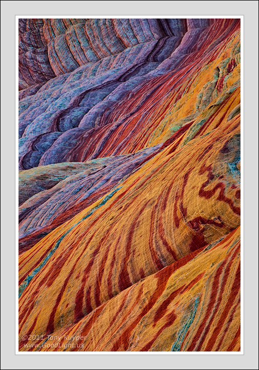
This is a place I've photographed before. The lines, colors, and textures all appeal to me, but to paraphrase Guy Tal, this is something you probably would not have seen were you standing next to me when I took this picture. This is a stylized rendition of what is actually here. The composition is true, but compressed and focus-blended. The colors are true, but enhanced and balanced. The texture is true, but contrast has been increased to reveal it.

There is a lot of time and effort put into the image, both in taking it and developing it. There is a lot of reality in this photograph . . . and a lot of personal interpretation of that reality. This image is a Nature photograph, but it's also about how we strive to give a voice to what we see and to find our voice in doing so.

Based on what I sometimes read, I feel I should apologize if I lead people astray through a Nature photograph. But on another level, I hope all Nature images will help us celebrate what we've been given to work with. The line is not always clear that separates perception and interpretation. The best I can offer is that we are our photographs, and they are us. I think it's entirely possible to be true to our personal natures, while at the same time being true to the natural world.

As always, your thoughts and recommendations would be appreciated.

5D2, 28-300@300 f/16 1/13sec

Comments

45 comments
Comment posted by Luke Austin on January 21, 2012 at 12:15 AM
Yet another brilliantly colorful image Tony. Plenty of lines and details to explore
Registered on November 30, 2011, 5 Posts, 43 Comments
Comment posted by Nathan Apodaca on January 21, 2012 at 12:23 AM
Very nice image, Tony! I like the comp in this, and as you mentioned, I like the lines and textures.

Honestly, I don't have a problem with your post-processing. Especially when you are open in saying that it didn't look exactly like that in person. I really appreciate the time that went into presenting this, and think it fits the scene well. I know this can be an interesting topic, with lots of different views, but I personally don't mind a bit of artistic influence in images. I'm almost sure, if I were standing there, it would 'seem' the colors were this way. I've never been there, but can tell it is incredible to behold!

Anyways, thanks for sharing this image!
Registered on November 16, 2011, 67 Posts, 1127 Comments
Comment posted by Raymond Klassen on January 21, 2012 at 12:36 AM
This is a really cool shot, especially with the cool to warm gradient. Great job on the processing, and I think what you said is very true, as long as people don't try to pass something off as "natural" when it's not.
Registered on November 30, 2008, 114 Posts, 790 Comments
Comment posted by Jimmy Gekas on January 21, 2012 at 2:26 AM
Whoa! This is sublime! Keep being true to your personal natures, as you say above. This is indeed a celebration of your amazing sandstone section of the world. No need to apologize. :toast:
Registered on July 26, 2007, 244 Posts, 2807 Comments
Comment posted by Lon Overacker on January 21, 2012 at 2:44 AM
The best I can offer is that we are our photographs, and they are us.

Truer words couldn't have been written. I've been thinking about that a lot and I think it's a good lesson for all of us to look within - see our photographs and see ourselves in our work. Thanks Tony!

Of course this is masterful. I would even go beyond Nathan's comment of "post-processing." At some point and at some level it ceases being processing and becomes creation and art. Processing to me is those things, contrast, color, saturation, focus/sharpness, dof, etc. etc. - but when one starts using those as a painter uses a brush or when a pianist uses pedals and keys, then you have art.

Lon

ps. Now I don't even want to post my image... :wink:
Registered on November 24, 2006, 521 Posts, 19147 Comments
Comment posted by Nick Bristol on January 21, 2012 at 9:15 AM
Beautiful!! Excellent composition bringing all these lines and shapes in to such a pleasing view. The light and colors are wonderful, and I love looking at this! This is really nice Tony. I agree, no apologizing necessary!

Nick Bristol
Lone Rock, WI
Registered on February 1, 2004, 752 Posts, 14140 Comments
Comment posted by Neil Rossmiller on January 21, 2012 at 9:16 AM
No apologies necessary, Tony.
Everything in photography is an interpretation whether it's by the camera, software or printer manufacture or our personal vision. Accepting the abstractness of a B&W is easier than color for most folks because most of us have a perception of natural color that is hard to get past. Your work always takes me to places I've never imagined and I love the "Magical Mystery Tour" I experience in your Art.
Well Done!
Neil
Registered on October 30, 2009, 156 Posts, 749 Comments
Comment posted by Greg Lessard on January 21, 2012 at 9:19 AM
This is what I was hoping to see when you recently posted the black and white of this scene. Both images are excellent, but I love this one even more! I appreciate that you put out a warning label that this is not how it looks to the naked eye. I think it is importnat to do that when we stretch reality pretty far, but I wouldn't apologize for your artistic vision! The real mastery here, regardless of color or black and white is the composition. What a great use of your 300mm lens to compress the image! With this composition, you might go crazy and put a different color on each wave and market it to Crayoloa Crayons. Thank you for posting this image! :toast:
Registered on January 14, 2009, 38 Posts, 219 Comments
Comment posted by Cristina Strudthof on January 21, 2012 at 9:23 AM
Very nice processing, I'm on the fence as to which I like better, this one or the B&W. I really like the broad range of colors you represent here. This may not be "natural" but that's the beauty of photography, liberties can sometimes be taken to express a vision that may or may not actual happen in the "natural" world.
Registered on January 14, 2011, 53 Posts, 363 Comments
Comment posted by Morris McClung on January 21, 2012 at 10:56 AM
Strictly speaking the B&W version of this is not what you saw either. Unless you are color blind, and this image proves that you are definitely not!

It kind of surprises me that B&W works are more accepted as "true to nature" shots than a color image that has been "enhanced".

I do believe there is a place in the "art world" for both approaches of remaining true in a pure sense, and for a more liberal insertion of ourselves into an image. I believe they are just different genres of the same medium.

This has Tony Kuyper written all over it, which to me says it reveals the work and "voice" you hoped to express. It is absolutely beautiful, mesmerizing, and is pure art, my friend.


:toast:
Registered on May 7, 2007, 670 Posts, 19650 Comments
Comment posted by Paul Breitkreuz on January 21, 2012 at 11:36 AM
Tony, the composition and overall detail in the image are outstanding. I especially like the angle of view you've provided as the finished product. The "stylized rendition" you mention is a forte you've developed over time and one that is very recognizable to many of us who have viewed your work here at NPN over the years, especially with these sandstone structures...... :cool:
Registered on February 25, 2006, 525 Posts, 8448 Comments
Comment posted by Phillip Noll on January 21, 2012 at 11:43 AM
Just amazing! Wonderful work, Tony! One thing I love about this site is being able to see the world through the eyes of others! :toast:
Registered on November 17, 2003, 207 Posts, 1083 Comments
Comment posted by Navin Sarma on January 21, 2012 at 12:40 PM
nicely said... and an amazingly artful image. i love the transition of colors and textures.
Registered on July 17, 2011, 233 Posts, 1373 Comments
Comment posted by Angela Classen on January 21, 2012 at 12:44 PM
A very artful interpretation. I like it! The lines, the textures you brought out, and of course, the colors are amazing.
Registered on June 13, 2007, 434 Posts, 2742 Comments
Comment posted by Rick Lundh on January 21, 2012 at 12:50 PM
Presented and spoken like a true artist. There are many photographers on this forum...being one is as easy as picking up a camera at the local store. To achieve a level of artistry, you must have an inner talent... and you are extremely talented. I would LOVE to see your work printed LARGE in a gallery someday, Tony! Great image! I think I kow the place :wink:
Registered on April 28, 2004, 774 Posts, 4351 Comments
Comment posted by Barbara Graham on January 21, 2012 at 1:05 PM
No apologies necessary, but I do think the explanation you gave in your first paragraph is very necessary on a site like NPN where you have people trying to learn from the images. I would love to see that type of explanation for every image that has been significantly personalized, I guess you'd say.

Regarding this image and your creation of it, it's absolutely beautiful, and you are a master. I agree with the person who said they wouldn't even use the term "processing" for this. This is creation, and it's amazing.
Registered on July 27, 2010, 1310 Posts, 5035 Comments
Comment posted by Shantikara Valuska on January 21, 2012 at 1:22 PM
Beautiful abstract! It was worth the effort, I love this wonderful colors and textures. You find the perfect balance for the saturation.
:toast: :toast:
Registered on July 25, 2011, 38 Posts, 451 Comments
Comment posted by Doug Koepsel on January 21, 2012 at 1:38 PM
Tony, I certainly enjoy your interpretation of color and shape. Your vision helps me look for these shapes and lines when I am out in the field.
Of the two versions, I like the colored for the striking vividness and the transfomation of colors from top to bottom.
Registered on April 1, 2010, 196 Posts, 1592 Comments
Comment posted by Guy Manning on January 21, 2012 at 2:02 PM
Tony,
I enjoy looking at your images, I just went through your web site portfolio again for the third time in 3 months. You have an eye for details and design in nature that is to be envied. Plus you aren't afraid of sunlight, though you use it sparingly (maybe 15% of your portfolio). In some people's portfolios it is non-existent as any kind of sunlight is too challenging. I guess, like product photographers, they feel the only good light is a huge soft light. Some of your wider angled shots are very exciting, for example "Mesa Overlook" and "Water Pocket Pool". These both handle the sun well and show you have the aptitude to go beyond the more abstract approach.
I don't have a problem with showing images that are obviously beyond what could be seen if I was standing there. I do have a problem with not expressing that fact to the viewer in some way outside of a cryptic comment or a mystic line in an "Artists Statement", which you seem to have avoided. Too many times I see a statement to the affect, "This print expresses how I experienced the scene", when it is obvious the image is so far from what was there when taken that it can only have been conceived in post processing.
Style includes not only one's vision but also their technique. Your technique becomes obvious in its importance to you as one moves through your portfolio. You have chosen to share that technique with the rest of the world and that is to be admired. Too many people in today's world hide what makes their work stand out. Whether it is technique or location. To me, there are a few of your images that are tweaked a bit over the top, most fall into the same category of subject matter, as does the image you have posted here.
It is difficult to utilize today's digital tools without hitting that spot, early on in post processing, where things just leave the realm of the realistic. In my own work I often get frustrated by that and have lately been having a conversation with myself about how to deal with it. I strongly feel that the public assumes that Landscape Photography shots are records of what nature served up. The public has an expectation of "honesty of image", when viewing an image. I am not saying they expect us to present raw copies. I spent 18 years in the commercial photo industry making sure the public received the "pretty" picture from custom printing that they couldn't get from a machine. That experience showed me it was obvious they have a expectation of "pretty but realistic" from the final product.
My conversation with myself has led me to the conclusion that in the pursuit of" honesty" vs. the" pursuit of the most spectacular image", I would have to divide my work into two categories: Realistic and Imaginistic (for lack of a better term). Once an image goes beyond the realistic, instead of stopping and re-approaching the image, I will now be continuing on and seeing where the work takes me. Re-approaching the image, so far, has led me only to abandoning the image and more frustration. When presenting the image I will use the terms "realistic" or "imaginistic" in my description of how I handled the image.
I realize there are those who will disagree, but this is my solution.
:smile:
Registered on October 17, 2011, 13 Posts, 44 Comments
Comment posted by Tom Hilton on January 21, 2012 at 2:10 PM
Tony,
Not only will I add my "great job" to this shot....
but, I would like to go further and express my appreciation for you (and many others on NPN)
for helping me improve my photography.
I have a ways to go until I "get it all" but I believe after reading your PDF's and using your actions, my stuff IS better than it was just a few months ago.
And that is why I came here, and why I keep coming back every day.
Registered on September 19, 2011, 68 Posts, 668 Comments
Comment posted by Russell Colletta on January 21, 2012 at 2:25 PM
You have captured the best of the craft in both the image and the comments. The best images are always well crafted, anything else is just luck. We have some very powerful tools at our disposal in this modern age. Those tools sometimes seem counter-intuitive to producing natural looking images, and certainly excess can be found. But the best skilled folks use the power wisely, like you have done here. No need worry about leading anyone astray IMO. I'm guessing almost everyone on this site "sees" the natural world through an idealized lens, or we probably wouldn't be spending time and money pursuing its beauty. We see things differently than the casual observer. I just love it when an image causes even the casual observer to see things with new appreciation. I am concerned when any observer feels like we have disrespected the natural world by transforming it beyond all sense of reality - a caricature if you will. For what its worth, your work leads to appreciation IMO.
Registered on October 31, 2009, 114 Posts, 1008 Comments
Comment posted by David Chauvin on January 21, 2012 at 2:39 PM
Classic Kuyper! I had no doubt whose image this was just by looking at the thumbnail. :toast: :toast: :toast: This is like a fantasy land of color and textures.
Registered on August 5, 2004, 1007 Posts, 5595 Comments
Comment posted by Vlad Sadovsky on January 21, 2012 at 3:56 PM
Impressive abstract and well complemented by the story in comments. Wonderful painting, I enjoyed studying how the lines and colors work together in harmony.
Registered on November 12, 2010, 48 Posts, 358 Comments
Comment posted by Harley Goldman on January 21, 2012 at 4:21 PM
The colors are enhanced? Really? :biggrin: :biggrin: Wild and trippy, TK! Very cool image. You are the sandstone master.

Given the almost total divergence from reality in terms of color, does this belong in photo art? I am just raising the topic to create some controversy. Things get dull around here. :biggrin:
Registered on November 19, 2003, 586 Posts, 11271 Comments
Comment posted by Nancy Lea Sandy on January 21, 2012 at 7:19 PM
Beautiful abstract. color and contrast add to the appeal I like this very much
Registered on January 24, 2011, 576 Posts, 6942 Comments
Comment posted by Robert Dayton on January 21, 2012 at 8:51 PM
Your post processing has made this very artistic, Tony.
Well composed diagonally. It has flow-like quality to it
from the upper right to the lower left. I also like the
variou layers. A good interpretation.
Registered on November 11, 2008, 281 Posts, 3958 Comments
Comment posted by John Williams on January 21, 2012 at 10:37 PM
I appreciate your photo, and your notes about processing. I think both are appropriate. :toast:
Registered on September 6, 2007, 221 Posts, 5985 Comments
Comment posted by Gary Reed on January 21, 2012 at 11:06 PM
Photographic licence includes post processing. If we did not master the tools what would there be to seperate us from that kid down the road with his point and shoot. Even they get lucky once in awhile.. :jump:
Registered on September 19, 2009, 198 Posts, 1074 Comments
Comment posted by Shane McDermott on January 21, 2012 at 11:38 PM
Beautiful and creative expression of your true nature in the natural world. Wonderful work Tony!
Registered on November 12, 2007, 49 Posts, 1074 Comments
Comment posted by Richard Hartmann on January 22, 2012 at 1:08 AM

Your work never ceases to captivate me. I always think to myself that this is the kind of stuff that actually gets hung on the wall.
Registered on January 15, 2009, 13 Posts, 772 Comments
Comment posted by Preston Birdwell on January 22, 2012 at 10:15 AM
Tony,

I have always appreciated your photography. You use the tools and techniques to great advantage, and have done so consistently for as long as we've been at NPN. It is this consistency that I believe many strive for, myself included.

"The best I can offer is that we are our photographs, and they are us."


This truly is the heart of the matter.

--P
Registered on November 1, 2003, 471 Posts, 5188 Comments
Comment posted by Mark Seaver on January 22, 2012 at 4:53 PM
Tony, the visual flow thorough this is special. The colors are very interesting and the contrast between the cool colors at the top and the warm color in the lower parts works really well. It would be fun to see this in person and compare that with your vision, but I sure do enjoy your vision.
Registered on January 23, 2011, 1103 Posts, 17270 Comments
Comment posted by Ned Fenimore on January 22, 2012 at 5:21 PM
I feel very fortunate to be able to see the beautiful images you consistently post here. This one is just fabulous!
Registered on November 1, 2003, 467 Posts, 2803 Comments
Comment posted by Mark Metternich on January 22, 2012 at 5:44 PM
I'll just be simple here. I really like the image a lot Tony. Having said that first, I would pull back color saturation globally a bit in color mode. As is, it is too strong for my taste. That is on my system. Who knows what it looks like on others... nice shot!
Registered on June 19, 2009, 276 Posts, 6240 Comments
Comment posted by Vance Gese on January 22, 2012 at 8:51 PM
Incredible, incredible art, Tony. The array of color and line and form, the flow of your composition, all extraordinary. Love everything about this. I agree wholeheartedly with your statement. Have always been guided by Ansel Adams analogy of the negative as score and the print the performance. Don't feel it necessary for anyone to feel the need to apologize for their art.
Registered on November 13, 2008, 298 Posts, 6629 Comments
Comment posted by Chris Chamberlain on January 22, 2012 at 10:42 PM
Yeah, this is already a favorite of mine! :wink: I think the colors are incredible. I figure if your going to take an image on a journey, then take it. No halfwayin' it. This is beautiful!

Chris
Registered on March 13, 2007, 500 Posts, 8365 Comments
Comment posted by David Edwards on January 23, 2012 at 2:58 AM
An amazing array of color, Tony. It certainly does have a compressed look to it, but it suits the subject so well and brings it further towards abstract, which I really like in so many of your images. I enjoyed your intro thoughts, but I don't think you need to apologize in any way! Excellent work.
Registered on December 6, 2008, 142 Posts, 2623 Comments
Comment posted by Gary McGhee on January 23, 2012 at 7:34 AM
Fantastic shot Tony, I love all the wonderful colours and lines in this. Inspirational.

Gary.
Registered on April 15, 2010, 142 Posts, 2416 Comments
Comment posted by Anil Rao on January 23, 2012 at 12:55 PM
Hi Tony,

As you already know, I love this image. It showcases the amazing geology of the location in a way that is unique and original. Seeing the wonders of the southwest through your eyes is a gift that I am fortunate to receive.


Registered on November 15, 2003, 234 Posts, 4923 Comments
Comment posted by Harry Lichtman on January 23, 2012 at 2:29 PM
Tony - The saturation and colors are a little too crazy for my tastes. Your other images seem a bit more subtle. I think the textures get a bit lost in the saturation. I also think that some of the appeal of your images for me is that these wild sandstone formation do actually exist and that the colors are believalbe under the right lighting conditions. This one seems to go beyond the realm of believability. Viewers of B&W know that the image is an artistic representation - color images are a differerent animal. Viewers measure what they see with their own experiences and memories. Beacuse many have not seen the most amazing sandstone formations out there, they have little to base their reality on. You clearly have seen some of the best, and while this looks to be one of them, a little to electric for me.
Registered on September 17, 2010, 304 Posts, 3507 Comments
Comment posted by Kory Lidstrom on January 23, 2012 at 6:56 PM
Beautiful work, no nits.
Registered on November 19, 2008, 49 Posts, 1035 Comments
Comment posted by Zack Clothier on January 24, 2012 at 12:34 AM
A wonderful piece of abstract art, Tony, I think I prefer this one over the B/W version..nicely seen!
Registered on January 28, 2010, 343 Posts, 2257 Comments
Comment posted by James Fougère on January 24, 2012 at 2:59 AM
I like and completely agree with what you have stated here :biggrin: As an artist, it is up to the individual whether to keep a photograph "photo realistic, in the case of the Grand Landscape", or in the case of an abstract image whether to enhance the image and take photo to a different level. The public will view this image in a different way than some of the photographers will on this forum. I like what you have presented here, and I am sure it would grace the wall of a abstract collector looking for the "one of a kind" artist creation :cool:
Registered on October 25, 2010, 41 Posts, 831 Comments
Comment posted by Jim Goldstein on January 27, 2012 at 2:53 AM
Wow other worldly. It almost reminds me of microscopy. Stellar work Tony.
Registered on March 18, 2006, 119 Posts, 878 Comments
Comment posted by Roger Kirchen on January 31, 2012 at 9:32 PM
Beautiful. Personally, I see nothing wrong with PP to give a voice to our vision, be it digital, silver halide, B/W (how non-natural). Sometimes, I hear people comment that they want to make sure that the picture is natural, as captured by the camera (RAW, or specks of metallic silver?).
Registered on March 6, 2011, 95 Posts, 847 Comments