Nature Photographers Network
This is the preserved archive of the original Nature Photographers Network. The community continues at naturephotographers.network.
Pollock-y
‹ PreviousLandscape GalleryNext ›

Pollock-y

by David Bostedo

Gallery: LandscapePosted January 25, 2012965 views8 comments
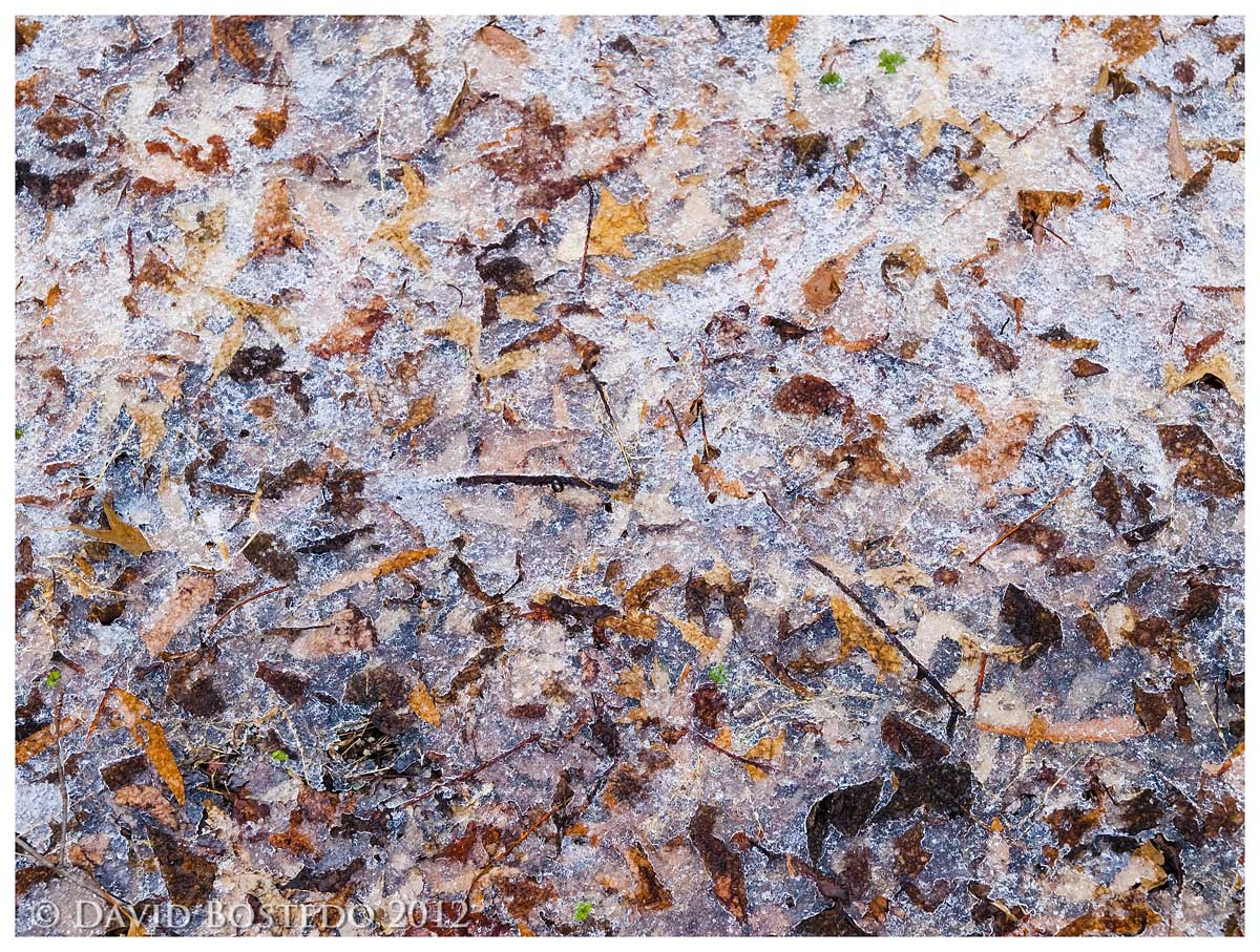
This is one from Huntley Meadows park in Virginia. We had a bit of snow and temps right around freezing, creating some ice cover on the leaf litter in the woods. It made me think of a Jackson Pollock creation of some kind.

This version is a bit amped up on the color, which I like. It's not over the top, but I find it bordering on too unrealistic for what the scene really was. Any thought on that? (I'll include the "real" color one too.)

Thanks for looking!

Olympus E-520
Zuiko 12-60 @ 35 mm
ISO 100
F/4.5
1/80 s
Handheld
PS CS4 for Raw conversion, web prep

Comments

8 comments
Comment posted by David Bostedo on January 25, 2012 at 12:23 AM
Here's the less amped version.
Registered on May 5, 2006, 178 Posts, 2224 Comments
Comment posted by Barbara Graham on January 25, 2012 at 12:28 AM
For me the color is not too unrealistic for what the scene was. The colors really aren't even different, just richer. I really like the way this looks, and it seems as though I can feel the ice.
Registered on July 27, 2010, 1310 Posts, 5035 Comments
Comment posted by Lon Overacker on January 25, 2012 at 12:39 AM
David,

Jigsaw puzzle is my immediate reaction - this would make a great one (in other words, an impossible one!)

I think the colors are great - except I would specifically dial back the green channel in your saturation layer as some of the green moss sticks out a little un-naturally. But that's minor.

I think this works great as a natural abstract, full of tiny details that can be appreciated in larger views.

Lon
Registered on November 24, 2006, 521 Posts, 19147 Comments
Comment posted by Genny K. on January 25, 2012 at 2:44 AM
This is one of those images that needs to be really big. :smile: A jigsaw puzzle? Wow, that'd be tough. I like the amped up colors, and I don't think they're too bright at all. Neat.
Registered on June 5, 2006, 132 Posts, 2001 Comments
Comment posted by Bill Chambers on January 25, 2012 at 10:25 AM
Nice abstract David. I definitely like the amped version best - not unrealistic at all IMO. Nicely done!
Registered on April 10, 2005, 753 Posts, 21216 Comments
Comment posted by Nancy Lea Sandy on January 25, 2012 at 11:03 AM
I like extra color in an abstract so my vote is for the first version. The ice really makes this standout. Nice find
Registered on January 24, 2011, 576 Posts, 6942 Comments
Comment posted by Tony Kuyper on January 25, 2012 at 9:48 PM
:cool:
Registered on November 1, 2003, 364 Posts, 22328 Comments
Comment posted by Dorin Bofan on January 26, 2012 at 9:07 AM
Looks very much alike some of Pollock's works and this makes it even more beautiful in my mind. Wonderful abstract, David!
Registered on April 30, 2007, 122 Posts, 3086 Comments