Gallery: FloraPosted January 27, 201277 views8 comments
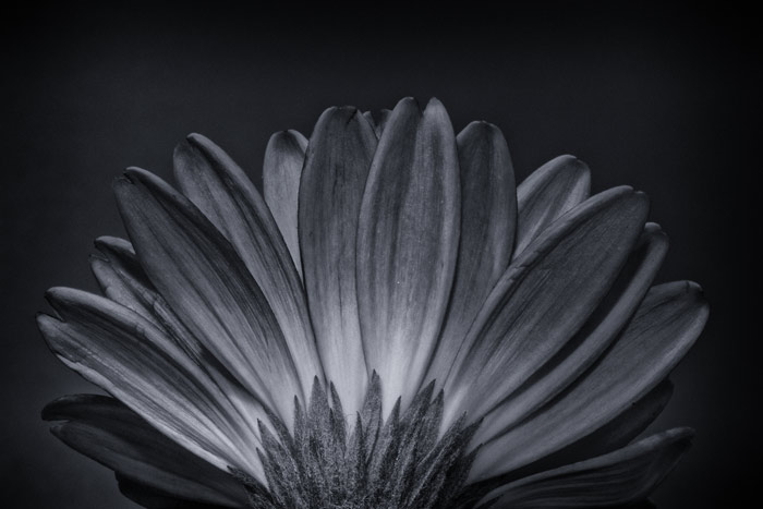
Tried b/w for something a little different.
Comments
8 comments
Comment posted by Patricia Brundage on January 27, 2012 at 9:32 AM
Good idea to try the black & white because it has the lines and textures. Needs a little more contrast and an improvement in the tonal range from black to white. Well worth a rework.
Registered on March 23, 2006, 1111 Posts, 6531 Comments
Comment posted by Mark Seaver on January 27, 2012 at 9:53 AM
Your conversion to b&w makes this look a lot like a radiographic image. The visual flow works very well.
Registered on January 23, 2011, 1103 Posts, 17270 Comments
Comment posted by Nancy Lea Sandy on January 27, 2012 at 10:33 AM
Interesting lines and strong shape works well in b&w. It's a little heavy on the dark end. Given the tonal range of the blossom, you might try a lighter bg. I like it as is, though. Beautiful detail in the petals.
Registered on January 24, 2011, 576 Posts, 6942 Comments
Comment posted by Lorna Taylor on January 27, 2012 at 8:45 PM
Nicely done , as stated a touch more contrast would really make this pop. Love that you chose to show this in B&w !
Registered on November 12, 2010, 254 Posts, 3083 Comments
Comment posted by Gary Yeoh on January 27, 2012 at 10:44 PM
Todd:
B&W can be very powerful in showcasing the lines, shape and texture as you have demonstrated here. Worth tweaking some more with this image to increase the tonal range and contrast.
Registered on September 1, 2009, 588 Posts, 8184 Comments
Comment posted by Jaymes Dempsey on January 28, 2012 at 1:55 PM
I like the tones a lot here, and the darkness works well with such prominent lines. Good comp, too.
Jaymes
Registered on June 28, 2010, 47 Posts, 590 Comments
Comment posted by Bill Fach on January 28, 2012 at 10:48 PM
Todd: Ditto the contrast comments and I'll add I might like a slightly lower camera angle to include all of the sepals. Keep after it. >=))>
Registered on November 1, 2003, 1805 Posts, 26981 Comments
Comment posted by Albert Darmo on January 29, 2012 at 2:58 PM
Hi Todd A good composition showing the lines and shapes of your subject. They work very well with B&W.. Try a bit more contrast, and see what happens
Albert Darmo
canada
Registered on November 25, 2008, 1386 Posts, 11978 Comments

Comments
8 commentsB&W can be very powerful in showcasing the lines, shape and texture as you have demonstrated here. Worth tweaking some more with this image to increase the tonal range and contrast.
Jaymes
Albert Darmo
canada