Nature Photographers Network
This is the preserved archive of the original Nature Photographers Network. The community continues at naturephotographers.network.
Tulip Curves
‹ PreviousMacro & Close-up GalleryNext ›

Tulip Curves

by Richard Siggins

Gallery: Macro & Close-upPosted February 22, 201282 views6 comments
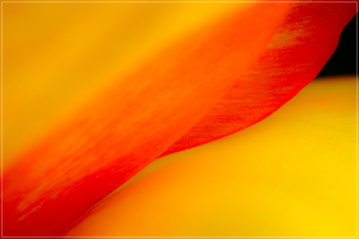
A saw a post earlier today of a rose that reminded me of this photo I took back in Spring of 2010. It's a macro shot of a tulip. I cropped and rotated to get the diagonal. I like simple compositions and am going to make myself work on capturing more minimalist images like this.

Comments

6 comments
Comment posted by Richard Siggins on February 22, 2012 at 8:16 PM
Here's a vertical composition of the same tulip. I'd like to hear which one people like better and why.

Registered on October 11, 2007, 115 Posts, 223 Comments
Comment posted by Gary Yeoh on February 24, 2012 at 9:47 AM
Richard:
The original is more like and abstract whilst the 2nd is more of a flora shot. For an abstract image, the black triangle along the right edge is probably no required. Both images are really vibrant. Great plane of focus management. :toast:
Registered on September 1, 2009, 588 Posts, 8184 Comments
Comment posted by rob ashcroft on February 24, 2012 at 6:51 PM
I like this, Richard. In fact I shot something very similar myself this afternoon - mine was of gerbera petals. I much prefer abstract images. I think the original orientation is better as it makes the viewer think more about what it is. Good colours.
Registered on February 24, 2012, 22 Posts, 43 Comments
Comment posted by scott lanz on February 24, 2012 at 9:01 PM
I am a big fan of abstracts, but they definitely aren't easy to shoot. I personally like the vertical here a little better. Even abstracts generally need a point of focus, which is typically the area or portion in focus (duh). In the first, I think the POF may be too far off center to the right of the image. In the second, it is more centered. Very nice colors.
Registered on November 14, 2003, 840 Posts, 12902 Comments
Comment posted by Albert Darmo on February 25, 2012 at 6:13 PM
Hi Richard :wavey: Vibrant color and flowing lines!, i would have composed this abstract. differently., making a vertical. with the black triangle on the bottom or removed completely.Check out Rams abstracts on flora, they are excellent :smile:
Albert Darmo
Canada
Registered on November 25, 2008, 1386 Posts, 11978 Comments
Comment posted by Danny Laureys on February 28, 2012 at 4:52 AM
Excellent, I do like the horozontal more. :toast:
Registered on January 5, 2008, 590 Posts, 1261 Comments