Gallery: FloraPosted February 23, 201279 views7 comments
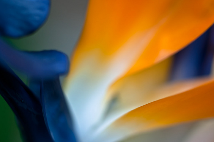
Was wondering whether the water drop on the left hand side is distracting.
comments appreciated
sindy
Comments
7 comments
Comment posted by Bill Fach on February 23, 2012 at 11:17 AM
Sindy: For me the water drop is a non-issue. I like the color and am a big fan of extracting details from Bird of Paradise. Here I'm not sure about the placement of the sharp elements and the plane of focus/DOF. Intriguing image that I'll try to revisit after seeing other comments.>=))>
Registered on November 1, 2003, 1805 Posts, 26981 Comments
Comment posted by Mark Seaver on February 23, 2012 at 5:02 PM
I don't see anything that looks like a water drop. The colors and shapes are striking. It looks like the only sharp area is the near edge of the lower orange petal. The lack of sharpness throughout makes this highly abstract.
Registered on January 23, 2011, 1103 Posts, 17270 Comments
Comment posted by Gary Yeoh on February 24, 2012 at 3:53 AM
Sindy:
The water droplets are not obvious and does not come into the equation at all. BOP are tough to capture especially in close up.. The blue and orange are strong and makes the image interesting. However there is not enough detail or sharp areas to keep the viewer interested for long.
Registered on September 1, 2009, 588 Posts, 8184 Comments
Comment posted by Ramamohan Pai on February 24, 2012 at 5:18 PM
The water drop is not quite apparent and I had to look for it after reading your comments, Sindy . I like the complementary colors here and this shot has good potential if lines were a little more defined.
Good work and keep at these Bird of Paradise flowers - some great compositions can be had.
Registered on November 1, 2003, 550 Posts, 9037 Comments
Comment posted by Lorna Taylor on February 25, 2012 at 12:21 PM
Lovely colours, just need a little more focus for all those wonderful lines maybe ?
Registered on November 12, 2010, 254 Posts, 3083 Comments
Comment posted by scott lanz on February 25, 2012 at 6:49 PM
Terrific contrasting colors. Not sure about the dark flower part in the LLC and the bright center. There's really great potential with this subject.
Registered on November 14, 2003, 840 Posts, 12902 Comments
Comment posted by Giuseppe Guadagno on February 27, 2012 at 4:17 PM
A feast of colors, Sindy. One of the most powerful color contrast, orange and blue. Yes, there is something that can be simplified, for me: cloning the upper part of the blue element can make the design simpler. Anyway, I think that the composition is excellent.
Take care.
Registered on February 3, 2007, 827 Posts, 5052 Comments

Comments
7 commentsThe water droplets are not obvious and does not come into the equation at all. BOP are tough to capture especially in close up.. The blue and orange are strong and makes the image interesting. However there is not enough detail or sharp areas to keep the viewer interested for long.
Good work and keep at these Bird of Paradise flowers - some great compositions can be had.
Take care.