Nature Photographers Network
This is the preserved archive of the original Nature Photographers Network. The community continues at naturephotographers.network.
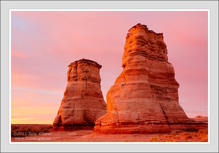
Elephant's Feet No. 2
‹ PreviousLandscape GalleryNext ›

Elephant's Feet No. 2

by Tony Kuyper

Gallery: LandscapePosted February 25, 2012646 views36 comments
The Elephant's Feet aren't too hard to find. They're adjacent to Highway 160 about 15 or 20 miles east of Tuba City. Despite their obviousness, they don't seem to be photographed too often. I'm as guilty as anyone, I suppose. They're only about 30 miles from where I live and I drive past them a couple of dozen times a year. However, this was only my second effort to photograph them in the 27 years I've lived nearby. Sad, really, when you think about it.

This is dawn light in mid-January. Weather forecast was for an approaching winter storm, so I headed over on a Saturday as I don't work weekends at my day job. The first hints of light weren't too spectacular, but the glow blossomed to eventually encompass the whole sky and there was nice reflected light everywhere.

Quite a bit of Photoshop in this as usual, but it was a rather gradual process that slowly moved the RAW conversion to this point. Also been struggling with screen brightness issues on this one for some reason. Slightly darker version posted below. Your thoughts and recommendations would, as always, be valued.

Canon 5D2, 28-300@42mm, f/16, ISO 400, 10 seconds. Complete hotoshopping for this image is at the bottom of this page.

Comments

36 comments
Comment posted by Scott Fricke on February 25, 2012 at 12:42 AM
Beautiful image Tony! You sure did pick the right sunrise out of those 27 years to shoot this location. Exquisite processing, as usual. I can't see anything I'd change, nice comp, great light and detail in the sandstone.
Registered on January 19, 2007, 133 Posts, 1448 Comments
Comment posted by Tony Kuyper on February 25, 2012 at 12:52 AM
Here's a second version with a different brightness setting. The original post seems too bright on my monitor.
Registered on November 1, 2003, 364 Posts, 22328 Comments
Comment posted by Genny K. on February 25, 2012 at 3:04 AM
I like the lighter one. Lovely image; certainly doesn't look like you had any problems with it! :smile: I sure like the colors; so much different from the pure white (OK, and dark spruce!) that I have outside my windows.
Love the detail here. Sweet.
Registered on June 5, 2006, 132 Posts, 2001 Comments
Comment posted by Waleed Marhoum on February 25, 2012 at 7:03 AM
amazing light and comp.
congrats
Registered on December 29, 2006, 85 Posts, 421 Comments
Comment posted by Nick Bristol on February 25, 2012 at 9:02 AM
Tony, This is wonderful! Perfect comp of a beautiful scene. That glowing light and the colors are beautiful. You picked a great time to be there Tony. Really nice work. :smile:

Nick Bristol
Lone Rock, WI
Registered on February 1, 2004, 752 Posts, 14140 Comments
Comment posted by Gary McGhee on February 25, 2012 at 9:39 AM
I think I prefer the top version too Tony albeit there's only a slight difference to my eye. The early morning light is real nice and it has your usual gorgeous saturation. I think they make a great subject.

Gary.
Registered on April 15, 2010, 142 Posts, 2416 Comments
Comment posted by Dietrich Gloger on February 25, 2012 at 9:55 AM
Fantastic light Tony. This looks so immediatly appealing and "warm". I don't want to think this was taken in winter. It has that summer evening feeling, although this is a january morning shot... :wink:
Registered on January 26, 2007, 360 Posts, 9876 Comments
Comment posted by Benjamin Olson on February 25, 2012 at 10:34 AM
Tony,

I also like the first one, the subtle glowing light is beautiful. The image is very well balanced and the composition is simple, but very strong. Wonderfully done, as usual.
Registered on April 7, 2007, 169 Posts, 725 Comments
Comment posted by Morris McClung on February 25, 2012 at 10:55 AM
The repost is richer to me, Tony. These formations do make excellent subjects, and you caught a great sky to compliment them. Beautiful image!
Registered on May 7, 2007, 670 Posts, 19650 Comments
Comment posted by Tom Haxby on February 25, 2012 at 11:57 AM
Tony: Hard to tell the difference between the two images. However, they are both outstanding. The color and light is sweet. I hope I can get something as good on my trip to the southwest next week.
Registered on July 6, 2006, 126 Posts, 647 Comments
Comment posted by Mark Metternich on February 25, 2012 at 12:23 PM
Isn't the SW beautiful? And bizarre!? Cool shot Tony.
Registered on June 19, 2009, 276 Posts, 6240 Comments
Comment posted by Joel Hazelton on February 25, 2012 at 1:20 PM
Beautiful, Tony! The colors are absolutely gorgeous. I've also driven past these several times and considered photographing them. Though, there always seems to be a couple canopies set up underneath them with people selling stuff.
Registered on August 6, 2008, 194 Posts, 1315 Comments
Comment posted by Robert Dayton on February 25, 2012 at 1:23 PM
Well composed, Tony. I like the formations, the tonal qualities, and the light.
Registered on November 11, 2008, 281 Posts, 3958 Comments
Comment posted by Rick Lundh on February 25, 2012 at 2:37 PM
Glad you shot this... it is really really really gorgeous! :toast: Thanks for posting your workflow too...really awesome to see!
Registered on April 28, 2004, 774 Posts, 4351 Comments
Comment posted by Lon Overacker on February 25, 2012 at 3:21 PM
Hi Tony,

Wow, gorgeous combination of earth and sky. Honestly, the color in the sky is just breathtaking. One of these moments that I think each of us hear cherish and could stare at forever. The repost is a little more subdued and I'm on the fence as to which works better. I'm leaning towards the original because it gives the appearance of light hitting the leading edges of the towers where as the repost the light is a little flatter hitting the rock.

The only nit/comment is to me I think the red channel is a tad strong in the rock itself. The sky is perfect. Just my .02 and of course your interpretation is what makes it yours. I'm glad you decided to stop for this one.

Lon
Registered on November 24, 2006, 521 Posts, 19147 Comments
Comment posted by Jeremy Cram on February 25, 2012 at 4:35 PM
Love it! The whole things just sings.
Registered on June 4, 2006, 204 Posts, 818 Comments
Comment posted by Chris Chamberlain on February 25, 2012 at 5:16 PM
Beautiful! I also thought this felt like a summer evening. Definately the first one for me.

Chris
Registered on March 13, 2007, 500 Posts, 8365 Comments
Comment posted by Tony Kuyper on February 25, 2012 at 5:20 PM
Interesting thought on the red saturation, Lon. I'd actually boosted that to give a sense of glow, but may try it with a more subtle look to see how I like it. Thanks.
Registered on November 1, 2003, 364 Posts, 22328 Comments
Comment posted by Brian Schrayer on February 25, 2012 at 6:30 PM
This is absolutely beautiful, Tony. Everything from the composition and lighting to the processing is expertly done. Thanks for sharing the Photoshop document to show how you arrived at the final image. Seeing that is very helpful for me to see all the steps that you took and to help me more accurately visualize the final output in my own images. I appreciate your willingness to share this information.
Registered on May 28, 2004, 114 Posts, 2890 Comments
Comment posted by Walt Sterneman on February 25, 2012 at 8:02 PM
I love the shot Tony. I am also having difficulty picking between the two but I think I am leaning toward the second. I have also been having trouble with deciding the correct brightness on some of my shots that I took on a recent trip to the SW. Lots of shots of the red rocks around Sedona and the brightness is a puzzle to me.
Registered on March 24, 2010, 73 Posts, 1268 Comments
Comment posted by Daniel Rappaport on February 25, 2012 at 11:00 PM
Beautiful composition and colors. I like the tonality of the second a bit better.
Registered on September 9, 2009, 294 Posts, 2006 Comments
Comment posted by Paul Breitkreuz on February 26, 2012 at 12:01 AM
Tony, I would say the light and overall brightness of the second image is the ticket here. :cool:
Registered on February 25, 2006, 525 Posts, 8448 Comments
Comment posted by Joseph Campisi on February 26, 2012 at 12:09 AM
Gorgeous color Tony! I like the repost best.
Registered on November 24, 2008, 304 Posts, 3211 Comments
Comment posted by Eva McDermott on February 26, 2012 at 12:46 AM
I prefer your first post Tony but both are gorgeous. The ware colors and light are especially pleasing.
Registered on January 4, 2009, 1015 Posts, 13229 Comments
Comment posted by Vance Gese on February 26, 2012 at 2:06 AM
Incredible, Tony, simply incredible. The light seems to be emanating from the rocks themselves, like beacons of the desert. Love the layers in the rock and that sky of course is superb. Another masterful work of art in my opinion.
Registered on November 13, 2008, 298 Posts, 6629 Comments
Comment posted by Jon Daining on February 26, 2012 at 10:49 AM
Tony, great image. The soft lighting and tones are beautiful. I personally like the darker version, although I'm looking at the photo on a bright monitor. On a calibrated monitor, it may be too dark. Is it possible to bring out more texture and contrast in the sky and clouds? Regardless, it's still a wonderful image.
Registered on February 25, 2012, 25 Posts, 191 Comments
Comment posted by Bill Chambers on February 26, 2012 at 3:14 PM
Gorgeous Tony! This has such a glow to it, almost surreal. I love being out on mornings like this. The pastels in the sky look so inviting.
Registered on April 10, 2005, 753 Posts, 21216 Comments
Comment posted by Doug Koepsel on February 26, 2012 at 4:16 PM
Tony, I just drove past there three hours ago on my way back from MV. The mid-day light I encountered pales in comparison to your touch on them. I prefer your first version as it has a little more range of brightness from sunny to shadowed side of the feet.
Registered on April 1, 2010, 196 Posts, 1592 Comments
Comment posted by Dennis Harding on February 26, 2012 at 5:49 PM
Great shot Tony. Another vote for the first image.
Registered on January 19, 2011, 33 Posts, 408 Comments
Comment posted by Scott Smorra on February 26, 2012 at 8:25 PM
Incredible light here Tony. I really like the soft glow which is present everywhere in the frame. I prefer the original version.
Registered on November 2, 2009, 161 Posts, 2143 Comments
Comment posted by Hamed Musharbak on February 27, 2012 at 8:04 AM
what a light :toast: :toast: :toast: :toast:
Registered on June 1, 2009, 372 Posts, 2282 Comments
Comment posted by Mark Seaver on February 27, 2012 at 6:25 PM
Hi Tony, the formations are very interesting, but my favorite part is how well the rock colors blend with the sky. Sure makes for a sweet image. I like the first post best.
Registered on January 23, 2011, 1103 Posts, 17270 Comments
Comment posted by Stuart Williams on February 28, 2012 at 12:57 AM
simple comp but effective. the sky's colour is gorgeous. i think i prefer the re-post ...
Registered on December 7, 2007, 247 Posts, 4792 Comments
Comment posted by Anil Rao on February 29, 2012 at 1:16 AM
I love the slight overlap in the feet which ends up providing a nice sense of depth to the composition. The light, especially the glow on the buttes is outstanding.
Registered on November 15, 2003, 234 Posts, 4923 Comments
Comment posted by Jared Ropelato on March 12, 2012 at 10:36 PM
Stunning color Tony. ...as always.
Registered on March 1, 2011, 25 Posts, 204 Comments
Comment posted by Leo Collazo on March 26, 2012 at 10:48 PM
Tony, I keep going back and forth between the two posts, and I'm leaning just a tad more towards the first image, although I think each of them has something going for it. First of all, it is a stunning image that demands to be looked at because it is compositionally and chromatically strong (all those rich shades of warm reds and oranges are beautiful). The first image has a bit more depth to me because of the lighter colors. It's atmosphere seems lighter, which to me creates more space. The second one's color is richer, heavier, and the atmosphere seems more dense, which to me makes it look just a tad, and I do mean a "tad" flatter, but the richness of color compensates for that. In conclusion, they are each beautiful, strong, attention getting images in their own right.
Registered on August 4, 2011, 19 Posts, 69 Comments