Nature Photographers Network
This is the preserved archive of the original Nature Photographers Network. The community continues at naturephotographers.network.
WC-524, Green and Gold
‹ PreviousWeekly Challenge GalleryNext ›

WC-524, Green and Gold

by Carol Hyman

Gallery: Weekly ChallengePosted March 4, 2012565 views8 comments
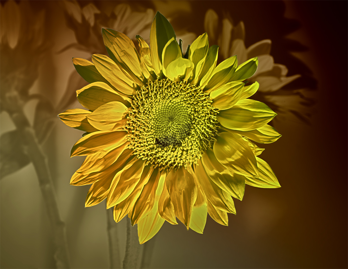
These sunflowers started life out as an HDR image which was a bit too bright and gold. Next I tried another version in B/W. Far more pleasing, and in both cases, I loved the background as much as the FG and foremost Sunflower. I finally made a composite of both images and worked on the Sunflower and the Background separately.
f/16, ISO 100, 1,0, 1.3,1.6s, matrix meter, tripod, cable release, small halogen reading lamp for light.
I am torn between the background and the foreground and I hope you agree that both are necessary to the image.
Thanks in advance for leaving your comments.
Carol

Comments

8 comments
Comment posted by scott lanz on March 4, 2012 at 5:14 PM
Yes, Carol, the BG is very effective. Great play between the light and shadows. I also like the striking detail and color in the main subject.
Registered on November 14, 2003, 840 Posts, 12902 Comments
Comment posted by Albert Darmo on March 4, 2012 at 10:39 PM
Hi Carol :wavey: The beautiful BG is in perfect harmony with this splendid Sunflower :cool: :smile:
Albert Darmo
Canada
Registered on November 25, 2008, 1386 Posts, 11978 Comments
Comment posted by Carolyn Derstine on March 5, 2012 at 10:21 AM
Creative processing in this photo, Carol. The foreground sunflower and the BG are both quite interesting and a composite of these makes a compelling image. I like the details and bright color of the sunflower contrasted with the muted blurred colors of the BG.
Registered on February 16, 2011, 610 Posts, 3684 Comments
Comment posted by Mark Seaver on March 5, 2012 at 6:01 PM
Neat composite (in both uses of the word here). The sharpness and details in the main flower are great and the background works well in suggesting that this is one of many.
Registered on January 23, 2011, 1103 Posts, 17270 Comments
Comment posted by RL Potts on March 5, 2012 at 9:34 PM
In a word, "metallic". Yeah the background is very nice. This image looks as if it has a a reflective metal sheet behind it. Both the green and the red are pleasing. But what really draws me to this is the details of the central disc. The small details look as if they are made of gold. It's a steam punk flower. I love it. :wavey:
Registered on November 24, 2003, 188 Posts, 985 Comments
Comment posted by May Haga on March 7, 2012 at 11:47 AM
Beautiful image Carol. I also like the brightness of the foreground flower contrasted with the muted tones of the background.
May
Registered on February 22, 2007, 714 Posts, 8470 Comments
Comment posted by Ray Whitt on March 7, 2012 at 7:43 PM
Yes, I agree both are necessary in the image. Love the depth the background provides, beautiful shot.

Ray
Registered on May 27, 2011, 92 Posts, 2619 Comments
Comment posted by Steve Balke on March 8, 2012 at 5:48 PM
It's so interesting to see how the bg works with the main subject to make this such a beautiful shot, Carol. The various shades of yellow and green here are just beautiful. Exceptional processing.
Registered on June 18, 2009, 229 Posts, 2915 Comments