Gallery: FloraPosted April 20, 2012150 views21 comments
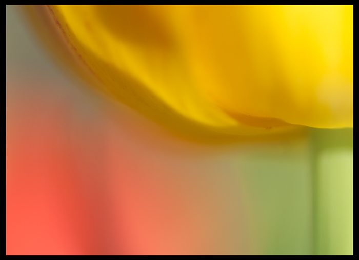
I decided I wanted to take a modification of a picture I posted, a week or so ago, and so this is it.
All comments and critiques appreciated.
60mm, f/4.5, 1/640, ISO 250
Thanks in advance!
Jaymes
Comments
21 comments
Comment posted by Phil Pogledich on April 20, 2012 at 12:39 PM
This works well for me. I like the impressionistic look and the nice balance of light and colors.
Registered on August 24, 2009, 123 Posts, 3099 Comments
Comment posted by SandyRichardsBrown on April 20, 2012 at 2:07 PM
Wonderful abstract - love the colour blends and dof.
Really nice work!
Sandy
Registered on November 24, 2003, 3937 Posts, 12909 Comments
Comment posted by Rick Diffley on April 20, 2012 at 3:24 PM
Love the soft focus. Trying to decide if I'd like a little less brightness with the background flowers, especially the one on the left.
Registered on April 8, 2012, 52 Posts, 279 Comments
Comment posted by Mark Stahlke on April 20, 2012 at 4:54 PM
Great tulip abstract! I like the way the colors blend together. Well done.
Registered on November 1, 2003, 97 Posts, 782 Comments
Comment posted by Brigitte Lorenz on April 20, 2012 at 5:18 PM
wonderful "painting" of light and color...great abstract work!!!
Brigitte
Registered on January 10, 2009, 187 Posts, 1507 Comments
Comment posted by Floyd Hopper on April 20, 2012 at 6:29 PM
Great impressionistic image. I like the softness and colors.
Registered on May 1, 2009, 652 Posts, 762 Comments
Comment posted by Ramamohan Pai on April 20, 2012 at 7:22 PM
Jaymes, Looks really nice - with all the blend of pastel shades . I'd have liked it better if a sharp edge of the petal or the curve was more prominent but that is a personal preference.
Registered on November 1, 2003, 550 Posts, 9037 Comments
Comment posted by Albert Darmo on April 20, 2012 at 9:53 PM
Hi Jaymes I like the the impressionistic look of this abstract, love the lines and colors
Albert Darmo
Registered on November 25, 2008, 1386 Posts, 11978 Comments
Comment posted by Miro Susta on April 20, 2012 at 10:13 PM
Very nice colors but a bit soft fotr my taste.
Registered on August 18, 2006, 719 Posts, 3736 Comments
Comment posted by Ken Smith on April 21, 2012 at 1:31 AM
I like this ... blend of soft colors and just enough detail to please the eye. Super! Creative handling to give something new!
Registered on September 5, 2008, 449 Posts, 2444 Comments
Comment posted by Catherine Reilly on April 21, 2012 at 3:00 AM
With so little in focus, this is strangely effective. Quite an achievement.
By modification, do you mean you did this in post-processing?
Registered on August 16, 2006, 603 Posts, 9192 Comments
Comment posted by Jaymes Dempsey on April 21, 2012 at 7:38 AM
Thanks for the comments, everybody, I appreciate it!
Catherine: Thanks! Nope, I didn't use post-processing...I just meant that I knew the composition that I wanted from my previous image, but captured it with a few changes.
Registered on June 28, 2010, 47 Posts, 590 Comments
Comment posted by Bob&Charly Nelson on April 21, 2012 at 4:29 PM
Great abstract vision and capture Jaymes, really outta the box.
Bob
Registered on October 27, 2005, 289 Posts, 4202 Comments
Comment posted by scott lanz on April 21, 2012 at 7:38 PM
Exactly what Bob said. Very pleasing abstract result. I also like the previous version very much.
Registered on November 14, 2003, 840 Posts, 12902 Comments
Comment posted by Fabio Giarrizzo on April 22, 2012 at 3:42 AM
Beautiful abstract- Great warm tones and a perfect composition choice- Very well done, Fabio
Registered on December 3, 2010, 90 Posts, 1614 Comments
Comment posted by Mark Seaver on April 22, 2012 at 9:25 AM
I like the abstract, painted quality here. The colors work well together and you've created a very balanced image with their placement and sizes. Well done.
Registered on January 23, 2011, 1103 Posts, 17270 Comments
Comment posted by Bill Fach on April 22, 2012 at 2:05 PM
Jaymes: I prefer this version simply because of the more interesting and colorful BG. Frame filling wonderful color palette. Very nicely done.>=))>
Registered on November 1, 2003, 1805 Posts, 26981 Comments
Comment posted by Lorna Taylor on April 24, 2012 at 9:33 AM
Lovely image !
Registered on November 12, 2010, 254 Posts, 3083 Comments
Comment posted by Robert Dayton on April 26, 2012 at 5:25 PM
Lovely, Jaymes! Although I like both images, I prefer this one to your earlier post.
For me, the BG makes this one work better.
Registered on November 11, 2008, 281 Posts, 3958 Comments
Comment posted by Lucy Aron on May 28, 2012 at 10:30 AM
Wonderful abstract. Only nit is the brownish line on left that seems somewhat out of key with the rest of the shot.
lucy
Registered on February 25, 2011, 189 Posts, 1160 Comments
Comment posted by Howard Cheek on July 25, 2012 at 6:19 PM
I see you have your soft brush out, you paint with light well
Lovely blend of pastel-like colors, just enough form to keep it real..
Very nice Jaymes
Registered on July 24, 2008, 1201 Posts, 10758 Comments

Comments
21 commentsReally nice work!
Sandy
Brigitte
Albert Darmo
By modification, do you mean you did this in post-processing?
Catherine: Thanks! Nope, I didn't use post-processing...I just meant that I knew the composition that I wanted from my previous image, but captured it with a few changes.
Bob
For me, the BG makes this one work better.
lucy
Lovely blend of pastel-like colors, just enough form to keep it real..
Very nice Jaymes