Serene Storm II
by Leo Collazo
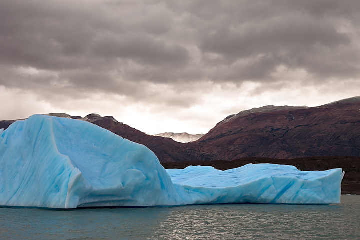
I got some good constructive feedback the other day telling me that the first version I posted of this image "Serene Storm" looked a bit flat. Thanks Mark and Nick for the feedback! I agreed with that, so I decided to see if I could bring a bit more depth and visual impact to this image. I played around with curves and contrast, as Stan suggested, and was able to bring out more detail on the rocky landscape in the background. I also brought out more of the color in that same background, and in the iceberg as well. I think I was able to get just a tad more detail on the top of the middle distant peak, but not a lot. By giving the image more contrast, I lost just a bit of detail from the dark, narrow strip of land directly behind the iceberg, but I like how it makes the blue of the iceberg stand out even more. In addition, I also increased the amount of sharpness in the entire image, using Unsharp Mask, by 20%, and I'm not sure if that's too much, but I do like how it looks. I darkened the clouds a bit as well, which to me makes the sky a bit more dramatic.
As always, I'd appreciate your comments and suggestions. Thanks, and I look forward to your feedback!
Canon EOS 5D Mark II, EF24-70mm f/2.8L lens, f/11, 1/125, 100 ISO

Comments
2 commentsNot sure where this was taken, but it looks like an amazing place to visit. TFS!