Gallery: LandscapePosted April 26, 2012223 views7 comments
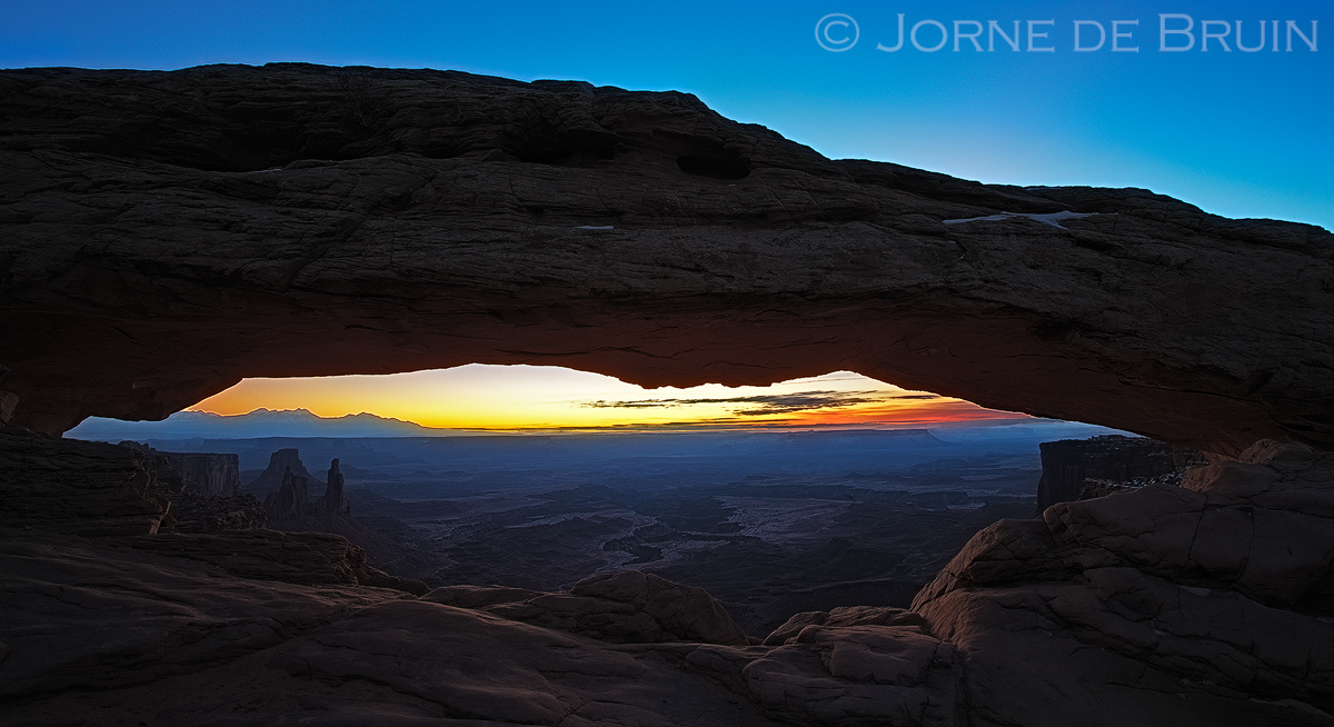
Right, nothing original to see here, but I enjoyed taking the shot none the less. I guess it's an icon for a reason
C&C welcome! Pls veiw large!
1ds2, 17mm and some cropping
Comments
7 comments
Comment posted by John Mumaw on April 26, 2012 at 2:14 PM
I prefer this with the signature glow underneath and light on the canyons below, actually.
Registered on September 9, 2005, 62 Posts, 2289 Comments
Comment posted by Stan Rose on April 26, 2012 at 3:19 PM
It's the anti Mesa Arch!
It is a bit dark, Jorne. But peaceful.
Registered on September 15, 2005, 836 Posts, 17099 Comments
Comment posted by Rick Turner on April 26, 2012 at 5:55 PM
Nice but a bit overworked to my eye.
Registered on February 18, 2012, 534 Posts, 2755 Comments
Comment posted by Nathan Apodaca on April 27, 2012 at 7:44 PM
I actually really like this, and enjoy seeing something new. IMO, it looks naturally processed...
Registered on November 16, 2011, 67 Posts, 1127 Comments
Comment posted by Stan Rose on April 28, 2012 at 11:55 AM
Just to clarify one thing--this looks totally natural. When I say 'too dark' I don't mean it should be brighter, I mean there's just too much shadow for it to be really visually appealing.
Registered on September 15, 2005, 836 Posts, 17099 Comments
Comment posted by Lars Lentz on April 30, 2012 at 4:54 PM
This shot has been taken many times, but I like your interpretation. It's good to see something different! I like the darkness. The blues are really nice in this one and I like how the blue is in the haze over the valley below. Nice sharp image also. May be a bit of over-sharpening as there are some lines around the distant clouds in left center, but possibly unavoidable. Nice work.
Registered on March 26, 2011, 42 Posts, 70 Comments
Comment posted by Lucy Aron on May 1, 2012 at 2:52 PM
Good composition and placement/angle of light. Nice.
lucy
Registered on February 25, 2011, 189 Posts, 1160 Comments


Comments
7 commentsIt is a bit dark, Jorne. But peaceful.
lucy