Nature Photographers Network
This is the preserved archive of the original Nature Photographers Network. The community continues at naturephotographers.network.
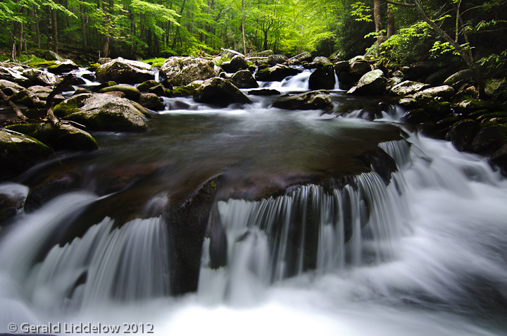
Waterfall
‹ PreviousLandscape GalleryNext ›

Waterfall

by Gerald Liddelow

Gallery: LandscapePosted April 29, 2012311 views6 comments
I took this shot at a workshop in the GSM NP.
I like the composition, but sometimes I see the
middle as empty and takes away from the picture.
I would like your feed back.

Nikon d7000
Tokina 11-16mm @ 16mm
2sec @ f/11
ISO 100

All comments and critiques welcome.
Gerald.

Comments

6 comments
Comment posted by Mark Seaver on April 29, 2012 at 9:23 PM
I've been looking at this for a while and think I know what you mean. There's really nice flow (pun intended :smile: ) around the falls, through the rocks and into the bright green distance, but the middle doesn't attract much attention. One thing you might try is to lighten the middle to try to pick up a bit more of the green reflection and bring out the hint of water flow a bit more strongly. I'm not sure those will be improvements, but hey, layers are easy to throw away.
Registered on January 23, 2011, 1103 Posts, 17270 Comments
Comment posted by Chris Chamberlain on April 29, 2012 at 11:50 PM
I think it's a nice shot. I don't think I would have taken notice to the empty middle had you not mentioned it. While there's not much you can do about that now. In the future with a similar situation, you could get closer, and lower. This would reduce the size of the midground just by changing your position/perspective. I am bothere by the very hot spot in the center foreground.
It looks completely blown, so burning won't really help, You could brush over it with the clone tool at a low opacity. This would add some texture and detail from the surrounding area to that spot.

Chris
Registered on March 13, 2007, 500 Posts, 8365 Comments
Comment posted by Paul Marcellini on April 30, 2012 at 10:37 AM
I got down here to try something different from the norm and also found this comp lacking...I do like the processing, maybe back off the true blacks just a tad.
Registered on November 27, 2007, 250 Posts, 2468 Comments
Comment posted by R.Bill Moser on April 30, 2012 at 1:49 PM
This is a lovely comp. The mid ground looks a bit empty. You captured a really nice flow. The hot spot in the foreground is a big distraction to me and I agree with Chris' suggestion to clone with a low opacity.
Registered on January 29, 2010, 285 Posts, 4281 Comments
Comment posted by Ned Fenimore on April 30, 2012 at 2:19 PM
Excellent comp... the foreground is a real treat, and the depth is great,
Registered on November 1, 2003, 467 Posts, 2803 Comments
Comment posted by Alex Mody on May 1, 2012 at 2:32 PM
I like this a lot - I really dig the dark tones, but might suggest easing off the blacks.
Registered on December 25, 2007, 163 Posts, 1896 Comments