Gallery: FloraPosted May 1, 2012112 views9 comments
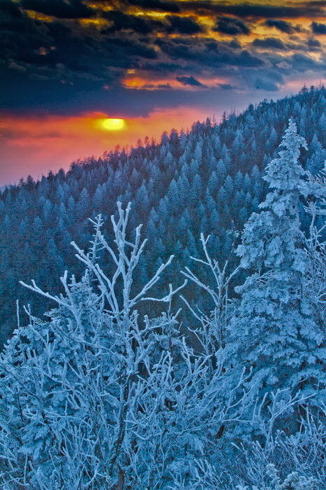
A very cold sunset at Clingmonds dome in GSMNP at the end of April no less.
7D
f22
1/10sec
iso 400
Comments
9 comments
Comment posted by Richard Teller on May 1, 2012 at 5:00 PM
This looks more like and impressionistic painting then a photograph. Nice color and interesting comp.
Registered on August 23, 2010, 1162 Posts, 6692 Comments
Comment posted by Philip Hodgkins on May 1, 2012 at 6:38 PM
The contrast between the warm sunset and the cold, frosty forest is unsettling. I wonder how this would look in B/W?
Registered on July 24, 2006, 2741 Posts, 12349 Comments
Comment posted by Miro Susta on May 1, 2012 at 8:12 PM
Nice color contrast. IMO the FG is a bit OOF(?). Nicely composed image,
Registered on August 18, 2006, 719 Posts, 3736 Comments
Comment posted by scott lanz on May 1, 2012 at 8:35 PM
Todd, the colors and overall look are a little surreal, or maybe painterly, but I like it. I find this a unique, artistic image. This would make a nice holiday card.
Registered on November 14, 2003, 840 Posts, 12902 Comments
Comment posted by Gary Yeoh on May 1, 2012 at 11:17 PM
Todd:
Nice contrast in the image. Warm on top 1/3 and blue and cold in the remainder. Beautiful capture. The trees looks a little grainy for 7D/iso400 - is this added pp?
Registered on September 1, 2009, 588 Posts, 8184 Comments
Comment posted by Ramamohan Pai on May 2, 2012 at 7:09 AM
Todd, I like how the vibrant Sun brings a bit of warmth to the otherwise "cold" scene. Repeating layers of trees forming subtle triangles is also something that appeals to me.
Registered on November 1, 2003, 550 Posts, 9037 Comments
Comment posted by Michael Lowe on May 2, 2012 at 2:37 PM
Very, very nice. Very painterly and non-photo looking. And I mean that in the most flattering way. I'm going to be the evil spelling police here. Just for your future reference, it's Clingmans Dome, I'm almost sure.
Registered on February 11, 2004, 777 Posts, 5252 Comments
Comment posted by Ian Wolfenden on May 3, 2012 at 6:02 PM
Intriguing and highly original rendering, Todd. I echo Scott's sentiments - it has a look of maybe a book illustration with its unusual and lovely colouring.
Registered on May 18, 2007, 1108 Posts, 7647 Comments
Comment posted by Todd Bielby on May 4, 2012 at 12:26 PM
Thanks for the comments everybody. Wasn't sure I liked this or not. Other people did so I decided to post it to see what other people thought. Gary, it does look grainy I was trying to figure out why and I think its because I added to much fill light from lightroom. It was a pretty dark seen with the sun behind the mountain. I will have to see what I can do to lessen the graininess. Michael, thanks for the spelling correction. I only heard the name guess I should of looked it up.
Registered on March 10, 2011, 169 Posts, 392 Comments

Comments
9 commentsNice contrast in the image. Warm on top 1/3 and blue and cold in the remainder. Beautiful capture. The trees looks a little grainy for 7D/iso400 - is this added pp?