Nature Photographers Network
This is the preserved archive of the original Nature Photographers Network. The community continues at naturephotographers.network.
Clematis 2
‹ PreviousFlora GalleryNext ›

Clematis 2

by scott lanz

Gallery: FloraPosted May 10, 2012198 views13 comments
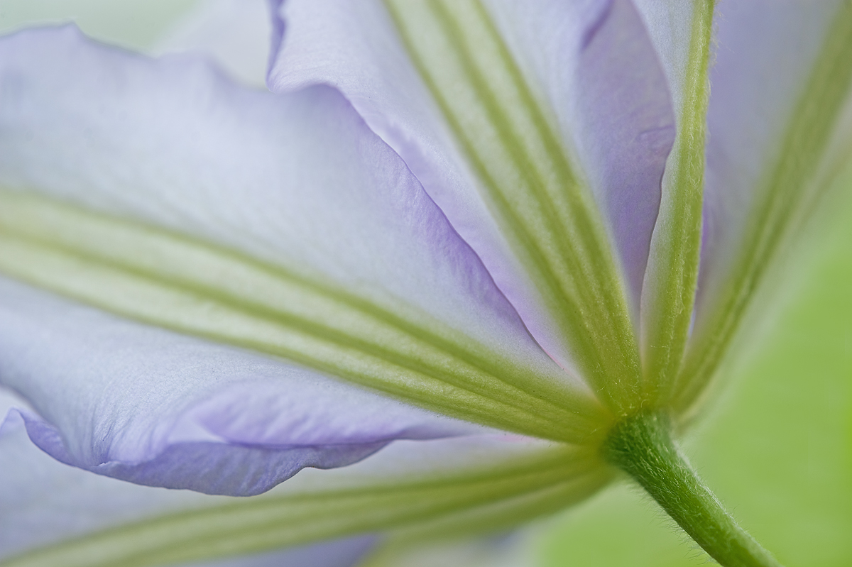
So, I previously posted a photo of this clematis in the macro gallery a couple days ago. This is a different comp (and different blossom) taken during the same shoot. I am curious as to which one works better. Nikon d700, 180 macro, f5 (vs. f16 in the other), 1/125 sec., iso 200. Larger image included.

Comments

13 comments
Comment posted by scott lanz on May 10, 2012 at 10:29 PM
For your convenience, here is the version posted in Macro (larger viewer available by going to that gallery or my gallery page).
Registered on November 14, 2003, 840 Posts, 12902 Comments
Comment posted by Albert Darmo on May 10, 2012 at 10:39 PM
Hi Scott :wavey: It's like asking, do you want the renoir, or the Vermeer! on your work, each has it's own fine qualities. #2 has softer lines, and has a kind of a refined air. #1 is stunning with a vibrant composition, and more " bon vivant" love them both :toast:
Albert Darmo
Registered on November 25, 2008, 1386 Posts, 11978 Comments
Comment posted by Morris McClung on May 10, 2012 at 11:23 PM
Albert is dead on. Both have different asthetic qualities that make them excellent. Great color and light and the comps are both very well done.
Registered on May 7, 2007, 670 Posts, 19650 Comments
Comment posted by Wayne Jones on May 10, 2012 at 11:24 PM
Scott, I like the colors and the comp/lines in this f/5 version. Also, concentrating on this small part of the flower makes the image somewhat abstract, so the soft focus works well. The biologist in me often prefers sharp focus throughout for shots of an entire bloom, but the soft focus is more appealing to me in this "non-ID" shot. (Have I been hanging around NPN so long that I am starting to get Artsy?)

Also, I just noticed that the difference in color is more pronounced on my wide-gamut, calibrated NEC Multisync monitor (using the Foxfire browser) than on standard Dell monitor. The wide-gamut monitor shows the rich greens much better.
Registered on April 18, 2007, 953 Posts, 6435 Comments
Comment posted by Nathan Buck on May 11, 2012 at 12:57 AM
Great lines Scott. I really like the unconventional comp. Excellent shot.

Nathan
Registered on November 1, 2003, 1101 Posts, 13589 Comments
Comment posted by Brigitte Lorenz on May 11, 2012 at 1:50 AM
agree with Albert, both are very artistic, each with his own fine quality...I like them both!!!

Brigitte
Registered on January 10, 2009, 187 Posts, 1507 Comments
Comment posted by Miro Susta on May 11, 2012 at 8:53 AM
Both are nice but I prefer the first one. Repost colors are a bit oversaturated and IMO also a bit oversharpened (may be only on my screen?). Well done Scott. :smile:
Registered on August 18, 2006, 719 Posts, 3736 Comments
Comment posted by Lorna Taylor on May 11, 2012 at 10:59 AM
Both are equally lovely images, love the softness of the first and comp of the second. Beautiful work Scott ! :wavey:
Registered on November 12, 2010, 254 Posts, 3083 Comments
Comment posted by Ramamohan Pai on May 11, 2012 at 4:14 PM
Scott - I prefer the 2nd version which you posted in the Macro Gallery too. Its frame filling good and I find the punchy colors in that version a lot more appealing that the First one you posted here. It almost resembles an inverted Umbrella with stronger leading lines :toast:
Registered on November 1, 2003, 550 Posts, 9037 Comments
Comment posted by Rick Diffley on May 11, 2012 at 7:42 PM
Thanks you for sharing this image. I really like it, actually more so than the other, mainly because: I like that there is a little more stem showing and where it is placed in the image.
Registered on April 8, 2012, 52 Posts, 279 Comments
Comment posted by Balan Vinod on May 12, 2012 at 2:00 AM
Scott ...another beautifully composed image and an ..wonderful palette ....well done ...

Balan Vinod
Registered on March 20, 2006, 889 Posts, 2312 Comments
Comment posted by Howard Cheek on May 12, 2012 at 9:04 PM
I like this one best Scott. Overall it feels like there's more room - The lines "flow" in this comp and it has an esthetically pleasing quality the other lacks.
Both R great :wavey:
Registered on July 24, 2008, 1201 Posts, 10758 Comments
Comment posted by Gary Yeoh on May 13, 2012 at 9:05 PM
Scott:
Very difficult choice (its like being asked by my two children whom I like better! :confused: ). Each has its own special quality. My personal preference would be for the softer image but I also like the depth in the second.
Registered on September 1, 2009, 588 Posts, 8184 Comments