Nature Photographers Network
This is the preserved archive of the original Nature Photographers Network. The community continues at naturephotographers.network.
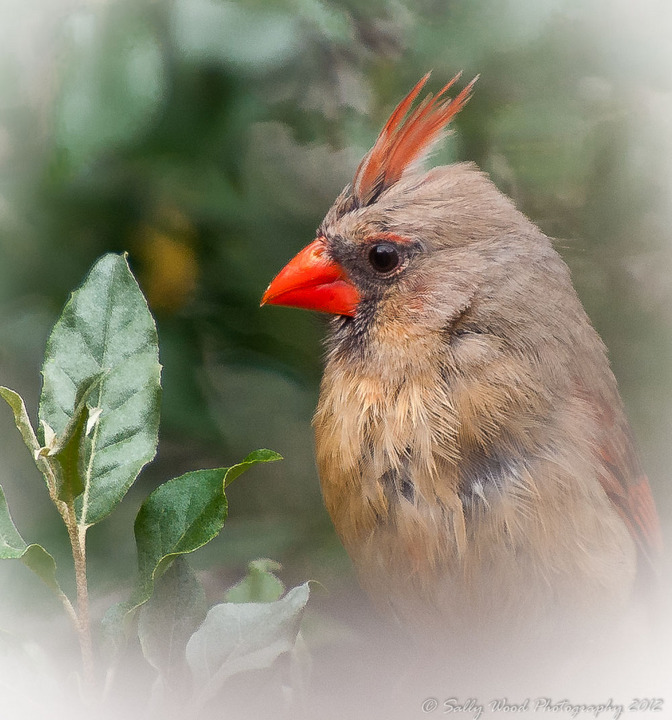
Cardinal + repost
‹ PreviousAvian GalleryNext ›

Cardinal + repost

by Sally Wood

Gallery: AvianPosted May 14, 2012130 views10 comments
I took this shot quickly with a big branch in the foreground, so had to crop as is... Do like her mysterious, what are you up to look though... she looks like she really rules the roost!

tripod.. nikon d700 70-200 mm 2.8 with teleconverter to 400 mm.

1/320th at 5.6 iso of 800
Thanks for your comments!

Comments

10 comments
Comment posted by Kurt Bowman on May 14, 2012 at 8:20 PM
Hi Sally. I like the head angle on this also and the detail looks nice. I do have to say, I am not a real big fan of heavy vignette...for some reason especially white. If it were one, I might change it to black vignette and make it a lot less noticeable. Just enough to make it look like you lost some detail on the edges of the lens. But that is a personal preference and just a suggestion.
Registered on June 19, 2008, 1005 Posts, 8028 Comments
Comment posted by Barb Pflaum on May 14, 2012 at 10:48 PM
I love the color and detail. Very nicely done.
Registered on January 14, 2009, 316 Posts, 2724 Comments
Comment posted by Sally Wood on May 15, 2012 at 6:00 AM
Good feedback Kurt.. I went with white as the big oof branch in the front left a big white blur... but have worked with the image, and moved to a black vignette as you see here.. i think it does showcase the bird better. thanks for the feedback.
Registered on March 8, 2012, 39 Posts, 509 Comments
Comment posted by Charles Gangas on May 15, 2012 at 11:30 AM
Sally- the original image has wonderful detail and a neat look from the cardinal, but I agree with Kurt on the effectiveness of the composition with a white vignette. The repost IMO, is excellent! The bird shows much better and my interest is directed toward the bird without my gaze leaving the subject.
Registered on August 12, 2009, 544 Posts, 2414 Comments
Comment posted by Nate Chappell on May 16, 2012 at 12:11 AM
My suggestion was going to be the same as Kurt's, your repost works quite well Sally :toast:
Registered on February 1, 2006, 1158 Posts, 19528 Comments
Comment posted by Jim DeWitt on May 16, 2012 at 12:11 AM
The re-post if far better. The vignetting is subtle and less intrusive. I suppose it is a matter of taste; I don't care for it, but your work makes it almost okay.
Registered on August 28, 2006, 1240 Posts, 8506 Comments
Comment posted by May Haga on May 16, 2012 at 9:01 PM
Lovely portrait Sally. I do like the black vignetting better.
May
Registered on February 22, 2007, 714 Posts, 8470 Comments
Comment posted by Dennis Plank on May 18, 2012 at 5:19 PM
Excellent, Sally. I agree with others that the repost looks better. A very "painterly" feel to this one that I find appealing.

:toast:
Registered on January 28, 2008, 1767 Posts, 23192 Comments
Comment posted by Sally Wood on May 18, 2012 at 7:17 PM
Dennis, thanks for backing up to take a look,, I appreciate it! I am learning everyday , and NPN has been wonderful!
Registered on March 8, 2012, 39 Posts, 509 Comments
Comment posted by Lucy Aron on May 21, 2012 at 10:38 AM
A classic look. Vignette works well here.


lucy
Registered on February 25, 2011, 189 Posts, 1160 Comments