Reflect for a .. +alternate
by Lon Overacker
Thanks for the feedback and comments on my last post.
Here's yet another from Yosemite in May (I may be posting for a while, at least until I run out...)
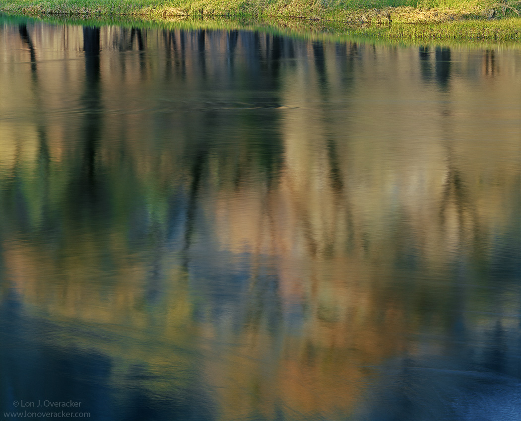
Reflections like this are kinda like clouds. We all love them, photograph them and I don't know about you, but can be mesmerized by them. Nothing original here, but I'm always on the look out for a good one; color, texture and balance all come in the play here. I do struggle with presentation though - do I present normally as seen with the river as viewed and upside down reflection, or do you flip these vertically? I'm just going to display this one as captured and you can let me know what you think. There is also the option of including or cropping out the reality of the shoreline. Here, I kinda liked the grass and light.
Would love to hear your thoughts on any aspect of this image.
4x5, Nikkor 300mm, Velvia 100f, f/45 @2s
Thanks!
Lon

Comments
19 commentsI really like it as is, I think they just get confusing when they get flipped haha. Colors and textures look good, and I like the grass at the top. Nice work!
-Cam
Nick Bristol
Lone rock, WI
Was curious if you tilted the lens to place the plane of sharp focus on the river surface or somewhere in between? The surface details are just so remarkable that I was wondering, given the small aperture used. Thanks.
Vance, great question and thanks for asking. Yes, I used tilt to get the surface of the water in sharp focus. Come to think of it, not sure why I went small at f/45 considering the water blurred the trees and background(El Capitan) and so therefore depth wasn't going to buy me anything. Still boggles me though about reflections and focus, considering the distance to the subject is the real distance, not what you see being reflected. Anyway.... I'm also surprised the texture and detail on the water's surface at 2 seconds.
Just for comparision, here is a flipped, flopped and cropped version. Certainly makes this more abstract. Perhaps I have two images out of this one. I also cropped just the grass, but the more clear reflections still grounded it in reality and thought they were distracting, so I cropped a little more.
To each our own I guess - but any preference?
Thanks!
The thumbnail caught my eye immediately. I really like the reflection itself and not the sharp grass so much. however I am not so sure about the repost. I understand the crop choice you mad, I think I would have made the same choice, but in it, something is lost even if I did not like it. It is still eye catching and differing from other blurs / reflections, this one imparts a sense of mystery without looking contrived or intentional - if that makes any sense.
I appreciate your repost, and could see working with contrast and sats to really abstract the abstract, but still prefer the original which I think is gorgeous.
Love the dark tree trunks and impressionistic feel of this. I wouldn't have known it was Yosemite if you hadn't said so, but that makes it even better!