Nature Photographers Network
This is the preserved archive of the original Nature Photographers Network. The community continues at naturephotographers.network.
Dogwood and ... +alt
‹ PreviousLandscape GalleryNext ›

Dogwood and ... +alt

by Lon Overacker

Gallery: LandscapePosted June 18, 2012439 views33 comments
No faces or clever titles this time.

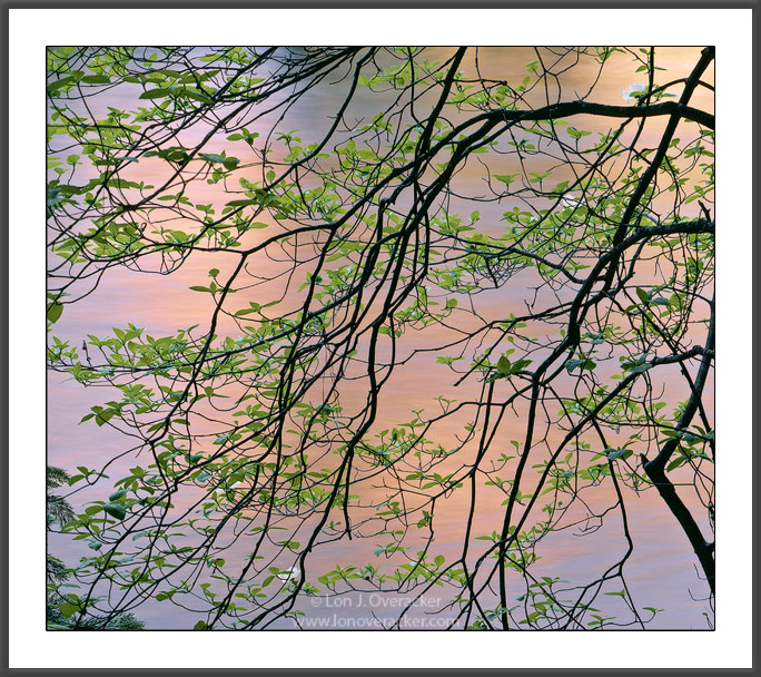
Different tree, but same time and area as my first dogwood image I posted recently. Not sure about this one, but I guess there's enough I liked about it to take the time to scan and process it, so I might as well share it. There's also a vertical option, both cut from the same vertical original.

I know there are like three out of sight blossoms here, so it can't be about them, so are they a distraction? Or is the glow and color of the river and the tree structure enough to carry the image? Your thoughts and critique are welcome!

4x5, 300mm, V50, f/32 @ 11s.

Thanks!

Lon

Comments

33 comments
Comment posted by Lon Overacker on June 18, 2012 at 5:04 AM
Here's a vertical crop for comparison.
Registered on November 24, 2006, 521 Posts, 19147 Comments
Comment posted by Alister Benn on June 18, 2012 at 6:51 AM
I don't know of anyone else working today who takes such thoughtful and stimulating studies as these. Another excellent image Lon, the warmth of the reflected rock walls creates a beautiful pastel BG for the graphic and vibrant life.
Registered on June 9, 2011, 23 Posts, 258 Comments
Comment posted by Kah Kit Yoong on June 18, 2012 at 7:42 AM
I prefer the original post. This is truly delightful. The water canvas is gorgeous an amazing foil for the delicate subject.
Registered on September 27, 2006, 636 Posts, 10682 Comments
Comment posted by Rob Blakers on June 18, 2012 at 8:21 AM
Both are stunning!

Registered on February 26, 2011, 8 Posts, 67 Comments
Comment posted by Stan Rose on June 18, 2012 at 9:31 AM
No faces? :frown: No funny titles?? :frown: :frown:
Ok, i like this, maybe not quite as strong as the simpler ones but pretty cool i think. Vertical or horizontal, the one thing i would do is crop so that angular branch is gone-- a bit distracting. Real interesting otherwise. :wavey:
Registered on September 15, 2005, 836 Posts, 17099 Comments
Comment posted by Harry Lichtman on June 18, 2012 at 10:22 AM
Lon - The mix of colors and graphic style with the branches definately works for me. There is a heaviness that the larger right branches give the image, so I might try a vertical crop, but eliminate the right sided branches and keep the left portion. This gives the image more of a lightness for me. Where's the Larger version? Would love to see the detail in the leaves.
Registered on September 17, 2010, 304 Posts, 3507 Comments
Comment posted by R.Bill Moser on June 18, 2012 at 12:36 PM
Awesome! I'd prefer the second version...though both of them are great. It's just a matter of personal preferences.
Registered on January 29, 2010, 285 Posts, 4281 Comments
Comment posted by Nick Bristol on June 18, 2012 at 12:59 PM
Beautiful! The wonderful color and glow in the river works so well here as a background. I like both version but might lean towards the original if I had to pick one over the other. This image has a wonderful and delicate feel. Very nice Lon!

Nick Bristol
Lone Rock, WI
Registered on February 1, 2004, 752 Posts, 14140 Comments
Comment posted by Lon Overacker on June 18, 2012 at 1:51 PM
Thanks for the response and comments folks. Ali, especially thank you for your kind words, I appreciate it!

I think I'm favoring the horizontal as well, but what's the best compromise between the two? How about square? I also wondered if that heavy crock of a branch would get mentioned. I think it's better without it now too.

So here's a cropped version. This may become my final version that makes the website, but the jury is still out.

Full disclosure - I cloned out one of the dogwood blossoms in the URC after the crop. Just seemed misplaced in the extreme corner. Also, there is a 10% opacity Orton layer on this too. I had a couple versions going so I don't remember if the first two were Ortonized or not - but probably.

Thanks! I appreciate the assist and feedback.

Lon
Registered on November 24, 2006, 521 Posts, 19147 Comments
Comment posted by Mark Seaver on June 18, 2012 at 2:50 PM
Lon, I really like the square crop. To me it feels much more dreamy and abstract as well as emphasizing the warm hues in the background. If you hadn't of pointed out the hidden blooms, I would have had to look for a long time before I noticed them. I really like the arching branches and the color/feeling contrast between the leaves and the background. Having reality intrude at the bottom in the form of the grasses halts the dream in its tracks. I don't feel much difference between the original and the latest post.
Registered on January 23, 2011, 1103 Posts, 17270 Comments
Comment posted by Richard Teller on June 18, 2012 at 2:54 PM
I think this is a very artistic image. I can see it blown up really large and hanging on a wall. The subtle colors are just great.
Registered on August 23, 2010, 1162 Posts, 6692 Comments
Comment posted by Bill Chambers on June 18, 2012 at 3:26 PM
Beautiful. I prefer the first (non-vertical, squarish) version. The various reflected colored really make this for me. I believe I've seen several similar renditions before from you on this subject if memory serves me correctly, all beautiful. I love the flow of the branches, except for the one larger branch at the bottom right that kinda goes against the grain. Excellent work, as usual.
Registered on April 10, 2005, 753 Posts, 21216 Comments
Comment posted by Jeremy Cram on June 18, 2012 at 7:08 PM
You are definitely a master at capturing trees and light. You're like some modern day druid. :wink:
Registered on June 4, 2006, 204 Posts, 818 Comments
Comment posted by Todd Liotine on June 18, 2012 at 7:40 PM
Lon, as others have said beautiful water canvas, the tones are really nice. I prefer the last version posted, I too was found the angular branch on the right side a bit distracting. Especially since the other branches all flow in the same direction making the compostion dynamic.
Registered on July 1, 2008, 131 Posts, 671 Comments
Comment posted by Youssef Ismail on June 18, 2012 at 9:01 PM
Lon the square version is best of all three and seems most balanced. I do wish there were a few more blossoms as I think the white adds greatly to the overall color scheme but it is what it is.
Registered on November 1, 2003, 474 Posts, 5555 Comments
Comment posted by Mark Pelton on June 18, 2012 at 9:37 PM
Very nice with beautiful background, Lon. I prefer a crop off of the right that removes the larger vertical branch on the extreme right. Oh, i see you have the same crop down below. This is much better IMO.
Registered on November 25, 2003, 380 Posts, 4647 Comments
Comment posted by Tony Kuyper on June 18, 2012 at 10:02 PM
I like all three images, Lon, though probably like the amount of orange in the squares best. I like what appears to be slightly more vivid color in the first image, though URC seems a bit bright.

Just love how you visit this grand landscape and find it possible to concentrate on such intimate scenes.
Registered on November 1, 2003, 364 Posts, 22328 Comments
Comment posted by Harley Goldman on June 18, 2012 at 10:16 PM
The cropped version works best for me, but this one is not rockin' my world.
Registered on November 19, 2003, 586 Posts, 11271 Comments
Comment posted by Catherine Reilly on June 18, 2012 at 10:40 PM
Blossoms just enough to identify the tree. The pattern of the tree's branches combined with the glow of light on the river make this really cool, Lon. Very cooperative tree, and persistent photog, to discover such a graceful drape of branches. The image has a feel of calmness and hopefulness to me; it's an appealing enough sense to ease me into a long period of gazing.
Registered on August 16, 2006, 603 Posts, 9192 Comments
Comment posted by Alister Benn on June 19, 2012 at 12:38 AM
The square is also awesome, and I may favor it... It feels somehow "cleaner!"
Registered on June 9, 2011, 23 Posts, 258 Comments
Comment posted by Helmut Steidl on June 19, 2012 at 1:32 AM
Hello Lon ...

Perfect .... all three Images are outstanding in colours and graphics .... very well done :toast:

Helmut
Registered on May 18, 2011, 17 Posts, 67 Comments
Comment posted by Ian Cameron on June 19, 2012 at 5:03 AM
Very pleasing Loni and I prefer the slightly more delicate vertical study with occasional Dogwood blooms.
Registered on August 6, 2004, 1125 Posts, 3318 Comments
Comment posted by David Edwards on June 19, 2012 at 5:48 AM
Beautiful work Lon. The reflected pinks and oranges on the bg water are a really wonderful backdrop to the green leaves of the fg branch. Love it's delicate and soft nature. I prefer the last square crop without the crooked branch on the far right.
Registered on December 6, 2008, 142 Posts, 2623 Comments
Comment posted by Peter Richter on June 19, 2012 at 6:22 AM
Lon, I really appreciate your subtle image, the unique glow in the background keeps my attention.

Regarding the crop, the last version (without the angular branch) works best for me. Maybe an illusion, but my impression is that the glow is more intense in the first (square) version than in the two others?

Peter
Registered on November 10, 2010, 218 Posts, 2723 Comments
Comment posted by Michael Anderson on June 19, 2012 at 4:51 PM
Lon,

Beautiful intimate work as always! I prefer the flow of the horizontal version the most. I really love the way you found balance in every corner of the image and the soft gold water reflections in the background really pull the intricacy of the foreground into relief. This is masterfully artistic. I love it.
Registered on January 31, 2006, 228 Posts, 3072 Comments
Comment posted by Scott Smorra on June 19, 2012 at 7:06 PM
My favorite is the square crop Lon. The square crop has no distracting elements, just beautiful reflected light and a nice arrangement of dogwood branches. You did an excellent job exploring all of the different possibilities in this single frame.
Registered on November 2, 2009, 161 Posts, 2143 Comments
Comment posted by Eva McDermott on June 19, 2012 at 8:02 PM
Love the balance and gracefulness of the square version Lon as well as the pastel background.
Registered on January 4, 2009, 1015 Posts, 13229 Comments
Comment posted by Gabi Lach on June 20, 2012 at 9:47 AM
Lon, this is such a fine photograph! Beautiful colors and detail, I can feel the breeze and freshness going through the air. Very plesant to view. :smile:
Registered on May 1, 2007, 101 Posts, 3187 Comments
Comment posted by Morris McClung on June 20, 2012 at 3:55 PM
Your repost hit it on the head. Great flow now in the lines of the branches. Gorgeous stuff, Lon!
Registered on May 7, 2007, 670 Posts, 19650 Comments
Comment posted by Gary McGhee on June 20, 2012 at 4:35 PM
Classic Lon shot, love the golden backdrop. I don't have a preference between the two Lon, both look fantastic.

Gary.
Registered on April 15, 2010, 142 Posts, 2416 Comments
Comment posted by Joseph Campisi on June 21, 2012 at 1:24 PM
Third one is the charm Lon. As Stan mentioned, not as strong as your simpler comps, but beautiful nonethe less! The third one has a really nice flow from top to bottom.
Registered on November 24, 2008, 304 Posts, 3211 Comments
Comment posted by Ruben Vicente on June 27, 2012 at 6:16 PM
I like the color contrast on this image. By using a slower shutter speed you were able to blur the background, which works perfectly.
Registered on April 9, 2011, 4 Posts, 59 Comments
Comment posted by Mohammad Hosseini on July 31, 2012 at 10:52 AM
Yes, That's great the third one. wonderful colors, well seen and well captured, Lon
Registered on May 16, 2011, 15 Posts, 301 Comments