Nature Photographers Network
This is the preserved archive of the original Nature Photographers Network. The community continues at naturephotographers.network.
Diagonals
‹ PreviousLandscape GalleryNext ›

Diagonals

by Morkel Erasmus

Gallery: LandscapePosted June 29, 2012155 views15 comments
I've been going through some unprocessed landscape images from 2011...and it's strange how time away from a specific shoot lets you realise what you did wrong, and also shows you some things that you did right which you felt were not really "hot & happening" at the time. :shock: :wink:

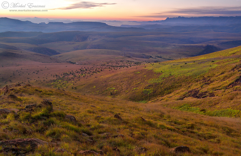
So here's one I'd like some straight-shooting opinions on. At the time I wanted to shoot this pre-sunrise scene over the rolling Maluti mountains to show the vestiges of the more "foreboding" Drakensberg peaks at the back, and I quite like the diagonal lines leading you in. I'm starting to debate my own choice of foreground elements these days - it feels like I'm often choosing a "too strong" foreground anchor (if there is such a thing :lol: )...what I mean is that sometimes the scene needs to get the attention, and placing a prominent rock or bush or tree in the immediate foreground then "robs" the real vista of some of the attention.

What do you think?

Techs:
Canon 7D with 10-22mm USM @ 22mm
f16 @ ISO-100
Blend of 3 exposures using luminosity masks
It had been raining the previous day so the colours were nice and saturated to begin with...

Comments

15 comments
Comment posted by Kah Kit Yoong on June 29, 2012 at 5:18 PM
Hmmm, I'm not sure about the immediate foreground. All the good stuff starts a third of the way up, the patches of green really appeal. I see telephoto shots here but there are various crops that work too.
Registered on September 27, 2006, 636 Posts, 10682 Comments
Comment posted by Morkel Erasmus on June 29, 2012 at 5:21 PM
Thanks KahKit...so where would you crop...to right where the greens start?? :smile:
Registered on March 22, 2011, 385 Posts, 2068 Comments
Comment posted by John Williams on June 29, 2012 at 5:23 PM
I'll take the counterpoint to Kah Kit; I really like the foreground, especially in the larger version. The details are very nice, and would look good in print. The first diagonal where the foreground hits the midground is important too. The distant low layer of fog (?) is a nice addition.

I too worry about being too "anchor" centric, and need to explore more open foregrounds in the future.
Registered on September 6, 2007, 221 Posts, 5985 Comments
Comment posted by Kah Kit Yoong on June 29, 2012 at 5:46 PM
Just looking at the larger version, I can see John's point. It's a nice pic as presented but my issue is that compositionally it seems unbalanced. The rocks catching the light at the bottom left and right are too close to the edges for me and I get the sense that there should be more sky. Probably stitching two horizontal frames would have been the best option here - more space around the rocks and more sky. I've tried cropping above the rocks at the bottom and a bit of the right but I can't definitively say they are better.
Registered on September 27, 2006, 636 Posts, 10682 Comments
Comment posted by Morkel Erasmus on June 29, 2012 at 6:00 PM
Thanks John and KahKit. To my shame, there is space around the bottom but I had to crop for levelling (probably didn't check it properly in-the-field :redface:). The sky was pretty bland higher up than this, so I composed it out upfront :mad:
Registered on March 22, 2011, 385 Posts, 2068 Comments
Comment posted by Nancy Lea Sandy on June 29, 2012 at 6:58 PM
I like the way the fg falls off to the mid-ground. I'd keep it all, as the first wedge keeps the strong slant of the second from sweeping my eyes off the image (if that makes sense.) Love the misty distance and allure of those rugged bg hills.
Registered on January 24, 2011, 576 Posts, 6942 Comments
Comment posted by Philip Hodgkins on June 29, 2012 at 8:26 PM
This is a complex scene, and I am sure there are many approaches and suitable crops. This one works fine for me. There is really not a path for the eye to follow to the horizon, but this is a scene where the eyes should linger and enjoy the feast of sights. This is the great thing about places like this—the story never ends.

Go back and I just bet you can find a hundred different angles and portrayals. Be thankful!
Registered on July 24, 2006, 2741 Posts, 12349 Comments
Comment posted by Tony Kuyper on June 29, 2012 at 9:10 PM
Relative to what's usually in foregrounds nowadays, this is very tame. Enjoyable and appropriate too, I might add. I think it works very well in the way it imparts color and depth to the image.
Registered on November 1, 2003, 364 Posts, 22328 Comments
Comment posted by Bob Miller on June 30, 2012 at 2:14 AM
I'm finding it hard to find a place for my eye to rest without a strong focal point somewhere in the scene. Don't get me wrong, it is a fine scene but the far peak on the horizon doesn't have the punch to get me to stay put.
Registered on January 24, 2005, 152 Posts, 405 Comments
Comment posted by Peter Richter on June 30, 2012 at 9:59 AM
Morkel, your choice of foreground elements is consistent with the scene and your plain composition shows the atmosphere very well in my opinion. The diagonals lead me appealingly into the depth of the image, which is the main area of interest to my eye. I especially enjoy the colors above the horizon. Thanks for sharing.

Peter
Registered on November 10, 2010, 218 Posts, 2723 Comments
Comment posted by Mark Seaver on June 30, 2012 at 12:33 PM
This is a lovely scene with incredible depth, but I agree with you that the ridge in the foreground grabs too much attention. I've tried cropping from the bottom so that the valley starts in the lrc, but that doesn't feel very well balanced either. In this case, I wonder what it would have looked like if you'd have walked a few steps forward? In spite of that it's a very nice scene as presented.
Registered on January 23, 2011, 1103 Posts, 17270 Comments
Comment posted by Lon Overacker on June 30, 2012 at 2:36 PM
Morkel,

Personally, I appreciate it when one can capture and present a landscape such as this without the use of a strong foreground element. And I think you're right that it can sometimes "rob" a scene of it's grand vista.

I like the diagonals here, as subtle as they are. And the foreground here has enough interest, detail and light to add to the composition and not detract from it. Great color too. Great combination of color and light in the foreground and layering as you get farther out in to the landscape.

I think a wonderful landscape.

Lon
Registered on November 24, 2006, 521 Posts, 19147 Comments
Comment posted by Morkel Erasmus on July 1, 2012 at 5:56 PM
I appreciate the honest and varied feedback, folks. It's great to hear such interesting takes on the image and get behind the way some of you think about composition in this regard. :smile:
Registered on March 22, 2011, 385 Posts, 2068 Comments
Comment posted by Harry Lichtman on July 2, 2012 at 6:07 AM
Nothing in the FG seems to jump out at me and says, put me there. SO I think the way you handled this is right on. The textures and rocks/stumps and diagonals work fine.
Registered on September 17, 2010, 304 Posts, 3507 Comments
Comment posted by Catherine Reilly on July 7, 2012 at 5:20 PM
This is a wonderful "grand scene" landscape, Morkel. I don't get a sense of the foreboding nature of the mountains in the bg because the color in the vista is so warm and appealing. As to the fg, I think I know what you mean about fg objects obstructing or detouring attention to the scope and scale of a grand scene. However, the most "leading" of the leading lines into the image for me is the bend/curve at the foot of the hill coming in from the right. So I'd try cropping this from the bottom into more of a panoramic image; maybe 1 to 2 inches off the bottom?
Registered on August 16, 2006, 603 Posts, 9192 Comments