Gallery: LandscapePosted June 30, 2012630 views31 comments
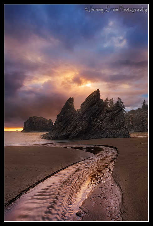
Southern Oregon coast this last weekend. I caught some nice light in between storms. Thanks for looking.
5dmkii, f16, 1.3 and 1/6, iso100
Comments
31 comments
Comment posted by Tony Kuyper on June 30, 2012 at 4:04 PM
What a stunner, Jeremy!
Registered on November 1, 2003, 364 Posts, 22328 Comments
Comment posted by Jeremy Cram on June 30, 2012 at 4:09 PM
Thanks Tony! Your actions made it possible..;) I like the darker processing on this but wanted some opinions on the crop. I'll post up a 4x5 if yall think it needs it.
Registered on June 4, 2006, 204 Posts, 818 Comments
Comment posted by Lon Overacker on June 30, 2012 at 4:09 PM
Jeremy,
Nice light indeed! Even that short strip of light on the horizon adds to the image here and lets us know where the light in the clouds is coming from. This also kinda has a misty glow to it around the rocks which contrasts with the clarity of the water and ripples in the foreground.
Lon
edit: Just saw your comment about a crop suggestion. I was actually thinking about that. Since you're emphasizing the lead-in of the stream here I was thinking you might not need so much sky. As it is, you might back off the blue sat too up top (minor.) Yeah, this almost felt too tall - if that makes sense.
Registered on November 24, 2006, 521 Posts, 19147 Comments
Comment posted by Jeremy Cram on June 30, 2012 at 4:17 PM
Thanks Lon...that was was I was kinda thinking too.
Registered on June 4, 2006, 204 Posts, 818 Comments
Comment posted by Jeremy Cram on June 30, 2012 at 4:43 PM
Here's a 4x5 crop, some off the top and bottom.
Registered on June 4, 2006, 204 Posts, 818 Comments
Comment posted by Youssef Ismail on June 30, 2012 at 5:31 PM
Beautiful Light Jeremy, with a great composition. It does feel a bit titled CCW. I actually thought the sky made the image. If anything, I would have liked more side to side if you were going for a 4x5 crop. The crop you posted feels to tight to me, although it is nice. I think what adds a great depth to the original is the blue in the sky adding color depth if that makes any sense.
Registered on November 1, 2003, 474 Posts, 5555 Comments
Comment posted by Nathan Apodaca on June 30, 2012 at 6:43 PM
Wow. Great re-post. In the original, I was absolutely stunned, but also feeling something wasn't quite right with the comp. The lighting is something new here. Maybe it's just the colors of the whole scene, but it creates a wonderful mood. The editing compliments this as well. Did you get any horizontal at this location?
Registered on November 16, 2011, 67 Posts, 1127 Comments
Comment posted by Peter Coskun on June 30, 2012 at 7:48 PM
The composition is great, I like the crop version better, much more balanced for me. The light and clarity are very nice too. All these images coming from the PNW are really making me antsy for my visit. Good inspiration.
Registered on October 31, 2011, 170 Posts, 1240 Comments
Comment posted by Danny Laureys on June 30, 2012 at 8:33 PM
Excellent!!!!
Registered on January 5, 2008, 590 Posts, 1261 Comments
Comment posted by Lon Overacker on June 30, 2012 at 9:22 PM
Jeremy,
I like the crop very much. The little stream in the sand seems to have a bigger role now and for me the sky becomes a nice accent to the scene and doesn't dominate like it did in the original. Of course, to each our own...
Lon
Registered on November 24, 2006, 521 Posts, 19147 Comments
Comment posted by Eva McDermott on June 30, 2012 at 9:43 PM
Beautiful light and color Jeremy. I like the cropped version best since it places more emphasis on the tidal stream.
Registered on January 4, 2009, 1015 Posts, 13229 Comments
Comment posted by Nicolaus Wegner on June 30, 2012 at 11:41 PM
I actually like both versions...each has a unique feel to them.
Registered on February 21, 2010, 133 Posts, 1509 Comments
Comment posted by Vlad Sadovsky on June 30, 2012 at 11:43 PM
Stunning view , clouds add just the right atmosphere. Leading lines with subtle reflections also work superb. For me the 4.x5 crop is the only one working..
Great work.
Registered on November 12, 2010, 48 Posts, 358 Comments
Comment posted by John Mumaw on June 30, 2012 at 11:51 PM
Excellent work! Great control of a tricky exposure and just an overall gorgeous scene.
Another big thumbs-up for the cropped version.
Registered on September 9, 2005, 62 Posts, 2289 Comments
Comment posted by Todd Liotine on July 1, 2012 at 12:26 AM
Beautiful light the repost nails it.
Registered on July 1, 2008, 131 Posts, 671 Comments
Comment posted by Nick Bristol on July 1, 2012 at 9:33 AM
An amazing image, Jeremy. Not sure how it could be any better than the cropped repost, even though the original was very nice. Fantastic!
Nick Bristol
Lone Rock, WI
Registered on February 1, 2004, 752 Posts, 14140 Comments
Comment posted by Mark Metternich on July 1, 2012 at 12:57 PM
Just wonderful Jeremy!!! These days I much prefer the subtle beauty as shown here over the, over the top stuff that a lot of us have striven for in the past. Having said that, I would not say this is totally subtle because I see power in it.
I might consider drawing the right foreground line into the corner via a warp.
Registered on June 19, 2009, 276 Posts, 6240 Comments
Comment posted by Paul Gasior on July 1, 2012 at 2:13 PM
Exellent
beautiful light color and composition
Registered on March 7, 2010, 99 Posts, 502 Comments
Comment posted by Jason Keefe on July 1, 2012 at 5:16 PM
Great color, Great composition in the crop. Wished I could have been there for that light!
Registered on June 22, 2012, 2 Posts, 9 Comments
Comment posted by Shantikara Valuska on July 1, 2012 at 5:29 PM
I love it! Fantastic light and mood.
(Actually I was writing the comment for the previous post, when you deleted it. )
So it looks that you reprocessed it complately. Much, much better, especially the details in the rock.
From the original post I felt a bit unbalanced, with too much sky, but now when I see the 4x5 crop I wish for more sky. Maybe between.
Anyway, great work!
Registered on July 25, 2011, 38 Posts, 451 Comments
Comment posted by Aaron Feinberg on July 1, 2012 at 5:56 PM
Some crazy light and scene. Think might be a bit too much extra up to and the comp is centered b/c of it...maybe 4:5 crop to help? Great catch
aF
EDIT:....just read through and saw repost. niice ;)
Registered on October 26, 2009, 399 Posts, 2789 Comments
Comment posted by Robert Dayton on July 1, 2012 at 6:16 PM
Awesome, Jeremy! I prefer the second post; for me it's more vibrant. Wonderful light and
color. The leadin water line really puts this over the top.
Registered on November 11, 2008, 281 Posts, 3958 Comments
Comment posted by Vance Gese on July 1, 2012 at 7:41 PM
Really like the lead in of the stream and the golden light on the water; that sky ain't half bad either. Really a gorgeous image. The cropped image does seem to work better, focusing more on that stream.
Registered on November 13, 2008, 298 Posts, 6629 Comments
Comment posted by Chris Moore on July 1, 2012 at 8:23 PM
I really like this, Jeremy. Compositional elements are there and the processing is spot on. Cropped works better.
Registered on January 12, 2010, 84 Posts, 388 Comments
Comment posted by David Edwards on July 2, 2012 at 4:07 AM
Very nice comp and processing Jeremy. I'm in two minds about which one I like. The crop is a tighter comp, and I think I prefer that one, but I do like the color combination of the blue in the upper sky of the original and the yellow/red of the lower section. I guess you could increase the blue at the top of the crop version to achieve that too if desired. The cropped version also has a more subdued mood compared to the original with the blue and brighter sky giving a more uplifting feeling. Fabulous shot either way!
Registered on December 6, 2008, 142 Posts, 2623 Comments
Comment posted by Oleg Kuchorenko on July 2, 2012 at 2:39 PM
Wonderful !
Registered on July 2, 2012, 9 Posts, 111 Comments
Comment posted by Jeremy Cram on July 2, 2012 at 3:34 PM
Thank you all for the input...It really helps and is appreciated. For those that wanted to see a wider shot, that was just not possible for this comp. There was a large sea stack just to the left that just looked like a big round black ball, I didn't feel it added anything to this comp. The sky was pretty great this night and I do have comps faceing more south, which I do plan to work on in the future. Thanks again...
Registered on June 4, 2006, 204 Posts, 818 Comments
Comment posted by Alister Benn on July 3, 2012 at 7:30 AM
Great comp in diverse light. I think it might need a CW rotation, it appears sloped...
Registered on June 9, 2011, 23 Posts, 258 Comments
Comment posted by Tom Nevesely on July 3, 2012 at 5:02 PM
Really nice! Not much else to say...
Registered on June 14, 2005, 147 Posts, 1550 Comments
Comment posted by Morris McClung on July 4, 2012 at 4:34 PM
The repost sings!
Registered on May 7, 2007, 670 Posts, 19650 Comments
Comment posted by Alex Noriega on July 17, 2012 at 7:24 PM
Probably your finest in recent memory, and that includes a pretty extensive set of baller images! Loved this the second I saw it on 500px. I prefer the 4:5 crop, as that was my first thought upon seeing the image.
Registered on May 19, 2012, 80 Posts, 195 Comments

Comments
31 commentsNice light indeed! Even that short strip of light on the horizon adds to the image here and lets us know where the light in the clouds is coming from. This also kinda has a misty glow to it around the rocks which contrasts with the clarity of the water and ripples in the foreground.
Lon
edit: Just saw your comment about a crop suggestion. I was actually thinking about that. Since you're emphasizing the lead-in of the stream here I was thinking you might not need so much sky. As it is, you might back off the blue sat too up top (minor.) Yeah, this almost felt too tall - if that makes sense.
I like the crop very much. The little stream in the sand seems to have a bigger role now and for me the sky becomes a nice accent to the scene and doesn't dominate like it did in the original. Of course, to each our own...
Lon
Great work.
Another big thumbs-up for the cropped version.
Nick Bristol
Lone Rock, WI
I might consider drawing the right foreground line into the corner via a warp.
beautiful light color and composition
(Actually I was writing the comment for the previous post, when you deleted it.
So it looks that you reprocessed it complately. Much, much better, especially the details in the rock.
From the original post I felt a bit unbalanced, with too much sky, but now when I see the 4x5 crop I wish for more sky. Maybe between.
Anyway, great work!
aF
EDIT:....just read through and saw repost. niice ;)
color. The leadin water line really puts this over the top.