Gallery: LandscapePosted July 9, 2012187 views8 comments
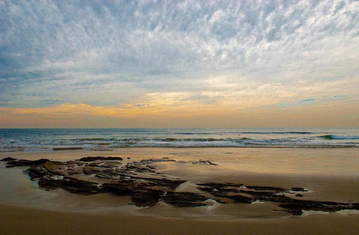
One from the archives. Does the lighter sky on the right upset the balance?
Nikon D200, 17-55 2.8, 1/400sec@f13, tripod.
Comments
8 comments
Comment posted by Wick Smith on July 9, 2012 at 10:36 AM
The lighter sky doesn't bother me a bit. I'm not sure what was in front of you, but I'd love to see what would happen in this scene if you moved closer in to the features on the beach & go with a tighter crop. It's a neat scene well captured.
Registered on June 12, 2009, 91 Posts, 379 Comments
Comment posted by Bill Chambers on July 9, 2012 at 10:51 AM
I like the scene and the composition, but have concerns about the post processing. In reality, I'm guessing the sky was much brighter than it shows in the image, and I think it needs to be processed that way. As it is, the entire image is somewhat monotone and doesn't appear realistic IMO. Just my .02's of course.
Registered on April 10, 2005, 753 Posts, 21216 Comments
Comment posted by Richard Teller on July 9, 2012 at 12:10 PM
I like the colors and the depth of the image. The only thing I might do is to crop up close to the rock feature on the beach. It would take the horizon out of the center.
Registered on August 23, 2010, 1162 Posts, 6692 Comments
Comment posted by Tony Kuyper on July 9, 2012 at 4:10 PM
Excellent comp and light . . . 'cept for those intensely cyan clouds on the right. These catch my eye more than the lightness of the clouds. Other than that, I really like the simplicity of the elements and the contrasting colors.
Registered on November 1, 2003, 364 Posts, 22328 Comments
Comment posted by Paul Marcellini on July 9, 2012 at 8:48 PM
Something definitely looks wrong here....cyan is way over saturated in areas. I would barely hit the top right to tone down but hardly noticeable. I like the sweeping lines you got though.
Registered on November 27, 2007, 250 Posts, 2468 Comments
Comment posted by Nancy Lea Sandy on July 9, 2012 at 10:55 PM
As mentioned, the color seems a little off but the clouds are great.
Registered on January 24, 2011, 576 Posts, 6942 Comments
Comment posted by Mark Seaver on July 9, 2012 at 11:08 PM
The lightness variation in the sky doesn't bother me at all, but I am bothered by the greenish areas in the sky touching the right edge and about 1/3 in from the left at the same level. The colors in the sand also seem oversaturated. Overall, I like the comp. with the rocky area in the foreground, the glow in the wet sand, and the big sky. Seems well worth another crack as processing.
Registered on January 23, 2011, 1103 Posts, 17270 Comments
Comment posted by Harry Lichtman on July 10, 2012 at 7:28 PM
Bob - I'm not a big fan of vignettes - especially the "artistic" obvious ones. Doesn't retract for me, but you probably could stand to darken the corner in a subtle way to balance the left a little more. Light is un-even in nature, and you defiantely don't have a blown out sky there. Nice seascape.
Registered on September 17, 2010, 304 Posts, 3507 Comments

Comments
8 comments