Nature Photographers Network
This is the preserved archive of the original Nature Photographers Network. The community continues at naturephotographers.network.
Palpitations
‹ PreviousLandscape GalleryNext ›

Palpitations

by Morris McClung

Gallery: LandscapePosted July 17, 2012908 views40 comments
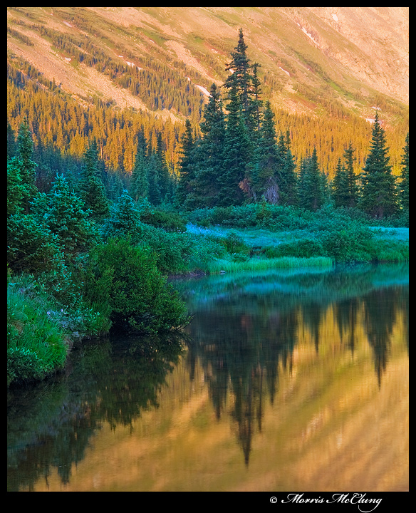
Between the altitude, and the beauty before me, I was having palpitations. :smile: The tree lines above and below the shore make me think of a heart monitor in a hospital.

Comments and critiques always welcome, and thanks for looking,

Morris

Tony K's wizardry

Comments

40 comments
Comment posted by Peter Coskun on July 17, 2012 at 5:36 PM
This is beautiful. Simple, but so much to look at. I love the color contrasts between the golden light and greens of the shoreline trees.
Registered on October 31, 2011, 170 Posts, 1240 Comments
Comment posted by Jack Garrett on July 17, 2012 at 5:56 PM
Oh yeah! Very nice...got color, got great reflection...looks like a long way to the top from where you were.
Registered on November 7, 2007, 41 Posts, 251 Comments
Comment posted by Ruben Vicente on July 17, 2012 at 6:09 PM
I would say this looks much better than the hospital heart monitor =)

Well done on the composition. I also like the contrasting colors.
Registered on April 9, 2011, 4 Posts, 59 Comments
Comment posted by Morris McClung on July 17, 2012 at 6:10 PM
Thanks, guys. :wavey:

Yeah, Jack, this is Long Lake at about 10,400' and only another 4000' to the summits around there. :biggrin: Which I did not do on this day.
Registered on May 7, 2007, 670 Posts, 19650 Comments
Comment posted by Kah Kit Yoong on July 17, 2012 at 6:32 PM
Nice and tight composition that focuses on the lovely contrasts here.
Registered on September 27, 2006, 636 Posts, 10682 Comments
Comment posted by Nick Bristol on July 17, 2012 at 6:36 PM
This is very nice Morris. Nice work on your composition and as mentioned the color contrast is wonderful. A very pleasing scene to enjoy. I like this much better than looking at a heart monitor!!... :smile:

Nick Bristol
Lone Rock, WI
Registered on February 1, 2004, 752 Posts, 14140 Comments
Comment posted by Eva McDermott on July 17, 2012 at 6:36 PM
Wonderful variety of greens here Morris as well as a nice muted reflection of the warm light.
Registered on January 4, 2009, 1015 Posts, 13229 Comments
Comment posted by John Mumaw on July 17, 2012 at 6:46 PM
A very beautiful scene almost perfectly captured and 'developed', Morris. Excellent work!
My only suggestion would be to add a bit more contrast to the sunlit slopes to help give them a bit more definition.
This is really just exquisite.
Registered on September 9, 2005, 62 Posts, 2289 Comments
Comment posted by Brian Schrayer on July 17, 2012 at 6:59 PM
I like the interplay between the light and shadow areas as well as the contrasting color. This really makes the trees stand out. I can see why you might have palpitations with this scene. Well composed and processed. I like the ~4x5 presentation here.
Registered on May 28, 2004, 114 Posts, 2890 Comments
Comment posted by Dan Baumbach on July 17, 2012 at 7:24 PM
NICE.

Long Lake, right. When were you there? I was there on Saturday and Saturday 2 weeks previous.

- Dan.
Registered on November 1, 2003, 473 Posts, 7980 Comments
Comment posted by Craig Myers on July 17, 2012 at 8:29 PM
I love the way that belt of sharp, cool tones cinches itself up between the layers of warmth. :toast:
Registered on September 1, 2008, 85 Posts, 757 Comments
Comment posted by scott lanz on July 17, 2012 at 9:03 PM
Gorgeous, Morris. :toast:
Registered on November 14, 2003, 840 Posts, 12902 Comments
Comment posted by Catherine Reilly on July 17, 2012 at 9:19 PM
Nice natural rhythm, here, Morris! Palpitations only in your soul- and rightfully so with this scene. It is a thrill to look at. There's so much detail and flow to this "simple" comp, and the colors are just delightful. It would hard to leave a scene like this. Lucky you for making a fine photograph of it so you can print it huge and enjoy it for a long time to come. I'm jealous! :wink:
Registered on August 16, 2006, 603 Posts, 9192 Comments
Comment posted by Floris van Breugel on July 17, 2012 at 10:13 PM
Beautiful! The mix of colors and strong shapes really makes this stand out. I'd say it looks a hairy cyan (or just saturated?) in the greens, otherwise a real beauty.
Registered on December 19, 2008, 306 Posts, 4840 Comments
Comment posted by Morris McClung on July 17, 2012 at 10:20 PM
Thanks everyone! :wavey:

Floris, you are right, as usual. I got caught up in the cool warm contrast a little too much, maybe. :biggrin: I actually did warm up the shaded area and cooled down the brighter areas to bring a little more balance to it. But, might need to go a little farther. I just don't want to go so far as to lose the contrast. Thanks!
Registered on May 7, 2007, 670 Posts, 19650 Comments
Comment posted by Mark Metternich on July 17, 2012 at 10:23 PM
Absolutely love this! :toast:
Registered on June 19, 2009, 276 Posts, 6240 Comments
Comment posted by Tony Kuyper on July 17, 2012 at 10:24 PM
What a wonderfully abstract and real image. You caught the light just right for this one. My only thought might be to burn down the URC and upper edge just a bit. While realistic, the increased brightness also seems to let the eye trail out of the image in this area. The blue in the foliage, while strong, makes for a very nice contrast with the sunlit mountain and the reflection.
Registered on November 1, 2003, 364 Posts, 22328 Comments
Comment posted by Marc Adamus on July 17, 2012 at 10:37 PM
What a fascinating and amazing study in light and contrasts, Morris! Very well seen!
Registered on September 17, 2005, 780 Posts, 8091 Comments
Comment posted by Nancy Lea Sandy on July 17, 2012 at 10:58 PM
Fabulous work!
Registered on January 24, 2011, 576 Posts, 6942 Comments
Comment posted by Richard Teller on July 17, 2012 at 11:19 PM
Very well composed scene. The colors are handled very nicely also. Fine image.
Registered on August 23, 2010, 1162 Posts, 6692 Comments
Comment posted by Jeremy Cram on July 18, 2012 at 2:37 AM
So cool Morris. You can almost feel the dewy wettness in the air. Really beautiful and great eye to see this.
Registered on June 4, 2006, 204 Posts, 818 Comments
Comment posted by Harry Lichtman on July 18, 2012 at 6:34 AM
The color contrasts dazzling! The cyans are just a little too strong for me, but the comp. and color mix is fantastic.
Registered on September 17, 2010, 304 Posts, 3507 Comments
Comment posted by Tom Haxby on July 18, 2012 at 7:54 AM
I like the impressionist look of the reflection. Overall, the lines really make for a nice composition and the different greens are amazing. What more can I say, just a really pleasing image.
Registered on July 6, 2006, 126 Posts, 647 Comments
Comment posted by Natalie Mikaels on July 18, 2012 at 8:31 AM
Wow Morris! I'm speechless...this is breathtaking. I have nothing but positive feedback to offer. The composition works perfectly...the contrast among the trees adds great depth...and the rich colors make this image pop off the monitor. It's a classic. Well done.
Registered on November 3, 2011, 45 Posts, 181 Comments
Comment posted by Howard Cheek on July 18, 2012 at 9:25 AM
Simple and very effective comp Morris, a well balanced exposure too..not easy with the lighter sunlit BG here..
Love all the different shades of green and the reflections takes it over the top :toast:
Registered on July 24, 2008, 1201 Posts, 10758 Comments
Comment posted by Serban Simboteleca on July 18, 2012 at 10:08 AM
Beautiful! I like the contrast created by the colors. The greens are pleasant, the cyan like Floris mentioned, make the image a little bit more unusual. But I like that, besides the trees in the front where it looks a little bit unnatural. I subscribe to others opinions regarding the contrast on the upper side.
Registered on March 17, 2011, 8 Posts, 67 Comments
Comment posted by Kurt Budliger on July 18, 2012 at 12:11 PM
Exceptional Morris. Comp is great but that mix of cool and warm tones are spectacular.
Registered on June 11, 2006, 113 Posts, 2116 Comments
Comment posted by Nicolaus Wegner on July 18, 2012 at 5:11 PM
The cyans do seem a bit strong, but that comes down to a matter of personal taste. Maybe darken the top right just a tad...other than that, very creative work!
Registered on February 21, 2010, 133 Posts, 1509 Comments
Comment posted by Chris Moore on July 18, 2012 at 10:42 PM
Nice! Love the light and symmetry.
Registered on January 12, 2010, 84 Posts, 388 Comments
Comment posted by Doug Koepsel on July 19, 2012 at 10:06 AM
Morris, the combination of warm and cool is nice, as is the sweeping bank. Perhaps a little less blue and some more contrast in the background and fir trees?
Registered on April 1, 2010, 196 Posts, 1592 Comments
Comment posted by Morris McClung on July 19, 2012 at 11:02 AM
Thanks, so much, everyone for your time to look and comment on this image. Definitely a consensus on the darkening the urc, and dialing back the cyan. Your input on this forum is invaluable to me, and I will be implementing the feedback on this one.
Registered on May 7, 2007, 670 Posts, 19650 Comments
Comment posted by Anil Rao on July 19, 2012 at 11:15 AM
Beautiful in concept and execution.
Registered on November 15, 2003, 234 Posts, 4923 Comments
Comment posted by Mark Seaver on July 19, 2012 at 12:23 PM
Simply beautiful! I really like the contrast between the cool greens/blues along the river and the warmth of the mountainside and it's reflection.
Registered on January 23, 2011, 1103 Posts, 17270 Comments
Comment posted by Joseph Campisi on July 19, 2012 at 1:21 PM
Wow, just a simple and beautiful comp with great color contrast Morris! Love this. I agree with Floris, those cyans are a bit over the top. Pull back on those, and you have a winner! This will make a great print!
Registered on November 24, 2008, 304 Posts, 3211 Comments
Comment posted by Bret Edge on July 19, 2012 at 2:00 PM
This is quiet and stunning, Morris. I love it. Beautiful intimate landscape in exquisite light.
Registered on November 1, 2003, 711 Posts, 6363 Comments
Comment posted by Robert Dayton on July 19, 2012 at 8:12 PM
Very unique, Morris. I like the colors and the composition. I have no suggestions
for changes or ways in which to improve this image.
Registered on November 11, 2008, 281 Posts, 3958 Comments
Comment posted by Dean Sauskojus on July 20, 2012 at 1:20 AM
Great looking shot Morris. I love all the different shades of green and the reflection couldn't be more perfect. Gorgeous!
Registered on September 29, 2009, 137 Posts, 2659 Comments
Comment posted by Andreas Resch on July 20, 2012 at 4:22 AM
Very nice contrasts going on here, Morris. I'd also say, that greens are a bit in the blueish side, but that's just a matter of taste I guess. Very nice overall.
Registered on November 14, 2007, 322 Posts, 6101 Comments
Comment posted by Stan Rose on July 22, 2012 at 1:03 AM
Nice one, Morris! Those blue highlites do look a tad too much like snow (bring it on!) but i love the comp and great clarity. :wavey:
Registered on September 15, 2005, 836 Posts, 17099 Comments
Comment posted by Robert Beideman on August 21, 2012 at 7:08 PM
The only word that come to mind is....gentle. It's a fantastically serene scene...and you captured it's essence well Morris!
Registered on April 7, 2011, 27 Posts, 74 Comments