Taquala Moon and repost
by Bruce King
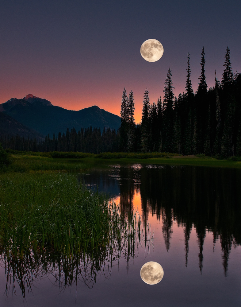
Here's a rework of an image I posted in the ESS gallery about a year ago. It's still im my gallery if you want to compare. This is my first effort at a composite. Honest, unflattering critiques welcome. Please check out the larger version. Thanks for looking.

Comments
17 commentsWonderful first effort at a composite - aren't they fun?
I like the way you've changed the crop and saturation/warmth from your original post.
You've also done some good things technically with the composite - the moon looks as if it could have been part of the original image (with respect to its edges) and you've flipped the reflection - which is critical.
To take it to the next level, you might consider modifying the reflected moon a little - it appears to be roughly the same sharpness/brightness/etc... as the moon in the sky. Check out the reflections of the trees and use them for hints - they're softer on the edges and even though the water is smooth, there's a hint of ripples. There's also less detail and they're probably a touch darker/less saturated. If you did something simple to the reflected moon - like add some transparency, slight gaussian blur, a touch of distortion, or even darken/burn, etc... it doesn't need a lot, but enough to make it 'reflected"
A point to consider when making composites are - do the elements go together/belong together... or are you going to put two things together that shouldn't be, purposefully, to create some intrigue.
This next comment completely depends on what your intent was here - there's some tension and intrigue in your image... caused by having a full moon in the same sky as the sun. The way the lunar cycle works, a full moon never shares the same sky/direction with the sun. When the moon rises with the sun in the AM it's going to be between 3/4 and new-moon (like your first post of this image). If you are trying to create some sense of mystery or intrigue, this works very well, on the other hand, if you were going for a moment which is "real", then it can't
From a technical perpsective - this is because the direction/angle of light will never be the same across each element of the composite - which you should have if you're going for "real", but you don't need if you're going for intrigue (soooo much to consider!!).
But half the fun with composites, is you can create something simply "just because"
Hope to see more - for a first one this is REALLY well done Bruce!
Karen-astute observations all around. I did consider applying some motion blur to the moon but it seems like most of the ripples are higher in the frame and I thought I might be able to get away without it.......I guess not
When I shot this I used a 3-stop reverse grad, so I have already darkened the reflection considerably, but I agree it needs more.......I just got lazy
Excellent critique. Thanks for taking the time.
My critique is shorter:
This is Photo Art. Anything goes. This works great for me - excellent colours, consept, and execution. I do, however , agree with blurring the reflected moon, as you did in the second post. A bit TOO much, possibly..
Sandy
I hope in all my wordiness the fact I really like your image and concept didn't get lost. My day job (the one that supports my photography addiction) is as an a-n-a-l-y-s-t (so I can be "anal" all too easily
This is photo-art, and I completely agree with what Sandy says - anything goes (look at Marc Ward's gallery and the elephant/meerkat composite with beach umbrellas!). Having said that, small tweaks, as picky as they sound, can take a good image to the next level.
Thanks for the repost and keep having fun with these - I can imagine you getting a lot of mileage out of that moon image.
Cheers,
Great first effort at compositing... many good suggestions given about blurs and brightness. It's nice to see a high number of views and comments here in the PA gallery. Bet ya can't just do one....
Sandy
Well deserved. You must be delighted!
Congrat on WP. The repost is fabulous.