Gallery: LandscapePosted August 20, 2012124 views13 comments
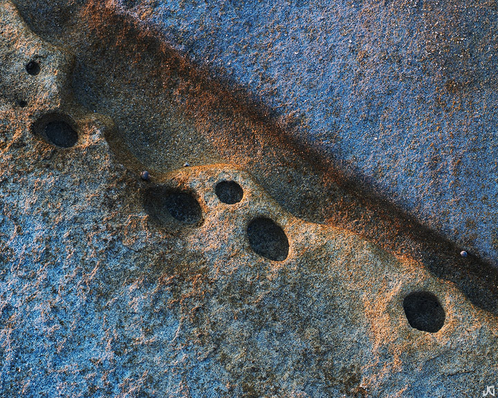
Seems like I find more little scenes when the skies are bare of clouds. The blues here may be a little too pronounced...too saturated?... but it is open shade.
Comments
13 comments
Comment posted by Mark Seaver on August 20, 2012 at 3:56 PM
I like the touch of light setting off those erosion pockets. The colors work well as does the strong diagonal line.
Registered on January 23, 2011, 1103 Posts, 17270 Comments
Comment posted by Dean Sauskojus on August 20, 2012 at 4:59 PM
Nice diagonal flow Jimmy. Definitely love the colors. Reminds me of the holes they drill in rock for dynamiting. Lovely image.
Registered on September 29, 2009, 137 Posts, 2659 Comments
Comment posted by Bill Chambers on August 20, 2012 at 5:13 PM
Nicely done Jimmy. Love the color combination and contrast here - texture too. Blues look good to me.
Registered on April 10, 2005, 753 Posts, 21216 Comments
Comment posted by Harley Goldman on August 20, 2012 at 6:23 PM
Looks really good to me, Jimmy. Fine colorful abstract. Well seen and executed.
Registered on November 19, 2003, 586 Posts, 11271 Comments
Comment posted by Morris McClung on August 20, 2012 at 10:11 PM
This is just put together so well, Jimmy! From concept to capture to presentation. A beautiful and fascinating abstract!
Registered on May 7, 2007, 670 Posts, 19650 Comments
Comment posted by Tony Kuyper on August 20, 2012 at 11:08 PM
Fun image, Jimmy. I think the color balance and degree of saturation look great . . . but how'd you get Harley's approval on those blues Little white rock near right edge maybe clone or darken. Just a thought.
Registered on November 1, 2003, 364 Posts, 22328 Comments
Comment posted by Jimmy Gekas on August 21, 2012 at 12:29 AM
That's a small sea creature, TK, with a purple-ish shell. I can easily tone that down a bit.
Registered on July 26, 2007, 244 Posts, 2807 Comments
Comment posted by Andreas Resch on August 21, 2012 at 1:53 AM
Great subject, colors and details - just like you always do it. Great shot.
Registered on November 14, 2007, 322 Posts, 6101 Comments
Comment posted by Stuart Williams on August 21, 2012 at 2:19 AM
simple and very effective. i like! the blues do appear a touch saturated to my eye - i'd like to see them slightly more muted.
Registered on December 7, 2007, 247 Posts, 4792 Comments
Comment posted by Nancy Lea Sandy on August 21, 2012 at 10:49 AM
I like the saturated blue, it adds depth and interest. Very nice abstract.
Registered on January 24, 2011, 576 Posts, 6942 Comments
Comment posted by Anil Rao on August 22, 2012 at 5:21 AM
Interesting subject matter and a very lovely composition.
Registered on November 15, 2003, 234 Posts, 4923 Comments
Comment posted by Stan Rose on August 22, 2012 at 5:54 PM
I like the blues...maybe crop a bit off the bottom for the diagonal.
Registered on September 15, 2005, 836 Posts, 17099 Comments
Comment posted by Navin Sarma on August 30, 2012 at 11:28 PM
love this. great balance and texture
Registered on July 17, 2011, 233 Posts, 1373 Comments

Comments
13 comments