Nature Photographers Network
This is the preserved archive of the original Nature Photographers Network. The community continues at naturephotographers.network.
Dark Arbor +Update
‹ PreviousLandscape GalleryNext ›

Dark Arbor +Update

by Alex Noriega

Gallery: LandscapePosted October 9, 2012522 views18 comments
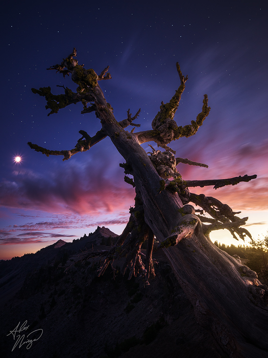
A different take on the old tree at Crater Lake. Best viewed on a dark background, so please view it at the Purchase Print link above. If you don't have Firefox, Safari, or the latest version of Chrome (which all correctly support color profiles), the shadows will probably look crushed.

Yep, that's the moon on the left, and no, this isn't a composite in the way you may be thinking.

The original exposure had many stars in it, but they were quite dim at f/11 and ISO 100. So, I cloned them all out and replaced them with stars from an exposure taken shortly after this at f/3.5, ISO 800, to make them pop. The moon was in the original exposure; it's untouched.

This is NOT sunset - the post-sunset sky color just lingered a VERY long time on this evening. It's rare, but the handful of times I've seen this happen, it has been at high elevation - so I believe that has to do with it. The colors were achieved through white balance, but are completely naturally pulled from the RAW. Obviously I took some artistic liberty with the glow in the LR, but that's just a localized exposure and white balance adjustment.

The light on the tree is partly natural from twilight, and partly from me light painting during the exposure with my headlamp.

The Purchase Print link shows an updated version with a darker LR sky. That's really as dark as it can go without looking unnaturally pulled back in that area. Additionally, I balanced the color and brightness of the light in the center of the tree to better match the top and bottom areas in that version.

Comments

18 comments
Comment posted by Yiming Hu on October 9, 2012 at 8:09 AM
Well done, Alex. A superb, dynamic image. The moon looks like a giant star :biggrin:

My only nit is that the bright area on the right is a bit too bright for my taste.
Registered on April 28, 2011, 38 Posts, 733 Comments
Comment posted by Alex Noriega on October 9, 2012 at 8:14 AM
I agree, Yiming - but when I toned down the brightness there, it just looked too "recovered" - pulled back unnaturally. Even though the original shot wasn't blown out there, I just couldn't pull any kind of good tone out of that area (as it was naturally very bright and somewhat devoid of color), so I went with the glowing look instead. I may need to go back and experiment some more with it to see if I can get it looking naturally less bright.
Registered on May 19, 2012, 80 Posts, 195 Comments
Comment posted by Gary Gosewisch on October 9, 2012 at 8:36 AM
A,
I like this transition of the sky better. It blends better than the other image you posted in my opinion. I also think the glow is a bit bright. Overall, this is an excellent image and I like your artistic liberty. You might have to give up your day job soon.
G
Registered on June 3, 2012, 17 Posts, 59 Comments
Comment posted by Alex Noriega on October 9, 2012 at 9:11 AM
Thanks for the input, G. I just updated the Purchase Print link with a version with a darker LR sky. That's really as dark as it can go without looking unnaturally pulled back. If print and licensing sales continue, hopefully I will be 100% on photography for work.. :smile:
Registered on May 19, 2012, 80 Posts, 195 Comments
Comment posted by Harry Lichtman on October 9, 2012 at 9:22 AM
I like the previous post a bit better. The moon star isn't working for me, but maybe will for others. Still a very interesting take on the tree and lighting.
Registered on September 17, 2010, 304 Posts, 3507 Comments
Comment posted by Alex Noriega on October 9, 2012 at 9:25 AM
It seems no matter what I do with moons, someone takes issue.. don't take this the wrong way, Harry, as I mean this in the nicest way possible: I honestly wonder what you (or anyone else that wants to chime in) would have done with the moon? That moon is straight out of the camera. This image was taken shortly after the first shot of mine from this evening, so that sort of moon handling would be the other option (shooting it wide open, at a longer focal length and lower exposure, to avoid the star - and cloning out the "original" moon to place that one in).
Registered on May 19, 2012, 80 Posts, 195 Comments
Comment posted by Harry Lichtman on October 9, 2012 at 11:14 AM
I would probably have presented the moon as you did on your previous shot, since that is more as it would have looked to some one viewing the scene. Just personal taste. When the sun shines through branches or peaks from the edge of a rock, a star is seen, so I would expect to see a sun star. Just haven't seen a moon star :biggrin:
Registered on September 17, 2010, 304 Posts, 3507 Comments
Comment posted by Daniel Rappaport on October 9, 2012 at 12:00 PM
Artistically I like this alot, but part of me has trouble with the apparently full moon so close to the apparently setting sun!
Registered on September 9, 2009, 294 Posts, 2006 Comments
Comment posted by Peter Coskun on October 9, 2012 at 2:37 PM
This is very nice Alex. Some may like the moon and some may not, but here I enjoy the sunstar shape you got of the moon. I like the comp as well. The only thing I would suggest is to darken the bright area on the right just a bit. Hard for me to tell if the repost addressed the issue, but on the other hand it casts a very nice glow onto the tree.
Registered on October 31, 2011, 170 Posts, 1240 Comments
Comment posted by Bill Chambers on October 9, 2012 at 3:22 PM
Beautiful Alex. I believe I like the other version (other composition) a bit better, but this still sings. Love the crisp moonstar.
Registered on April 10, 2005, 753 Posts, 21216 Comments
Comment posted by Alex Noriega on October 9, 2012 at 3:51 PM
I gotcha, Harry. It's funny, I had someone giving me a hard time about what they called the "montage moon" in the last shot. I wonder what they would have said about a moon star.. I did consider doing it that way again, but I liked the star, perhaps because I haven't gotten such a prominent one before from the moon. I didn't get a star in the other shot's original exposure, since it was a bit earlier in the evening and wasn't as long of an exposure with as dark of a sky. Indeed, the moonstar isn't realistic - but neither are sunstars from shooting at f/22 (if they're not right at a horizon line, tree branch, or cloud break) :smile:

Daniel, it was a fat crescent, but the 30-second exposure brought it out as a perfect circle/star. Nothing fishy going on here, I can assure you. :smile:

Peter, I think the repost (Purchase Print link for anyone else reading this) is as dark as I can go without getting down and dirty with some manual painting in that area.. the original RAW has very little tone/color there no matter what I do with exposure and white balance, and it just looks weird when it's darker with the glow on the tree. I'm not 100% happy with it either.

Bill, the other comp is the tried-and-true "classic" from that spot, or at least a variation of it. Trying to do something different here, plus the post-sunset color was incredible in this direction.. luckily, I have both shots. :smile:
Registered on May 19, 2012, 80 Posts, 195 Comments
Comment posted by Paul Marcellini on October 9, 2012 at 7:37 PM
Nice range of detail. The yellow does start to look dingy in the redo. I appreciate whats done but its just hard to believe the scene. Maybe the light painting is too natural so it looks like some composite instead of a painted tree at twilight. I'm sure the public will love it though. I'd be interested to see the original processed out so the blues aren't as deep in the sky perhaps.
Registered on November 27, 2007, 250 Posts, 2468 Comments
Comment posted by Alex Noriega on October 9, 2012 at 8:05 PM
Paul, I agree the re-do does look slightly dingy in the yellow, which is why I went with the brightness in the original. I'm still torn on which way would be better to go with it - all-out on the glow/brightness, or trying to pull it down without looking -too- dingy. I could also do some manual painting or cloning to bring it more in-line with the LL sky, but that's tougher than you'd think with the gradients and complicated edges surrounding the area.

I can't blame you for not believing the scene, but there is nothing fishy going on here with compositing or color. This is VERY close to the SOOC RAW in terms of color. I made ZERO specific color adjustments in PS - all that was done with overall WB during RAW processing. Twilight is a transitional period, and if you're lucky with conditions (as I have been on a handful of occasions), it looks neither like sunset, nor like night. I cloned out probably 50 stars in the sky to make way for the ones I pulled from a brighter exposure. It is possible to get stars in an exposure with these colors. That's the entire reason I shoot so much twilight stuff - it's a unique feel and I think it mostly gets overlooked. It's surreal, yeah - I would think that all the comments on my recent twilight images about how (un)believeable they are mean that I've succeeded at what I'm trying to do (specifically, NOT to capture an image that is firmly night or sunset).

Regarding the blues, do you want to see them less saturated, less vibrant, or do you want to see the overall white balance warmer? The transition from yellow to magenta/red to blue is precisely what I hope for when shooting these images - but I imagine you would like to see the blues toned down to make the LR yellow look more natural? Perhaps I'll try that..

(snarky comment not directed at you, Paul): I bet if I went warmer and toned down the blues, I'd have people (photojournalists, apparently) telling me it's unrealistic to have stars on a warm sky. (end snarkiness)

As far as the light painting, I'm not sure what effect my headlamp actually had at this stage, and how much of the light is twilight vs. the headlamp. I suspect it's much less the painting and much more the natural twilight, as in later exposures from the evening, the color of the headlamp was a ghastly green (it's a white LED one). At any rate, I would *never* make my light painting look less natural in order to make it obvious that it was painted, or to avoid the composite misconception (let me reiterate that this is a single frame, save for one to punch up the stars). With light painting, I try for softness, directionality, and subtlety, specifically so it *doesn't* look painted (which is what I think 98% of people miss when they blow out their subjects by drowning them in light head-on.)
Registered on May 19, 2012, 80 Posts, 195 Comments
Comment posted by Paul Marcellini on October 9, 2012 at 8:12 PM
The color is fine, I think it is mainly the amount of brightness in the sky and the deep blues simultaneous. I didn't read the processing as well and thought the blend was sky and stars. For my eye I was imagining less stars and a lighter blue to harmonize everything more. Living near Miami, I don't have the best point of reference for twilight.
Registered on November 27, 2007, 250 Posts, 2468 Comments
Comment posted by Alex Noriega on October 9, 2012 at 9:04 PM
Ah yes, twilight colors like this only happen far away from light pollution, and at high elevation, in my experience. Otherwise, you a) have everything turning tungsten orange as soon as the sun's down, b) don't have stars showing up if you're near the light pollution, and c) you need the elevation to be able to catch the light passing through lots of atmosphere, to have the clouds looking red/magenta this long after sunset.
Registered on May 19, 2012, 80 Posts, 195 Comments
Comment posted by Tony Kuyper on October 9, 2012 at 10:31 PM
Very nice comp. There seems to be some sort of dance happening here. Agree the bright area feels a bit too "daytime."
Registered on November 1, 2003, 364 Posts, 22328 Comments
Comment posted by Dietrich Gloger on October 10, 2012 at 1:12 PM
I enjoy it Alex. The processing well - as mentioned in my other comment - is perhaps not something I would go for, but the final result works great and I like your full disclosure. Generally, I notice your friendly approach to a "controversial" discussion this time again.
Keep it that way, I think it is a classy way of approaching the topic.
Registered on January 26, 2007, 360 Posts, 9876 Comments
Comment posted by Wick Smith on October 10, 2012 at 2:42 PM
A super image all around. Another great one! :toast:
Registered on June 12, 2009, 91 Posts, 379 Comments