Gallery: FloraPosted October 9, 201278 views11 comments
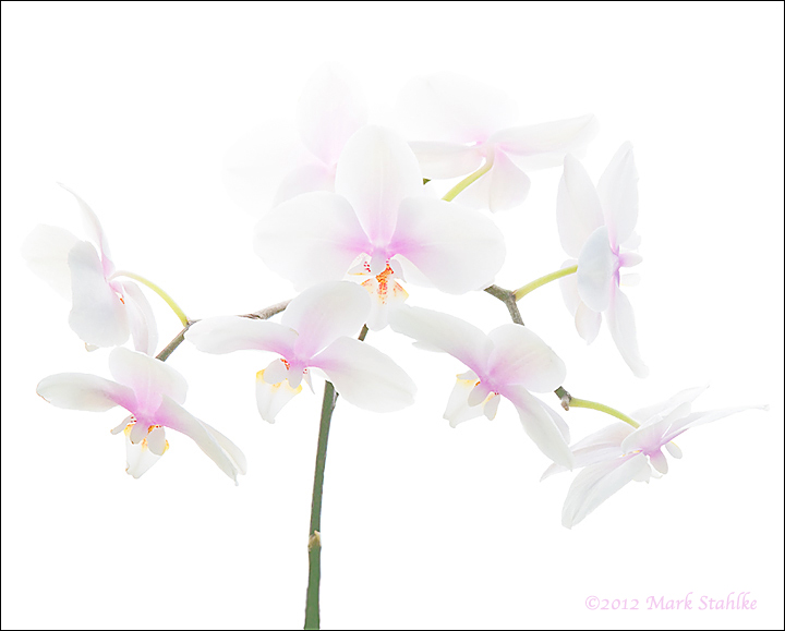
When I tell these orchids how beautiful they are, they blush. I used a wider angle of view this time. Is it too busy? Is the flower in the lower left too dark?
Comments
11 comments
Comment posted by Nathan Buck on October 9, 2012 at 11:20 AM
The high key look with hints of color works really well here Mark. No, it does not look too busy to me. No, the flower on the lower left is not too dark to me. I like it a lot.
Nathan
Registered on November 1, 2003, 1101 Posts, 13589 Comments
Comment posted by Mark Stahlke on October 9, 2012 at 1:22 PM
The more I stared at this the more I noticed a couple of small things that bothered me about this image. The dark bit of stem in the upper center and the darkness of the left lower flower. I brightened those areas and now I'm happier.
Subtlety in Photoshop is not my forte. One reason for doing this series is to challenge myself and improve my Photoshop skills.
Registered on November 1, 2003, 97 Posts, 782 Comments
Comment posted by Philip Hodgkins on October 9, 2012 at 5:05 PM
I agree with Nathan. One of the (many) flaws in Photoshop—well, not really a flaw, more a user trap, is a proclivity to go one step to far. Both your original and the repost are fine. Photoshop is all about images. Photography is all about light. If the light is doing what the light does, then the photographic requirements are met. Let it be after that.
Registered on July 24, 2006, 2741 Posts, 12349 Comments
Comment posted by Howard Cheek on October 9, 2012 at 6:53 PM
The repost is more uniform in lightness, but either way it's just a matter of taste IMO.
Very beautiful ethereal look, let there be light
Registered on July 24, 2008, 1201 Posts, 10758 Comments
Comment posted by Ramamohan Pai on October 9, 2012 at 7:55 PM
Mark - Honestly great call on the repost. A small thing it might be, but the repost makes a good photo really great. I have no nits here - both this and the Previous Version are from the top drawer !!.
Registered on November 1, 2003, 550 Posts, 9037 Comments
Comment posted by Gary Yeoh on October 11, 2012 at 12:22 AM
Mark:
Looks like angels emerging from the bright light. Very pretty and nicely presented. The repost is a little stronger.
Registered on September 1, 2009, 588 Posts, 8184 Comments
Comment posted by Bob&Charly Nelson on October 11, 2012 at 7:12 AM
Another beauty, very well handled.
Bob
Registered on October 27, 2005, 289 Posts, 4202 Comments
Comment posted by Albert Darmo on October 11, 2012 at 10:25 AM
Hi Mark Again marvelous control of light and color the repost with it's subtle changes is even better. great to see a perfectionist at work
Albert Darmo
Registered on November 25, 2008, 1386 Posts, 11978 Comments
Comment posted by Giuseppe Guadagno on October 12, 2012 at 10:56 AM
This is beautiful too. I love both versions and, for my taste, I prefer a third version with the upper part of the first and the lower part of the second.
Take care.
Registered on February 3, 2007, 827 Posts, 5052 Comments
Comment posted by Mark Stahlke on October 13, 2012 at 12:31 AM
Gary Yeoh wrote:
Looks like angels emerging from the bright light.
Oooh, angels. I like that. "A Flight of Angels" would be a much better title. I hope you don't mind if I borrow it.
Registered on November 1, 2003, 97 Posts, 782 Comments
Comment posted by Morris McClung on October 15, 2012 at 1:12 PM
An excellent high-key series you have been bringing. The repost has excellent balance in tones. Very well done!
Registered on May 7, 2007, 670 Posts, 19650 Comments

Comments
11 commentsNathan
Subtlety in Photoshop is not my forte. One reason for doing this series is to challenge myself and improve my Photoshop skills.
Very beautiful ethereal look, let there be light
Looks like angels emerging from the bright light. Very pretty and nicely presented. The repost is a little stronger.
Bob
Albert Darmo
Take care.