Passion #2
by Mark Stahlke
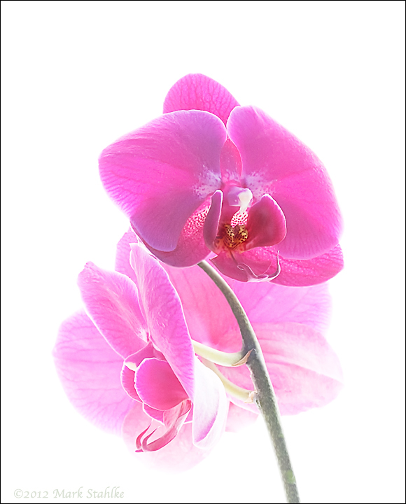
After looking at it dispassionately, I wasn't passionate about "Passion".
I went back to my raw files and pulled out this one. It had much less noise and the top petal looks right.
I probably skipped over this image because the stem continued its arc and exited the frame on the left. That had to go, I cloned it out. I think this is a stronger composition and a better image overall. It makes me wonder why I bothered with the first one.

Comments
4 commentsFor some reason this high key rendition resonates with me a lot with lighter colored petals more than dark colored ones like this. But that is more taste related.
A tiny crop from the top seems to put the emphasis more on the subject for me.
Bob
I agree with everything you said. Varieties like this with dark colors and poorly defined vein patterns aren't the best subjects for a high key treatment. I have one orchid that has an irregular dark red/purple pattern towards the edges of the petals and white in the center of them. I've shot that one three times and I just can't make it work. I think it has too much contrast.
I don't think "Passion" will get any better than this. I wanted to get it finished.
I have another orchid shot coming up that I like a lot. Sorry, you'll have to wait a day or two for that one.