Nature Photographers Network
This is the preserved archive of the original Nature Photographers Network. The community continues at naturephotographers.network.
Walking on Clouds
‹ PreviousLandscape GalleryNext ›

Walking on Clouds

by Brad Strong

Gallery: LandscapePosted October 19, 2012131 views8 comments
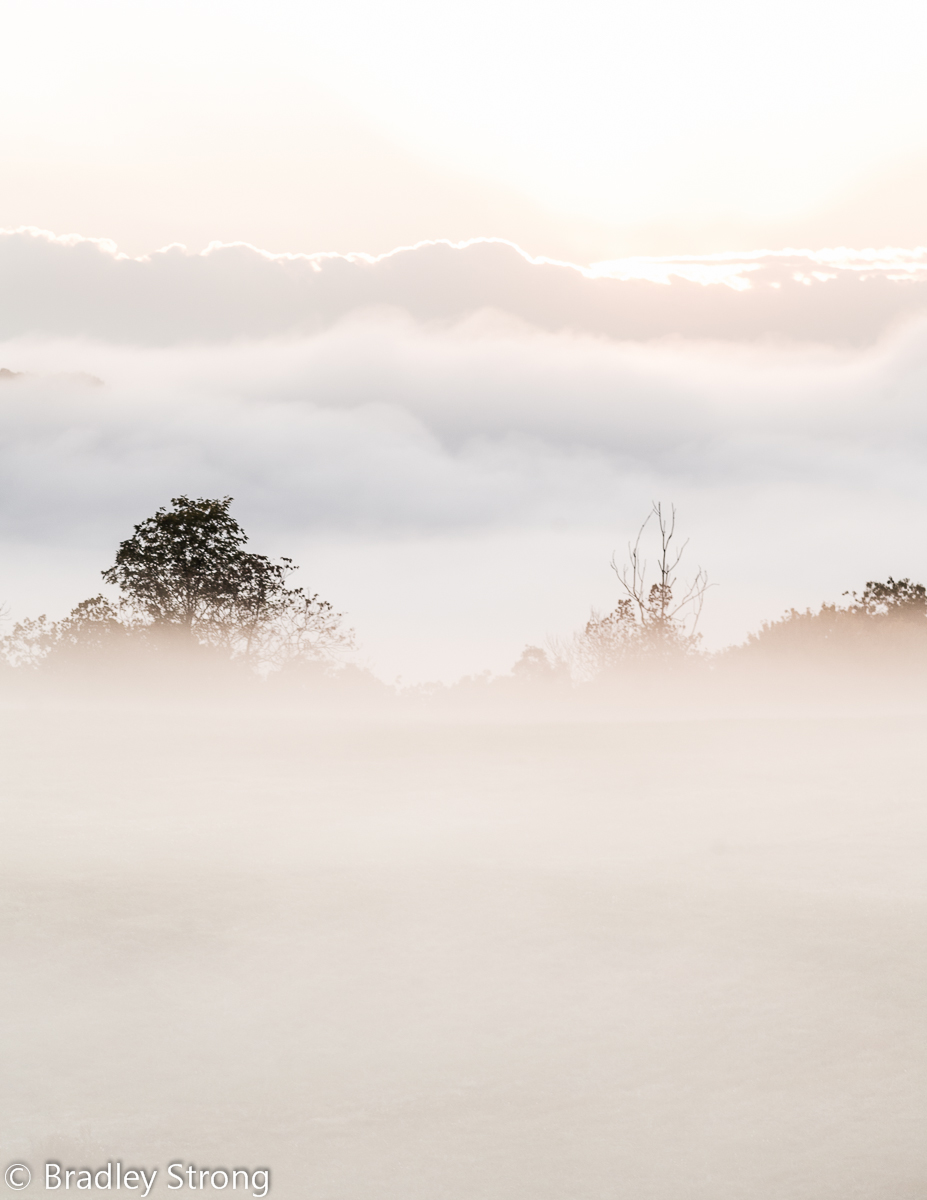
I took this this morning. The sky was pretty plain, but the ground fog was rockin.

I know this is technically overexposed, but I edited it to be high key. I purposely brightened the foreground fog a bit to add to the feel of walking on clouds.

All comments welcome as always, but I'm really wondering if this works as a high key image and if you like it or not. If you don't like it, please say why.

Canon 5D, 200L Prime, 1/80S, f5.0, iso 250, hand held, single image, LR4.2, cropped to 8.5 x 11.

Comments

8 comments
Comment posted by R.Bill Moser on October 19, 2012 at 11:41 AM
This one doesn't do much for me. The mood sure was quiet interesting but the comp doesn't really work well for me.Sorry! I would crop the top of the image since there's not much going on.
Registered on January 29, 2010, 285 Posts, 4281 Comments
Comment posted by Richard Siggins on October 19, 2012 at 12:56 PM
I agree with cropping off the top. I like the ground fog but would have liked to have seen more of the trees. If we could only control the weather :wink:
Registered on October 11, 2007, 115 Posts, 223 Comments
Comment posted by John&Patty Benway on October 19, 2012 at 3:54 PM
Sorry Brad, this just don't work for me, your only option is to crop out the blown sky, that may help.
John
Registered on May 12, 2006, 626 Posts, 8700 Comments
Comment posted by Brad Strong on October 19, 2012 at 4:40 PM
Thanks for the comments. I'm not surprised at the responses. There's something I like about it, but... I tried cropping it as suggested, but without the bright line on top of the clouds, it doesn't work at all.

Here's a landscape version of the correct exposure.
Registered on October 1, 2012, 43 Posts, 302 Comments
Comment posted by John&Patty Benway on October 19, 2012 at 4:53 PM
Very nice, this scene has come to life. Beautifully done Brad.
John
Registered on May 12, 2006, 626 Posts, 8700 Comments
Comment posted by Scott Smorra on October 19, 2012 at 7:57 PM
I definitely prefer the repost Brad. Nice mood and atmosphere.
Registered on November 2, 2009, 161 Posts, 2143 Comments
Comment posted by Brian Schrayer on October 19, 2012 at 8:07 PM
I would say that I definitely prefer the repost. Beyond just the fact that it looks more realistic (realizing that admittedly that wasn't your goal) I prefer the moodiness of the repost image as well as the warm / cool contrast going on. To me it just conveys the feeling of the scene much better.
Registered on May 28, 2004, 114 Posts, 2890 Comments
Comment posted by Stan Rose on October 21, 2012 at 12:30 PM
This is a classic example of drama trumping subtlety. I like the repost landscape, but i actually slightly prefer the original because it's quirkier, and i like the odder shots :wink:
I think there are some minor edits that might make it more appealing though--first id use a black border (it's an option when you post to either use black/white, or another web color); one reason the repost is more visually appealing is that it is dark on a white bg, light photos get lost in the white bg. I like the top bright line, but maybe some tweaks in curves or similar could get it to stand out a bit more, as it does in the repost. Finally, i'd crop for thirds (crop a bit off the bottom)--this shot is perfect for thirds. I like the subtle textures and mood--cool stuff! :smile:
Registered on September 15, 2005, 836 Posts, 17099 Comments