Nature Photographers Network
This is the preserved archive of the original Nature Photographers Network. The community continues at naturephotographers.network.
Coyote Rising (+repost)
‹ PreviousLandscape GalleryNext ›

Coyote Rising (+repost)

by Doug Koepsel

Gallery: LandscapePosted October 23, 2012293 views13 comments
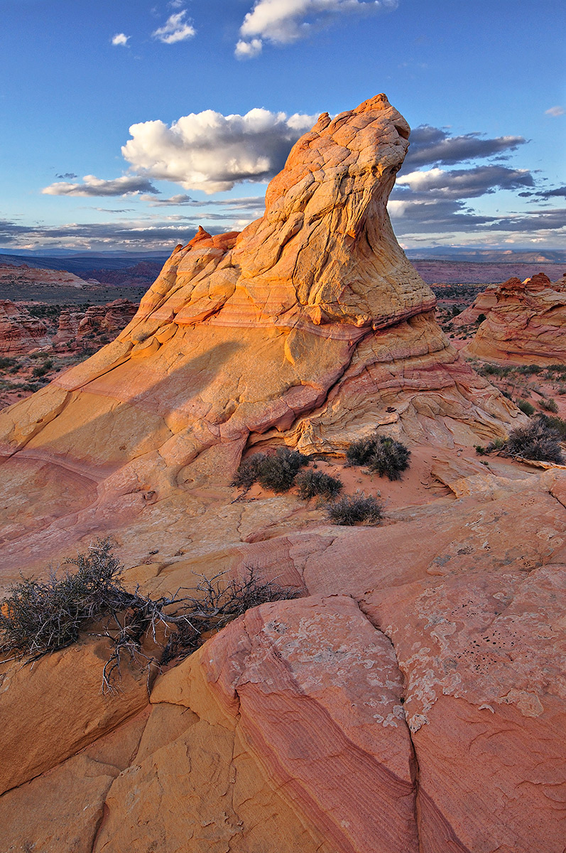
This past weekend, a permit to Coyote Buttes enabled a friend and me to see the colorful sandstone upon the Paria Plateau. This is a hand blend of 3 images- two for dof and one for the sky exposure.
Nikon D90, 16-35 f/4 @ f/6.7, ISO 200.

Any feedback on the processing and blending is welcome.

(larger image provided)

Comments

13 comments
Comment posted by Peter Coskun on October 24, 2012 at 12:40 AM
Really nice light on this Doug and good balance in the comp. Really gotta get myself a new vehicle to enjoy these places off the beaten path.
Registered on October 31, 2011, 170 Posts, 1240 Comments
Comment posted by Tom Hilton on October 24, 2012 at 6:17 AM
Spectacular...
I love it,
plus great processing!
no suggestions from me...

:toast:
Registered on September 19, 2011, 68 Posts, 668 Comments
Comment posted by John Mumaw on October 24, 2012 at 6:24 AM
Real nice light and a refreshingly original scene from the area. Sharp from fore to aft. Well done, Doug!
Registered on September 9, 2005, 62 Posts, 2289 Comments
Comment posted by Paul Breitkreuz on October 24, 2012 at 9:13 AM
Truly a new look to this often shot area, Doug. Excellent capture all the way around. :cool:
Registered on February 25, 2006, 525 Posts, 8448 Comments
Comment posted by Mark Seaver on October 24, 2012 at 9:39 AM
Beautiful! Great job of isolating this pillar. The lighting is wonderful. The blend looks perfect.
Registered on January 23, 2011, 1103 Posts, 17270 Comments
Comment posted by Bill Chambers on October 24, 2012 at 11:52 AM
WOW, this really pops Doug!! There is so much depth to this, and I really like that it seems to be an original scene, at least to me. Beautiful light, and wonderful processing. This is very impressive.
:toast: :toast: :toast:
Registered on April 10, 2005, 753 Posts, 21216 Comments
Comment posted by Morris McClung on October 24, 2012 at 1:19 PM
Good comp, interesting main subject, nice work on the blend, and natural color.
A minor nit would be the sky pulls a little more attention than the rock. Maybe pull down the brightness there and pull up the brightness on the rock to make it stand out more. You could even lose the top cloud.

Still, a strong image and the shadow falling across the main rock is a great addtional element of interest.
Registered on May 7, 2007, 670 Posts, 19650 Comments
Comment posted by John Mumaw on October 24, 2012 at 6:18 PM
"You could even lose the top cloud."

Hey, that's a terrific idea, Doug. Check it out...
Registered on September 9, 2005, 62 Posts, 2289 Comments
Comment posted by Nick Bristol on October 24, 2012 at 7:39 PM
This is fantastic! Great light and the colors are beautiful. Really like this comp too, Doug. Excellent work. :toast:
Edit: Yes, it does work without the upper cloud.
Nick Bristol
Lone Rock, WI
Registered on February 1, 2004, 752 Posts, 14140 Comments
Comment posted by Doug Koepsel on October 25, 2012 at 9:27 AM
Thank you for the good feedback. I will work on darkening the cloud brightness and upper cloud removal, and make a repost later today.
Registered on April 1, 2010, 196 Posts, 1592 Comments
Comment posted by Doug Koepsel on October 25, 2012 at 11:29 AM
Here is a repost with the upper clouds removed, brighter spots of main cloud darkened, and a slight crop from the bottom. I do like the upper cloud removed. Your thoughts, especially about the bottom crop?
Registered on April 1, 2010, 196 Posts, 1592 Comments
Comment posted by Nancy Lea Sandy on October 25, 2012 at 12:27 PM
The re-post with the top cloud gone and the bottom crop is a much stronger image, IMO, but the original was purty durn good, too. Wonderful colors and stunning dof. Truly excellent.
Registered on January 24, 2011, 576 Posts, 6942 Comments
Comment posted by Jim Greenwood on October 26, 2012 at 12:02 AM
Nicely seen and composed! The title is very fitting. I like the clouds (or lack of them) in the repost, but I don't agree about the crop from the bottom.
Registered on November 9, 2003, 229 Posts, 1523 Comments