Nature Photographers Network
This is the preserved archive of the original Nature Photographers Network. The community continues at naturephotographers.network.
Layers & Lines w/Repost
‹ PreviousLandscape GalleryNext ›

Layers & Lines w/Repost

by Scott Fricke

Gallery: LandscapePosted November 4, 2012979 views14 comments
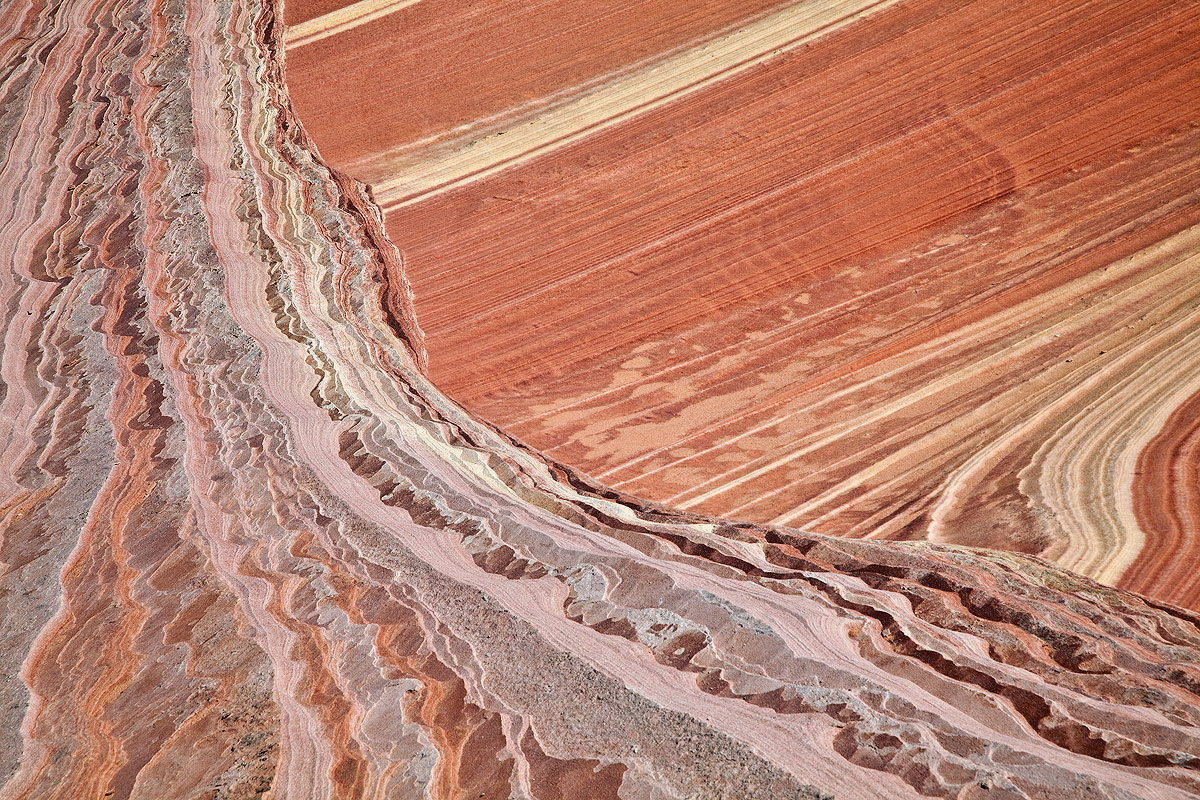
This is the crest of a sandstone 'wave', the sandstone in the upper right curls up underneath the sandstone on the lower left until they intersect. Any critiques would be greatly appreciated! Please see larger image for more detail.

North Coyote Buttes, Arizona

Canon 5DII, 24-105L @ 105, f22, 1/30, ISO100

Comments

14 comments
Comment posted by Nancy Lea Sandy on November 4, 2012 at 5:09 PM
Wow, this is an outstanding 'desert' abstract. The tension between the two patterns is wonderful and you've balanced this image to perfection. The colors are very natural here but I think you could get away with a boost in saturation to create even more impact. Very well seen and captured.
Registered on January 24, 2011, 576 Posts, 6942 Comments
Comment posted by Peter Coskun on November 4, 2012 at 6:33 PM
This is great Scott, love the converging lines and different patterns and textures found throughout the image. I may try to apply for a permit here, but we shall see. Great work!
Registered on October 31, 2011, 170 Posts, 1240 Comments
Comment posted by David Chauvin on November 4, 2012 at 6:44 PM
The competing lines are interesting,,,,,,nicely composed and executed. :cool:
Registered on August 5, 2004, 1007 Posts, 5595 Comments
Comment posted by Peter Cross on November 4, 2012 at 7:25 PM
I can't quite figure out the geological relationship here, but who cares? This is a great image, Scott. The colors, composition, and exposure are just right. If I didn't know this was a real thing, I'd think it was an invention made is PS. Great sense of motion even though there is none. I don't think I've seen an image like this before. Well seen.
Registered on April 3, 2010, 271 Posts, 1342 Comments
Comment posted by Navin Sarma on November 4, 2012 at 7:33 PM
awesome perpendicular lines (one that leads to the exact corner) and i like the sweep across the frame. very realistic colors and an amazing geological shape. very cool shot!
Registered on July 17, 2011, 233 Posts, 1373 Comments
Comment posted by Jim Greenwood on November 4, 2012 at 8:49 PM
This is fantastically deceptive ... a definitive sandstone abstract. Well seen and composed.
Registered on November 9, 2003, 229 Posts, 1523 Comments
Comment posted by Tony Kuyper on November 4, 2012 at 9:14 PM
Really like the lines and textures too. Could maybe see darkening it a bit and adding some contrast. Is this focus blended? The sharpness looks really good.
Registered on November 1, 2003, 364 Posts, 22328 Comments
Comment posted by Doug Koepsel on November 4, 2012 at 9:28 PM
Quite an intersection of different lines and layers that keeps me looking. A consideration may be a slight increase in contrast.
Registered on April 1, 2010, 196 Posts, 1592 Comments
Comment posted by Scott Fricke on November 4, 2012 at 10:30 PM
Thank you everybody for your comments so far, seems pretty unanimous about increasing the contrast so here is a reworked image (also decreased the brightness a tad), how is this?

Tony, no it is not a focus blend, just one image at f22. I did take 3 shots to do a focus blend, but it seemed sharp enough with just this image.
Registered on January 19, 2007, 133 Posts, 1448 Comments
Comment posted by Stan Rose on November 4, 2012 at 10:41 PM
Interesting abstract, Scott--love the intersecting lines. Repost is a huge improvement. :wavey:
Registered on September 15, 2005, 836 Posts, 17099 Comments
Comment posted by Scott Smorra on November 5, 2012 at 12:43 AM
The repost looks great to me Scott. The lines here are fascinating.
Registered on November 2, 2009, 161 Posts, 2143 Comments
Comment posted by R.Bill Moser on November 5, 2012 at 11:59 AM
Great abstract. I'd prefer the repost.
Registered on January 29, 2010, 285 Posts, 4281 Comments
Comment posted by Morris McClung on November 5, 2012 at 4:46 PM
This makes for one fine abstract. Nice use of lines, color, and tones.
Registered on May 7, 2007, 670 Posts, 19650 Comments
Comment posted by John Mumaw on November 5, 2012 at 8:06 PM
Yeah, the reposted version has much more pop. Good eye for seeing this one!
Registered on September 9, 2005, 62 Posts, 2289 Comments