Nature Photographers Network
This is the preserved archive of the original Nature Photographers Network. The community continues at naturephotographers.network.
West Fork Autumn
‹ PreviousLandscape GalleryNext ›

West Fork Autumn

by Bob Miller

Gallery: LandscapePosted November 14, 2012284 views5 comments
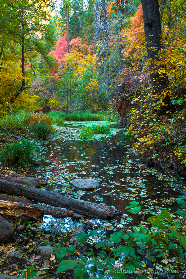
This image I first bypassed when editing due to the wind blur but have had second thoughts. What do you think? Is the blur too noticable? This was one that I came away with while shooting with Chikku and Peter Oct. 21st.

1.3 second exposure @ f14,tripod.

Comments

5 comments
Comment posted by Lon Overacker on November 14, 2012 at 2:26 PM
Bob,

Wow, what a kaleidoscope of color! The salmon/red in the bg really draws the eye thru the frame. It's really hard to see the ill effects of any wind, especially at these sizes; even the large version looks good and so I would say no, the blur from wind isn't that noticeable.

Always a tough call and a personal choice one, but to me the colors are a bit saturated (coming from someone who just posted a richly saturated image!) I say that mostly because of the green grasses in the middle of the frame are a little too green which provides a clue as to the overall saturation. It's not much mind you, so again, personal choice.

I like the comp and framing. There's quite a lot going on, but definitely keeps the eye engaged and moving throughout the frame.

Lon
Registered on November 24, 2006, 521 Posts, 19147 Comments
Comment posted by Robert Dayton on November 14, 2012 at 2:46 PM
The wind blur doesn't bother me. Great color. Beautiful, Bob!
Registered on November 11, 2008, 281 Posts, 3958 Comments
Comment posted by Tony Kuyper on November 14, 2012 at 9:52 PM
I like the top 2/3's best. Lots of color and interest in this area. Greens are maybe a bit oversaturated.
Registered on November 1, 2003, 364 Posts, 22328 Comments
Comment posted by Peter Coskun on November 15, 2012 at 1:23 AM
You found a pretty nice color palette here Bob. The wind did not effect this, at least not anything that would make me toss this. A few suggestions may be to shave off just a bit of the bottom, and then a crop from the top just below where the sky seems visible. I also may tone down the greens particularly in the mid-ground as they seem to pop a bit too much. I'm wondering if you have a horizontal comp without the foreground foliage and logs as most of my interest is above that with the colors.
Registered on October 31, 2011, 170 Posts, 1240 Comments
Comment posted by Stan Rose on November 16, 2012 at 7:41 PM
Huh--i have a totally different take than the others. I think the colors look fine, but i actually prefer the bottom 2/3. There seems to be quite a bit of blur up top, while the bottom is sharp. i really like the mix of colors and elements in the bottom. The dead stuff and bg sky/cliffs just dont mix well with the color up top, which is too bad cause obviously those colors are what is grabbing the crowd reaction.
And the blur below just gets in the way of the main beauty of this image, which is all the crazy detail and array of colors. So in short--yeah the blur is too much. Accept and move on... :wink:
Registered on September 15, 2005, 836 Posts, 17099 Comments