Nature Photographers Network
This is the preserved archive of the original Nature Photographers Network. The community continues at naturephotographers.network.
Yosemite Moments #7+RP
‹ PreviousLandscape GalleryNext ›

Yosemite Moments #7+RP

by Lon Overacker

Gallery: LandscapePosted November 27, 2012399 views23 comments
Thank you so much for the comments and discussions on the previous image. Quite a variety of responses and I appreciate the honest comments.

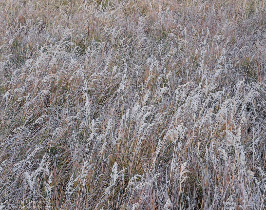
Same morning, same meadow although these grasses aren't within the same previous frame, I moved around a bit in the meadow looking for a comp. In fact this whole trip one of my goals was to capture the grasses of Yosemite's meadows. I was quite obsessed with it actually. This is the first of a number of grass images - you might tire of them, but I hope not.

These intimate images of the grasses might not be everyone's cup of tea and of course the details are usually lost in these small web versions, so make sure to view large - even though these are saved at Q6.

Thanks for coming along for the ride and for all your comments and critiques. Always appreciated.

4x5, Nikkor 210mm, V50, f/45 @10s
no fog. :wink:

Thanks!
Lon

ps. going to include a vertical. preference?

Comments

23 comments
Comment posted by Lon Overacker on November 27, 2012 at 2:20 PM
Here's the vertical. Any preference?
Registered on November 24, 2006, 521 Posts, 19147 Comments
Comment posted by Nathan Apodaca on November 27, 2012 at 2:49 PM
I know I keep saying it, but I really love these grasses... For some reason, I prefer the vertical. I like the comp, hint of colors, and how each detail can be distinguished among the blades. I would be obsessed with them too if I were there! Nice image... :smile:
Registered on November 16, 2011, 67 Posts, 1127 Comments
Comment posted by Harley Goldman on November 27, 2012 at 3:14 PM
Beautiful intimate scene. I think I would prefer the horizontal with the processing of the vertical. The horizontal looks a little dark and not as much pop as the vertical.
Registered on November 19, 2003, 586 Posts, 11271 Comments
Comment posted by John&Patty Benway on November 27, 2012 at 3:23 PM
Lon, this is just beautiful, I love this kind of scene, and you have really impressed me, love the composition, the colors within the grasses, just perfect in every way. Think I prefer the vertical, but either way gorgeous. By the way, I wont tire of them.
John
Registered on May 12, 2006, 626 Posts, 8700 Comments
Comment posted by Russell Colletta on November 27, 2012 at 4:06 PM
Thanks for the journey Lon. Personally, I love these studies of nature's details, the stuff we often overlook. The lines at the edges and corners are are done well. That has to be by design. Nicely done, and either orientation works equally well for me.
Registered on October 31, 2009, 114 Posts, 1008 Comments
Comment posted by Rudy Ruberti on November 27, 2012 at 6:38 PM
Lon,
I actually prefer the additional depth in the vertical. Either way, it's a pleasure to view and the light and color create a strong image. Nicely done.
Registered on October 28, 2008, 179 Posts, 1875 Comments
Comment posted by Eva McDermott on November 27, 2012 at 8:18 PM
I like the vertical best Lon. Fantastic detail and light. Only suggestion would be to bring the highlights up a bit but beautiful none-the-less. I love scenes like this.
Registered on January 4, 2009, 1015 Posts, 13229 Comments
Comment posted by Chris Chamberlain on November 27, 2012 at 8:26 PM
I don't know? I think this is all about the details, so I'm tempted to say the horizontal. It is a tighter shot, so the detail would show off better. But, I like the vertical just a well? So there, does that help? Either way, it's simple and subtle, and delicately beautiful!

CHris
Registered on March 13, 2007, 500 Posts, 8365 Comments
Comment posted by Nick Bristol on November 27, 2012 at 8:38 PM
This is wonderful! Not an easy image to make work so well, but you sure did it here! I enjoy the feel and the detail is just amazing. Both of these are really nice so hard to pick one over the other. After looking at both for awhile I do prefer the vert one. It is not so much the comp as it is the color and feel of that one. Beautiful work Lon. :smile:

Nick Bristol
Lone Rock, WI
Registered on February 1, 2004, 752 Posts, 14140 Comments
Comment posted by Nick Palmieri on November 27, 2012 at 8:41 PM
Love the horizontal. Love the details and subtle colors in the grasses.
Registered on September 1, 2011, 35 Posts, 748 Comments
Comment posted by Youssef Ismail on November 27, 2012 at 9:10 PM
Either one works for me Lon. I am just amazed at how you pull off these photos with such cohesiveness. I try at grass and fail nearly every time. I might post one or more of mine but don't expect much when I do get to them.
Registered on November 1, 2003, 474 Posts, 5555 Comments
Comment posted by Lon Overacker on November 27, 2012 at 9:34 PM
Thanks for the comments folks! Good call on the processing for the H version Harley, now that I look and compare, the H version is a little flat, confirmed by Nick and possibly by others. Here's a reworked version; a little more brightness, color, and highlights - not much, but I think an improvement. Thanks for the feedback!

Youssef - I'm looking forward to your renditions. I think you have a knack for coming up with images and results that I know I wouldn't have seen or crafted. And trust me, I wondered around in a Harley daze these mornings seeking out these comps and you're right, they're not easy to find - in fact I would say near impossible - it's more like snap and pray most of the time. :wink:

Thanks everyone!
Registered on November 24, 2006, 521 Posts, 19147 Comments
Comment posted by Vance Gese on November 27, 2012 at 9:41 PM
Simply stunning, Lon. Isolating a meaningful composition amongst the chaos of this meadow must have taken some time but your efforts were well rewarded, especially with the vertical image. In the vertical, the grouping of grasses in the upper right hand corner provides a subtle counterpoint to the grasses in the foreground, and to me works a bit better. Love the soft glow of the frost covered seed pods or fronds. Can only imagine the detail and nuances in an actual print that are lost on the web. Think you were very successful in your quest.
Registered on November 13, 2008, 298 Posts, 6629 Comments
Comment posted by Harley Goldman on November 27, 2012 at 9:50 PM
The repost is a huge improvement!! Love it! :toast:
Registered on November 19, 2003, 586 Posts, 11271 Comments
Comment posted by Youssef Ismail on November 27, 2012 at 10:19 PM
A Harley Daze?? :razz: Funny that I know what you are talking about.
Registered on November 1, 2003, 474 Posts, 5555 Comments
Comment posted by Nancy Lea Sandy on November 27, 2012 at 10:30 PM
I like all the versions but will give a slight edge to the horizontal re-post. I love the simplicity and intimacy and can't wait for more images of grass.
Registered on January 24, 2011, 576 Posts, 6942 Comments
Comment posted by scott lanz on November 27, 2012 at 11:06 PM
I like them both, but I prefer the horizontal, Lon. I may be just influenced by being able to see the larger version, which is great, but I like seeing all that nice detail up close. Exceptional image.
Registered on November 14, 2003, 840 Posts, 12902 Comments
Comment posted by Morris McClung on November 27, 2012 at 11:41 PM
Well, now the rework makes it harder to choose, Lon. :biggrin:
Both work well for me with the vertical still getting the slight nod, but that's just me liking the format more, so don't necessarily listen to me. :wink:
Registered on May 7, 2007, 670 Posts, 19650 Comments
Comment posted by Stan Rose on November 28, 2012 at 12:07 AM
Nice solid texture shot, Lon--works for me! :smile:
Registered on September 15, 2005, 836 Posts, 17099 Comments
Comment posted by Peter Richter on November 28, 2012 at 11:25 AM
Lon, the subtle colors and textures are fascinating to me.

In the vertical version you are leading me from bottom to top or from near to distance, thereby adding a kind of appealing tension. I think I might prefer this one.

Peter
Registered on November 10, 2010, 218 Posts, 2723 Comments
Comment posted by Bill Chambers on November 28, 2012 at 12:31 PM
These are my kind of images! Of the two, I prefer the vertical - I like the way the BG kind of thins out on top - nice transition.
Registered on April 10, 2005, 753 Posts, 21216 Comments
Comment posted by Barry Vangrov on November 28, 2012 at 5:08 PM
Wonderful image Lon. Horizontal is best (you could even crop down a bit from the top) I haven't seen the previous image but I love this one.
Registered on September 1, 2009, 148 Posts, 749 Comments
Comment posted by Dan Baumbach on November 28, 2012 at 10:07 PM
Very nice, Lon. Love the detail. I think I like the vertical one better.

- Dan
Registered on November 1, 2003, 473 Posts, 7980 Comments