Gallery: LandscapePosted December 8, 2012346 views14 comments
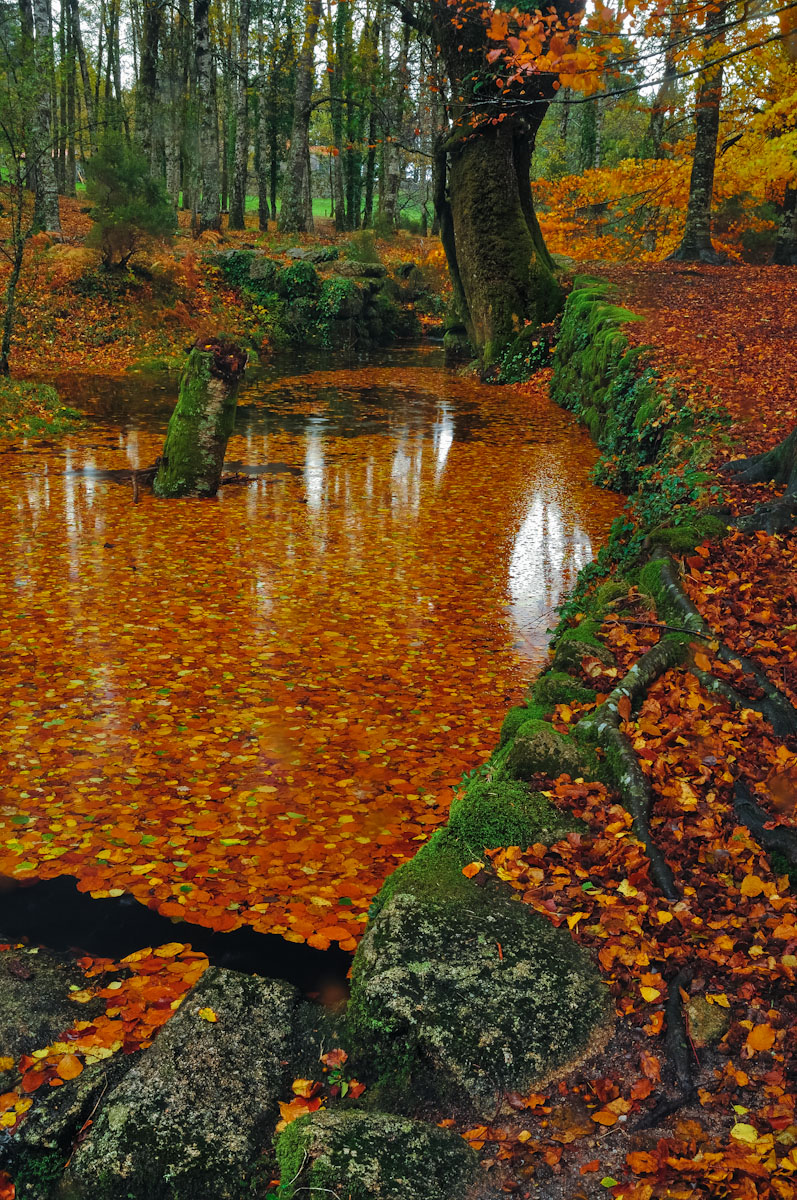
After a shower, I tried to capture the atmosphere of this beautiful location Autumn,
I appreciate all your views ....
Comments
14 comments
Comment posted by Rick Turner on December 8, 2012 at 12:16 PM
This is one great capture of fall leaves
A bit over saturated in my opinion
Registered on February 18, 2012, 534 Posts, 2755 Comments
Comment posted by Raied Alani on December 8, 2012 at 12:29 PM
Like: Fall colors, reflection of the tree on the water through the leaves
Dislike: Saturation, the tree is trimmed.
I like it.
Registered on December 3, 2012, 27 Posts, 90 Comments
Comment posted by John Clulow on December 8, 2012 at 12:59 PM
I love this composition, and as Rick Turner observed, I would like it even more a little bit less saturated.
If you do this kind of thing in ACR, you might want to try settings like clarity +35. vibrane +18 and saturation -15 or something like that to see how that strikes you. Because I think this composition has sufficient strength to carry it without color given the lines and reflectance. So I would suggest starting from that and adding color back in because this is really more about form than color, to me at least.
Registered on November 1, 2012, 155 Posts, 1079 Comments
Comment posted by Lon Overacker on December 8, 2012 at 2:04 PM
Nuno,
What I find fascinating here is the pool of leaves. The mirror-like reflection almost looks like acrylic - or something like that, a sheet of glass; which is fascinating because you would think the leaves would provide some texture, breaking up the surface of the water a little bit.
Personally, I don't find the saturation too high. Normally greens might go neon when saturation is stretched too far. I think the diffused light is working here to make the colors richer.
The only suggestion I have is a slight crop from the top to eliminate most of the patches of sky. The image is all about the pool and foreground, so the top is expendable, IMHO.
Lon
Registered on November 24, 2006, 521 Posts, 19147 Comments
Comment posted by Nancy Lea Sandy on December 8, 2012 at 2:52 PM
What a lovely scene. In particular, I like the unassuming stump in the middle of the pond and the strong anchor in the large tree trunk on the pond edge. The colors are rich and vibrant but not beyond belief. Beautiful image
Registered on January 24, 2011, 576 Posts, 6942 Comments
Comment posted by Justin Richardson on December 8, 2012 at 3:16 PM
Agreed on the sturation..just seems a bit much. I like the thought behind it. Did you try a polarizer here?
Registered on November 18, 2012, 28 Posts, 134 Comments
Comment posted by Nuno Eira on December 8, 2012 at 4:06 PM
Yes I used the polarizer and the colors practically came out so strong camera but personally I think they are a bit more saturated.
Here is another less Vibrance and Saturation.
Registered on October 8, 2012, 37 Posts, 99 Comments
Comment posted by Daniel Rappaport on December 8, 2012 at 5:26 PM
I like the second a bit better - the colors are still plenty intense but not over the top. The combination of leaves/color in the water with the unbroken surface reflection is striking. Don't think I've ever seen anything like it.
Registered on September 9, 2009, 294 Posts, 2006 Comments
Comment posted by Rick Turner on December 8, 2012 at 6:34 PM
2nd post is more to my liking
I look to the field of grass in upper left to find the correct balance
Beauty is in the eye of the beholder~great capture
Registered on February 18, 2012, 534 Posts, 2755 Comments
Comment posted by Robert Dayton on December 8, 2012 at 7:02 PM
A very special and unique autumn scenic. Wonderfully composed with great colors,
textures, and tree lines. You also had optimal lighting. I do agree with others thatt
the saturation maybe a little strong; nevertheless, this lovely
Registered on November 11, 2008, 281 Posts, 3958 Comments
Comment posted by Tony Kuyper on December 9, 2012 at 8:53 AM
That's very special, Nuno. The dark values feel a bit underexposed, but that does make for some rich color.
Registered on November 1, 2003, 364 Posts, 22328 Comments
Comment posted by Russell Colletta on December 9, 2012 at 10:46 AM
The saturated first post didn't bother me as much as the bright reflections in the water Nuno, I actually like the bottom third of this as an image by itself. This is a great find and beautiful spot.
Registered on October 31, 2009, 114 Posts, 1008 Comments
Comment posted by Morris McClung on December 9, 2012 at 5:02 PM
Marvelous color. Very vibrant.
Registered on May 7, 2007, 670 Posts, 19650 Comments
Comment posted by Vlad Sadovsky on December 9, 2012 at 6:48 PM
Well done, the second version is more appealing to me. Composition works well as is, though for my taste a little bit more of patchwork of roots on the right would complement the mirror of the pond. Deep rich colors, beautiful location indeed.
Registered on November 12, 2010, 48 Posts, 358 Comments

Comments
14 commentsA bit over saturated in my opinion
Dislike: Saturation, the tree is trimmed.
I like it.
If you do this kind of thing in ACR, you might want to try settings like clarity +35. vibrane +18 and saturation -15 or something like that to see how that strikes you. Because I think this composition has sufficient strength to carry it without color given the lines and reflectance. So I would suggest starting from that and adding color back in because this is really more about form than color, to me at least.
What I find fascinating here is the pool of leaves. The mirror-like reflection almost looks like acrylic - or something like that, a sheet of glass; which is fascinating because you would think the leaves would provide some texture, breaking up the surface of the water a little bit.
Personally, I don't find the saturation too high. Normally greens might go neon when saturation is stretched too far. I think the diffused light is working here to make the colors richer.
The only suggestion I have is a slight crop from the top to eliminate most of the patches of sky. The image is all about the pool and foreground, so the top is expendable, IMHO.
Lon
Here is another less Vibrance and Saturation.
I look to the field of grass in upper left to find the correct balance
Beauty is in the eye of the beholder~great capture
textures, and tree lines. You also had optimal lighting. I do agree with others thatt
the saturation maybe a little strong; nevertheless, this lovely