Yosemite Moments#12+rp
by Lon Overacker
First of all, thank you again for your comments on my previous image. I have a couple more of that wonderful little garden.
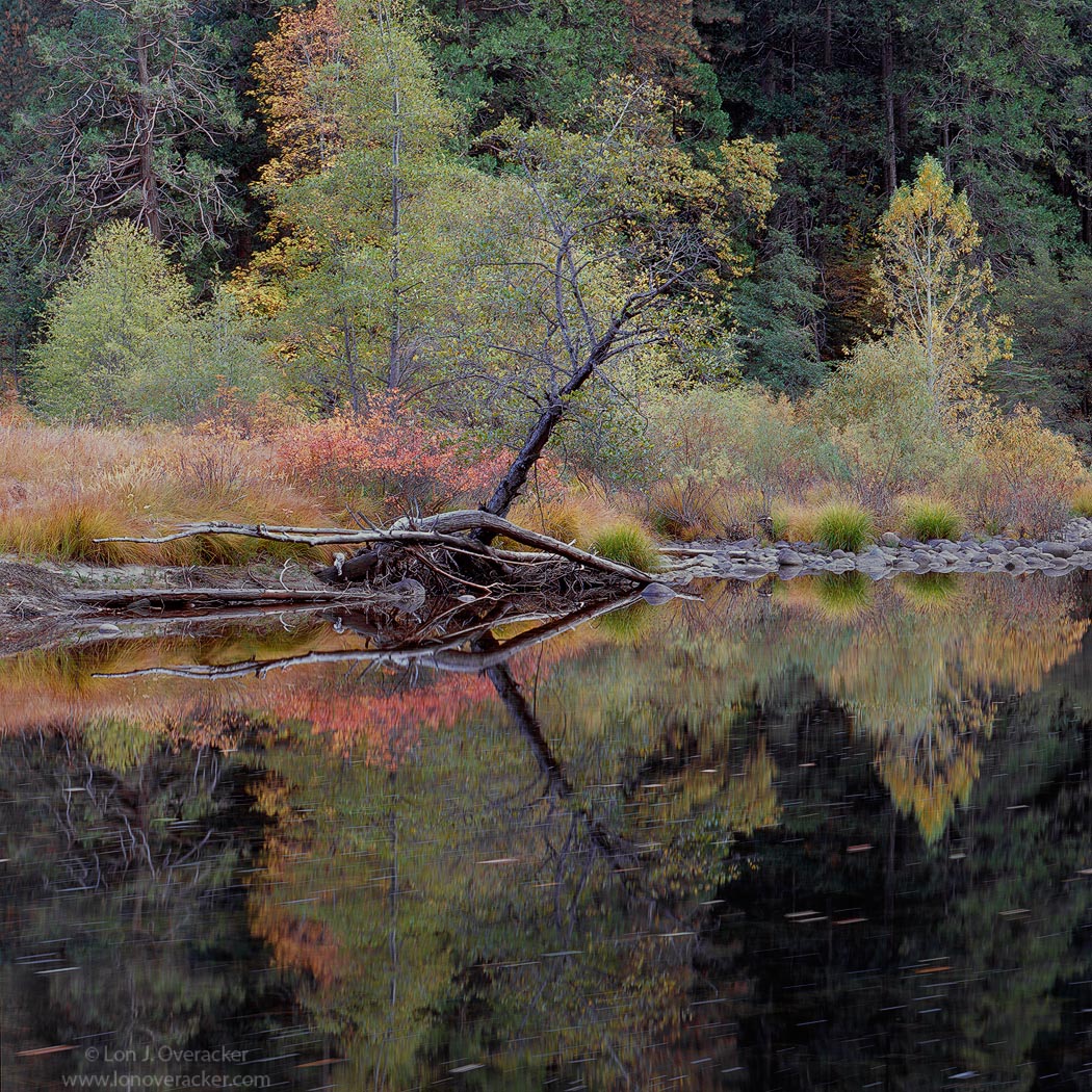
Moving on down the river to Valley View. I cropped to a square because there wasn't anything interesting, just more pines up top. Nothing ground breaking here, just the next in the series. I'm getting a little antsy waiting to share a few more that I'm really happy with. For now, just the next one in order.
Any comments, critiques or suggestions of course welcome.
Chamonix 4x5, 300mm, V100f f/32 @2s, 2stop grad
Thanks!
Lon

Comments
28 commentsEither way, it's a delicate, and beautiful scene. I think you got more leaves floating by than I did, that I like. I would agree with Harley, that the top needs enough room to include the closer tree tops.
Chris
Beautiful
John
Is the full frame a better comp, or do you like the square?
Thanks folks!
Nicely done, sir,
--P
For me, one thing going on here is a kind of "arrow" effect pointing from left to right, which I feel is a natural way for us in the West ot view things. That occurs due to the forms but also because they have sort of a rim lighting with the yellows and especially the reds over toward the right side.
I like the square aspect ratio for this, especially since you provided an alternate version to compare it too. However, it does appear to me to be in need of a levels adjustment -- or something -- it just seems a bit too sombre for the potential of the brightness of the yellows and reds to pop; sort of feels like they are being held back. So I guess I would suggest jacking up the overall luminance a bit -- bringing in the right edge of the histogram a bit in levels.
The other thing is that since you have the center line between reflection and reality where it is, almost in the center of the frame, my eye seems to be seeing a "tilted horizon" effect even though I realize it's not. I'm just wondering if a perspective crop or a transform could be employed to flatten out the junction at the water's edge so that it would seem more level. To the extent that it is perceived as not level, it doesn't do anything but distract from the otherwise extradinory landscape and its reflection.
mood of serenity for me.
Nick Bristol
Lone Rock, WI
I like the square crop more, because it puts me closer into the scene, but Preston has a good point: I think more room at the top would be nice, so I think I go for the vertical, but cropped a bit from the top.
My response to the crop was similar to others, too tight maybe at the top. I much prefer the second full size letting the main FG area blend easily towards the BG area.
Not sure if it might be the highlights or the contrast/sat that I would tweak a bit. I'm so bad in that arena and it takes me forever to get things right. I'm probably way off base as I did not think I saw any other comments on that point at all.
Maybe gamma?....
- Dan