Nature Photographers Network
This is the preserved archive of the original Nature Photographers Network. The community continues at naturephotographers.network.
Nashville Star WC565
‹ PreviousWeekly Challenge GalleryNext ›

Nashville Star WC565

by John Clulow

Gallery: Weekly ChallengePosted December 17, 201276 views9 comments
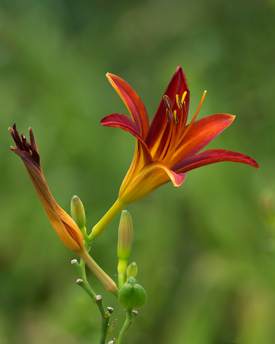
From Chicago Botanic Garden in mid July. Hemerocallis.
K-5, Tamron 90mm f/2.8 at f/4, 1/125s, ISO 100 tripod
An impression from 13 focus stack processed with CS5 Automate>Photomerge. This technique was selected to attempt to provide sharpness in the subject with as much creaminess in the bokeh background as possible.

Comments

9 comments
Comment posted by Philip Hodgkins on December 17, 2012 at 7:52 PM
A much better focus stack than the previous. Good detail and focus and a lovely blurred, complementing BG. The spent blossom provides balance, and as such is necessary. I just wish it weren't quite so spent.
Registered on July 24, 2006, 2741 Posts, 12349 Comments
Comment posted by John Clulow on December 17, 2012 at 8:21 PM
Thanks again for your comment on this one, Phil. Same CS5 method and I may retry this one too in zerene.

And while I do understand where you are coming from in the wish the spent blossom weren't so spent, I just want to say that I actually looked around quite a while, and it was a rather breezy morning, I recall. And why I picked this one is precisely what you didn't like about it; i.e., the spent blossom. I am somewhat into the consequent cognitive processes that occur in interpretation of images, whereas, I suspect you are more focused upon the image quality itself. And I think you would probably agree that there is room for a fairly broad range of thought along this continuum. Different strokes for different folks.

I think I'll try a repost on this one too using zerene, just to satisfy my own scientific curiosity.
Registered on November 1, 2012, 155 Posts, 1079 Comments
Comment posted by Carolyn Derstine on December 17, 2012 at 8:23 PM
"This technique was selected to attempt to provide sharpness in the subject with as much creaminess in the bokeh background as possible."

Wow, John, I'd say you achieved your goal! Very nice details throughout the flower, coupled with a wonderful soft background. Great rich colors and a nice comp--wish for a tiny bit more room on left side though. Great job processing this! Works well for our theme. :smile:
Registered on February 16, 2011, 610 Posts, 3684 Comments
Comment posted by Richard Ditch on December 18, 2012 at 12:05 AM
Pleasing colors and good fit for the theme. Nice detail and good depth from the focus stacking. If possible I'd trade a little off tghe top for a touch more room on the left.
Registered on November 1, 2003, 1031 Posts, 12705 Comments
Comment posted by John Clulow on December 18, 2012 at 5:04 AM
Thanks for the suggestions, Carolyn and Richard. Since the original was uncropped, I had to create some additional background to try your suggestions, and I think the diagonals are improved and the placement of the main blossom as well. What I've learned from this is to leave additional room around the perimeter next time to provide more flexibility in cropping. Also the square format is probably something I should consider more. :smile:
Registered on November 1, 2012, 155 Posts, 1079 Comments
Comment posted by Richard Ditch on December 18, 2012 at 10:45 AM
I prefer the repost. A square crop if fine for me if the subject looks best that way. The new version has a more pleasing balance for me than the original.
Registered on November 1, 2003, 1031 Posts, 12705 Comments
Comment posted by Carolyn Derstine on December 18, 2012 at 11:47 AM
I prefer the repost, John! Feels more balanced comp-wise. To be extra nit-picky (or helpful, I hope) I would suggest trying to balance the amount of space on the left with the amount on the right--almost too much extra room on the left now. :rolleyes: Very minor issue but something to keep in mind for future images, especially those with a more square crop. :smile:
Registered on February 16, 2011, 610 Posts, 3684 Comments
Comment posted by Nick Bristol on December 18, 2012 at 9:02 PM
John, This is really nice. I agree with Carolyn that just a little less room on the left side of the repost would be perfect... :smile: A wonderful image however I look at it.

Nick Bristol
Lone Rock, WI
Registered on February 1, 2004, 752 Posts, 14140 Comments
Comment posted by John Clulow on December 23, 2012 at 7:03 AM
Thanks Richard, Carolyn and Nick. I agree with the need to equate border spaces and will definitely keep that in mind next time. I learned a lot from posting this from the many great observations and suggestions, and I'm sure I will be able to carry this forward in future work.
Registered on November 1, 2012, 155 Posts, 1079 Comments