Gallery: Weekly ChallengePosted December 18, 2012246 views5 comments
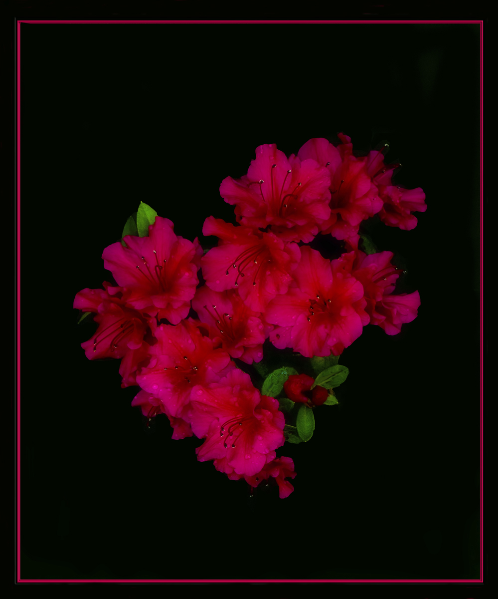
Since we are apparently not considering black as a colour, this is 100% red and green.
D300s
105mm
Subject dist: 1.26m
1/50 sec, f/14
Mode: Av
Metering: Spot
Exp comp: -2/3
ISO: 400
White balance: Auto
Comments
5 comments
Comment posted by Carolyn Derstine on December 18, 2012 at 12:24 PM
Sandy, this is stunning! I love the dark, soft flower images with a black background and matching frame that you have posted periodically. The vivid colors are so eye-catching and show up wonderfully against the black BG. The matching color pinstripe frame puts a very nice finishing touch to these images. I also really like the soft processing. Well done!
Registered on February 16, 2011, 610 Posts, 3684 Comments
Comment posted by John Clulow on December 18, 2012 at 6:04 PM
I agree with the ajective "stunning": The wonderful dynamic range within the red monochrome portion are better seen in the large view. While the red seems initially dominant, it was then I noticed that it would not be what it was, visually, without the green, and the green's luminance.
Without the green, and the nice balance and compositional location of the green elements, the red would not be the same red. It's showing red and green not as two separate things, but rather as a correlative pair; like hot and cold, up and down; Red and Green.
What is in the junction of red and green? Yellow.
Registered on November 1, 2012, 155 Posts, 1079 Comments
Comment posted by Allen Brooks on December 19, 2012 at 1:02 AM
Another winner. A beautiful composition.
Registered on July 27, 2011, 262 Posts, 2597 Comments
Comment posted by Lucy VanSwearingen on December 19, 2012 at 10:38 AM
I really do like this! The cluster is such a beautiful shape. And I do believe, that some photos, like this one and some of my flowers, are enhanced by the framing. Love your frame! The little bit of red outline just snaps the whole photo into place for me! I might crop a tad more off the top....and make sure you sign it! It's a winner.
The glamour glow looks good on this one! Sometimes, too sharp a focus can detract from the mood!
Registered on May 23, 2009, 800 Posts, 2042 Comments
Comment posted by scott lanz on December 23, 2012 at 1:16 PM
Very dramatic with eye-popping colors, Sandy. Beautiful arrangement of the holiday.
Registered on November 14, 2003, 840 Posts, 12902 Comments


Comments
5 commentsWithout the green, and the nice balance and compositional location of the green elements, the red would not be the same red. It's showing red and green not as two separate things, but rather as a correlative pair; like hot and cold, up and down; Red and Green.
What is in the junction of red and green? Yellow.
The glamour glow looks good on this one! Sometimes, too sharp a focus can detract from the mood!