Lifeless + Repost
by Youssef Ismail
Thanks for the feed back on my previous photo, though sparse. I understand it is not a Wow of an image. I really do feel its charm is in the close up impressions of brush strokes that are completely lost in the web presentation.
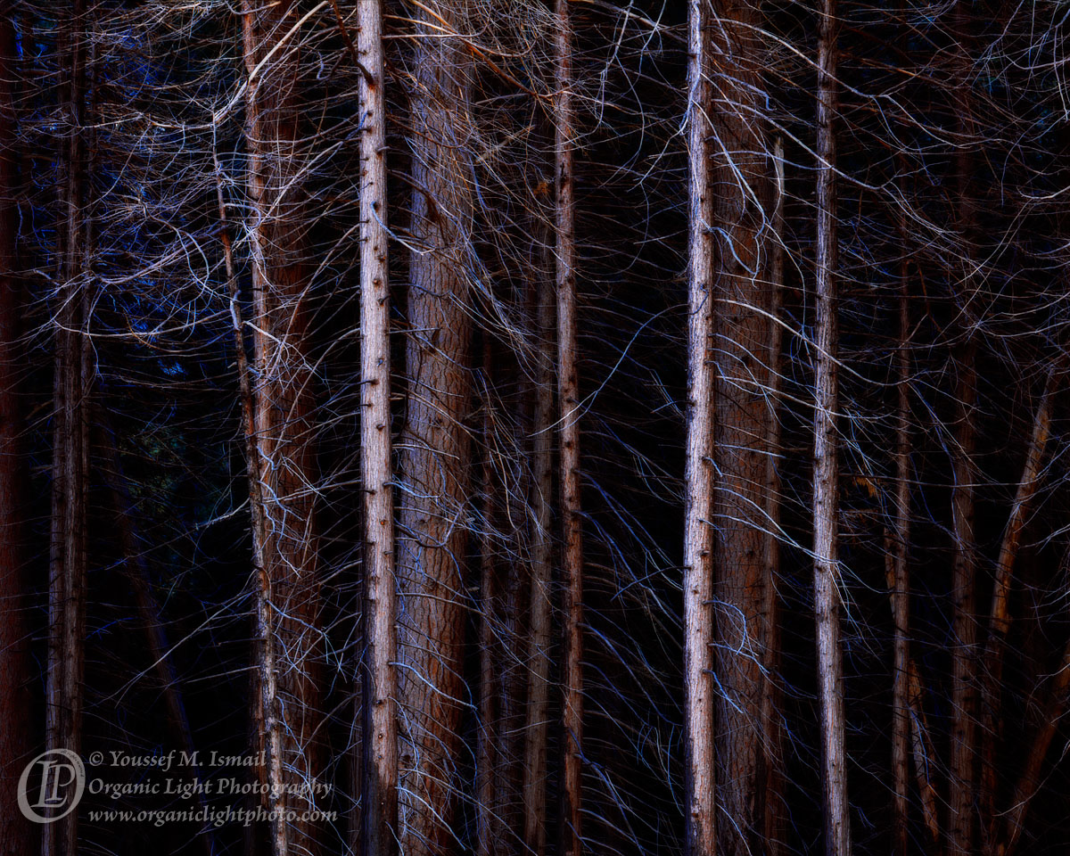
My second day in Yosemite on this trip was half over. For Lon it was over, we needed to get back to camp and he needed to break down and get on the road. Preston had already left. We made one last stop on Southside Drive at a meadow that has a great view of Yosemite Falls. I am not sure what this meadow is called, from a USGS map I gather that it is the east end of Leidig Meadow, or possibly it could be called Sentinel Meadow. In any case on the south side of the road is a stand of burned out trees, that has always piqued my interest but never had much luck with. We stopped and tried again as the light was nice.
When I first scanned this and began its development I was not happy with it. It was still missing that something that made me want to photograph these trees in the first place. So I started to play a bit. I added an Orton layer with minimal blurring. and then increased the contrast some and removed some of the red overall in the image using curves. Suddenly the stark lifeless nature of the trees that I liked so much appeared. And I present it now.
This is also a crop of the original frame, 1/3 of the bottom was removed. I like the full frame as well but this crop has more of an impact.
4x5, Nikkor 300mm, f22, 1 sec, Fuji Provia 100F
Your feedback appreciated.

Comments
13 comments- Dan
Ah ha! So this is what you came away with! This is awesome! I have one from here which will be my final image from the trip. ;-(
This is a great example and I think a great use of the Orton technique. I don't really see a "glow" here per se, and I think that's an under utilized feature of the technique. What it does, and you can only really tell by turning the layer off and on, is that for chaotic forest scenes like this, the Orton effect actually helps simplify and reduce some of that random chaos and I think makes for a stronger forest image. This is a great example of this, the result in a very powerful and engaging image.
My only nit, and this fits within the personal choice and interpretation category, is that I think the blues are too much for my taste, especially in the bg left, almost purple. I know the bg being in deep shade, etc. etc. but to me, even the some of the branches are a little too much. Then again, it is clearly a matter of personal preference and artistic license. I'm fine with that. No matter, still a wonderful image Youssef! Gonna make mine look like a snapshot.
Lon
I agree with Lon about the blue on the left. Otherwise it is great.
Personally I like the blue as it lends to the lifeless quality of these dead trees. But that ULC was overly blue. Here is the repost.
Alrighty now......the second one looks better.
Nick Bristol
Lone Rock, WI
Lon