Shadowy Creosote 2
by Eirini Pajak
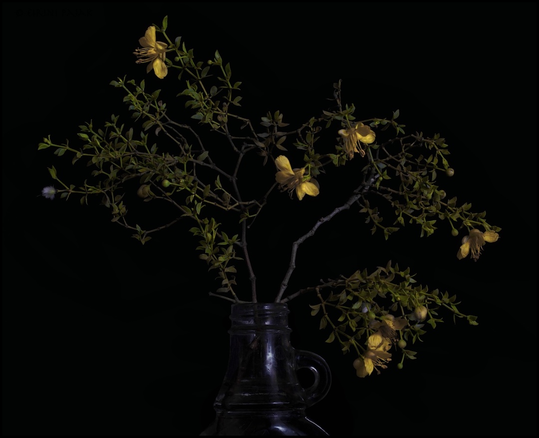
My husband at first said about this one: " It's ok for what it is"...then later said he thinks it is too boring composition & color-wise. I love his honesty!
But you don't however have to squint as hard to see this one!:)
I really appreciate all the helpful comments I have been getting. I use Apple Aperture for processing & I play around with all sorts of graphs and sliders that say "luminance" but I am not exactly sure what I am doing but I enjoy it anyhow.
Stack of 6, Zerene

Comments
8 commentsThis is interesting to me - especially in the larger version. I think part of my problem is in not knowing where to rest my eye at in the composition. Maybe that's not necessary though. These may just need to be seen larger. I like the image as posted.
My favorite of these has been the Citrus in Vase and I think that's because there was some place my eye rested naturally.
pat
I also think that the choice of ordinary, common place glass jugs and jars as vases is an important factor in generating this feeling in that again, the object itself is implied by specular highlights and consists mostly of negative space.
HollyMorris