Gallery: LandscapePosted January 2, 201362 views4 comments
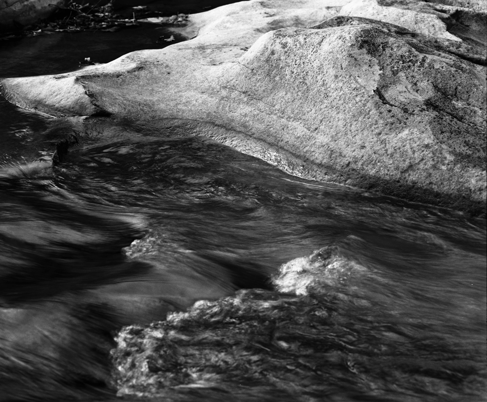
Fallingwater falls Richland Creek Wilderness Arkansas
Mamiya RB67
Fomapan 100 at EI 50
Rodinal 1:50
Comments
4 comments
Comment posted by Nick Palmieri on January 3, 2013 at 11:42 AM
I like the effect on the water. I am thinking this may stronger if you cropped about 50% of the rock from the top. I think it is a little bright at the top and really doesn't add much interest. TFS
Registered on September 1, 2011, 35 Posts, 748 Comments
Comment posted by Brian Schrayer on January 3, 2013 at 9:12 PM
I like the tonal contrast in this image as well as the contrasting textures in the water and in the rocks. I visited this area for the first time this past fall but the water levels were quite low. Your image reminds me to look beyond the obvious and to look for details.
Registered on May 28, 2004, 114 Posts, 2890 Comments
Comment posted by Lon Overacker on January 4, 2013 at 5:54 PM
Kris,
I think the b&w works very well with this scene. I'm having a hard time with the composition though. I'm torn between the rock and the water. My suggestion might be a crop down from the top to remove the brighter rock - but then I wish the water was sharper up front. So my eye kind of goes back and forth. The only other option would be a crop from the bottom to remove the oof water, but keeping the semi-swirling pool and the rock. If you did that I would recommend burning down the brighter rock up top.
Thanks for posting.
Lon
Registered on November 24, 2006, 521 Posts, 19147 Comments
Comment posted by Kris Johnson on January 4, 2013 at 8:54 PM
Posting my black and white images continues to be gamble. I never know what the contrast or brightness will be. The top are actually is darker. I agree it needs to be burned in. I will also look into the various cropping ideas suggested. Thanks for the comments.
Brian, this image was taken in the middle of the fall. The water levels were quite low which I actually prefer because things like this can be seen.
Registered on March 6, 2010, 26 Posts, 299 Comments

Comments
4 commentsI think the b&w works very well with this scene. I'm having a hard time with the composition though. I'm torn between the rock and the water. My suggestion might be a crop down from the top to remove the brighter rock - but then I wish the water was sharper up front. So my eye kind of goes back and forth. The only other option would be a crop from the bottom to remove the oof water, but keeping the semi-swirling pool and the rock. If you did that I would recommend burning down the brighter rock up top.
Thanks for posting.
Lon
Brian, this image was taken in the middle of the fall. The water levels were quite low which I actually prefer because things like this can be seen.