Nature Photographers Network
This is the preserved archive of the original Nature Photographers Network. The community continues at naturephotographers.network.
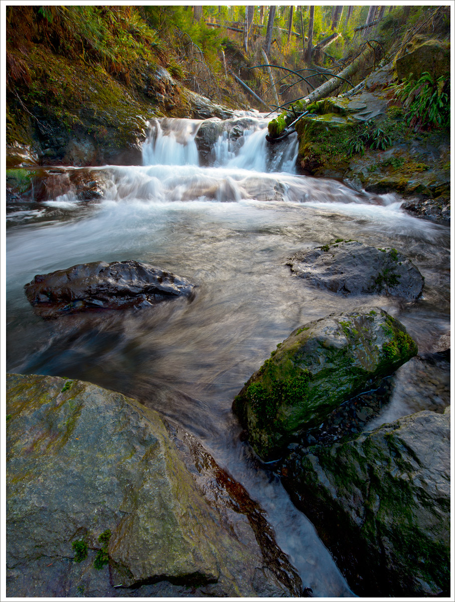
Little Cascade
‹ PreviousLandscape GalleryNext ›

Little Cascade

by Ken Smith

Gallery: LandscapePosted January 4, 2013276 views10 comments
Day trip exploring Quinault Lake area with a couple photo buddies..

Nikon 800e with 14-24mm

Edit: Joe, this was taken Sun Dec 30th '12...thanks for the comment.

One Shot...no layers...no blending. F20

Second Version: (Lon and others...thanks for comments) Agree with over-saturated...which is esp true when compared to the first... I like the wider view. That version to be worked on ...maybe in a month or two when I have fresh eyes.

Comments

10 comments
Comment posted by Joseph Campisi on January 5, 2013 at 9:14 AM
Nice soft light hitting the falls Ken, and I like your perspective here. The large version puts me there. What day did you guys go out here?
Registered on November 24, 2008, 304 Posts, 3211 Comments
Comment posted by Steve Zimic on January 5, 2013 at 9:19 AM
Lovely scene and nice comp with the extreme wide angle. I might crop a bit off the bottom to just above that dark shadow on the left rock.
Registered on November 23, 2003, 176 Posts, 727 Comments
Comment posted by David E Lester on January 5, 2013 at 1:39 PM
Love the color and depth, was this one shot or a merge of photos? :toast:
Registered on March 24, 2010, 155 Posts, 793 Comments
Comment posted by Ken Smith on January 5, 2013 at 3:58 PM
Here is a photomerge of two portraits...cropped square.... I like it a bit more.

Registered on September 5, 2008, 449 Posts, 2444 Comments
Comment posted by John Mumaw on January 5, 2013 at 4:43 PM
The difference is like night & day. The foreground heavy composition and the so-so light did not appeal to me at all, but the second version is quite wonderful!
Registered on September 9, 2005, 62 Posts, 2289 Comments
Comment posted by Lon Overacker on January 5, 2013 at 5:03 PM
Ken,

Looks like a great location. Interesting in that I was thinking the foreground rocks were a little too domineering and I was thinking this would look real nice as a square crop. then I come back, and there it is! The comp works very well, nicely balanced and it also looks like you took care of a slight rotation that I though existed in the first version.

The only suggestion I have is that it appears that the saturation was also increased; most notably the water has quite a bit of cyan and the green/yellow up top is nearly fluorescence. I think backing off the saturation a wee bit and this will be a wonderful image. Again, the square crop is the ticket here.

Lon
Registered on November 24, 2006, 521 Posts, 19147 Comments
Comment posted by Nick Palmieri on January 5, 2013 at 10:19 PM
Like the original post. The re-post appears a bit oversaturated. Nice leading lines and nice effect on the water.
Registered on September 1, 2011, 35 Posts, 748 Comments
Comment posted by R.Bill Moser on January 6, 2013 at 6:43 AM
The repost is a huge improvement. The square crop really work well here. My only nit is that the second version is a bit over-saturated for my taste.
Registered on January 29, 2010, 285 Posts, 4281 Comments
Comment posted by Morris McClung on January 6, 2013 at 4:23 PM
Nice comp, lovely scene. I also like the nice light on it and the natural and engaging colors. Very well done.
Registered on May 7, 2007, 670 Posts, 19650 Comments
Comment posted by Tony Kuyper on January 6, 2013 at 10:18 PM
I used to live near there. Don't ever remember seeing this though. First one is nice but light in the second one is better IMO.
Registered on November 1, 2003, 364 Posts, 22328 Comments