Nature Photographers Network
This is the preserved archive of the original Nature Photographers Network. The community continues at naturephotographers.network.
Desert Baccharis + RP
‹ PreviousFlora GalleryNext ›

Desert Baccharis + RP

by Eirini Pajak

Gallery: FloraPosted January 9, 201366 views11 comments
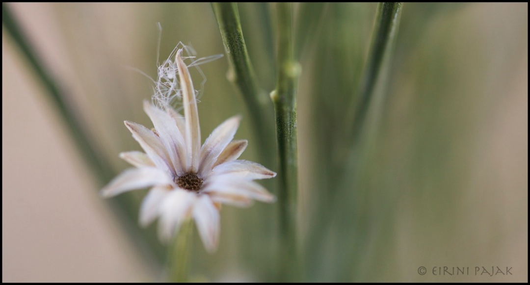
These are the little seed heads that look a lot like little flowers.

This is the composition that felt right to me but I would imagine it will get some negative responses...which I am very open to hearing:)

Is it too unconventional?

Comments

11 comments
Comment posted by Balan Vinod on January 9, 2013 at 12:37 PM
Eirini...it appeals to me, one may call it conventional or unconventional. This looks like a piece of art, and as a person who is always attempting unconventional images, I appreciate it ..well done. The color palette is killing too ..one tad bit of contrast would be better for me.

Balan Vinod
Registered on March 20, 2006, 889 Posts, 2312 Comments
Comment posted by Carolyn Derstine on January 9, 2013 at 1:12 PM
Great image, Eirini! No, I don't think it is too unconventional although unconventional can also be very creative too sometimes. :smile: I like your soft focus with the center and some of the fluff being in focus. The neutral colors are calming and appealing to me. Great comp too with the pano layout. Nice find!
Registered on February 16, 2011, 610 Posts, 3684 Comments
Comment posted by Mark Seaver on January 9, 2013 at 5:54 PM
I like the comp and the overall color, but would like a little more dof in the seed head. I would also be tempted to blur that sharp area of stem.
Registered on January 23, 2011, 1103 Posts, 17270 Comments
Comment posted by Philip Hodgkins on January 9, 2013 at 7:16 PM
I like this pretty much as is, Eirini. Just a tad more contrast and saturation wouldn't hurt. :toast:
Registered on July 24, 2006, 2741 Posts, 12349 Comments
Comment posted by scott lanz on January 9, 2013 at 8:47 PM
Hi Eirini, my thoughts on this one pretty much echo Mark's. I like the comp, subject, and shallow dof. Very lovely. However, I am bothered by the sharp section of stem in the center. This actually seems to be the pof, as opposed to the flower. I think this is due to that section of stem being dead center and it looking to be the sharpest part of the image. I'd try to blur that to put the "focus" on the flower.
Registered on November 14, 2003, 840 Posts, 12902 Comments
Comment posted by Eirini Pajak on January 10, 2013 at 6:25 AM
Thanks for all the suggestions! I tried smoothing out that middle branch and did a small adjustment to the contrast & saturation.
Registered on December 13, 2011, 216 Posts, 1671 Comments
Comment posted by Albert Darmo on January 10, 2013 at 10:03 PM
Hi Eirini :wavey: Love the comp, and colors!! Mark's thoughts echo mine on the DOF :smile:
Albert Darmo
Registered on November 25, 2008, 1386 Posts, 11978 Comments
Comment posted by Gary Yeoh on January 11, 2013 at 5:41 AM
Erini:
Mark's comment is spot on. The repost looks stronger.

BTW I always like you unconventional take and uncommon subject matter.
Registered on September 1, 2009, 588 Posts, 8184 Comments
Comment posted by Lorna Taylor on January 11, 2013 at 9:40 AM
Just beautiful Eirini, a lovely balance of focus and softness for me ! :toast:
Registered on November 12, 2010, 254 Posts, 3083 Comments
Comment posted by Bill Fach on January 11, 2013 at 1:50 PM
Eirini: Who cares about convention when you can come up with an artistic result like this. I like the original but the repost is an improvement. Nicely done. >=))>
Registered on November 1, 2003, 1805 Posts, 26981 Comments
Comment posted by Morris McClung on January 12, 2013 at 11:35 AM
The large version shows this off much better. And, the repost minimizes the stalk well. An artistic effort.
Registered on May 7, 2007, 670 Posts, 19650 Comments